
DESIGN WORK: ART DIRECTION, GRAPHIC DESIGN / DISPLAY
PACKAGE, PROMOTIONAL MATERIALS
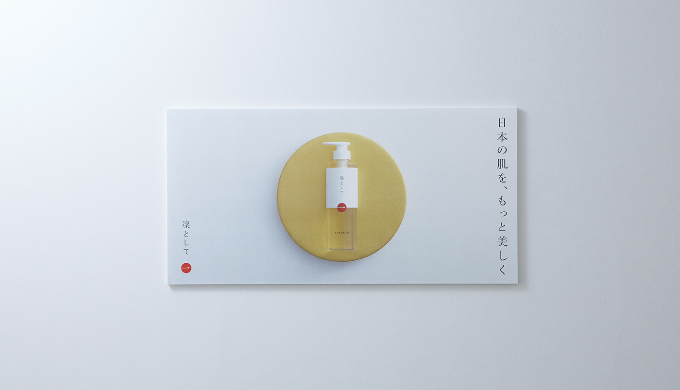
ブランドの思想を、素材と佇まいで伝える。
「身体にも環境にもやさしく、誰もが安心して使えるシャンプーをつくりたい」という想いから生まれた「凜として」。
そのブランドの世界観を、売り場でも自然に感じてもらえるディスプレイを目指しました。
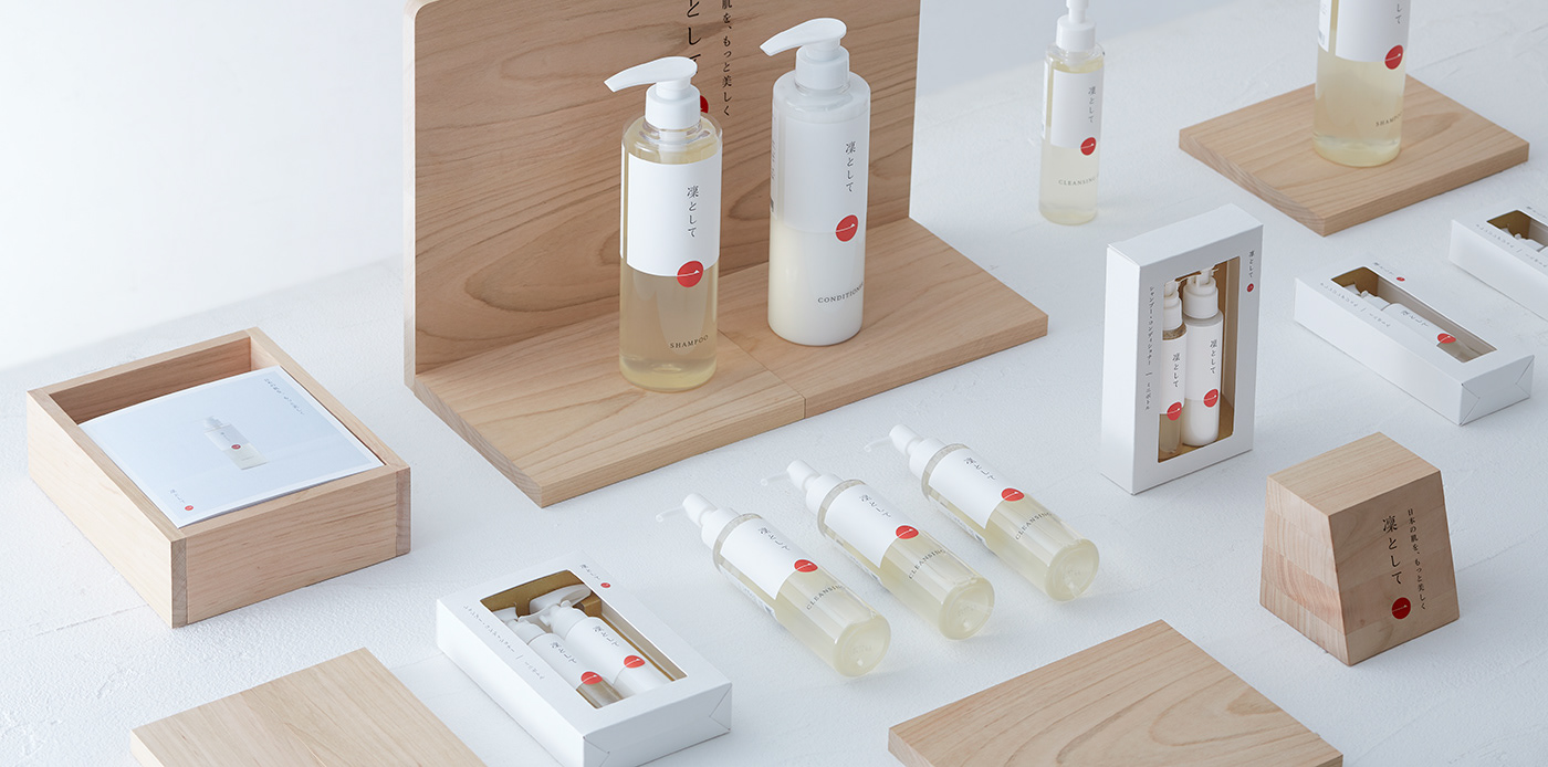
着目したのは、木という自然素材が持つ、やさしさと温かみ。商品のシンプルな佇まいと調和しながら、ブランドが大切にする価値観を、素材の質感を通して表現しました。
また、さまざまな売り場に柔軟に対応できるよう、パーツのサイズや組み合わせ方を検討し、自由度の高いディスプレイ構造を考案。売り場の広さや商品の展開に合わせて、さまざまな形に構成できるデザインとしました。
素材の選定から構造、商品の見せ方まで。すべてにブランドの思想を反映したディスプレイです。
Expressing the Brand Philosophy Through Materials and Design
“Rin to Shite” was born from a desire to create a shampoo that is gentle on both the body and the environment, and that anyone can use with confidence.
Our aim was to create a display that would bring the brand’s distinctive character into the retail environment.
We focused on the natural warmth and gentle character of wood. Its texture complements the simplicity of the products while reflecting the values at the heart of the brand.
To accommodate different retail spaces, we developed a flexible modular structure, carefully considering the size and arrangement of each component. The interchangeable elements allow the display to be configured in various ways to suit different spaces and product arrangements.
From the choice of materials to the structure and presentation of the products, every detail reflects the brand’s philosophy.




CLIENT: DAIKYO INC.
ART DIRECTION & DESIGN: JUNICHI HAKOYAMA (RHYTHM INC.)
ALL PROJECTS | CATEGORIES | BRANDING | GRAPHIC | PACKAGE | WEB | VIDEO


