
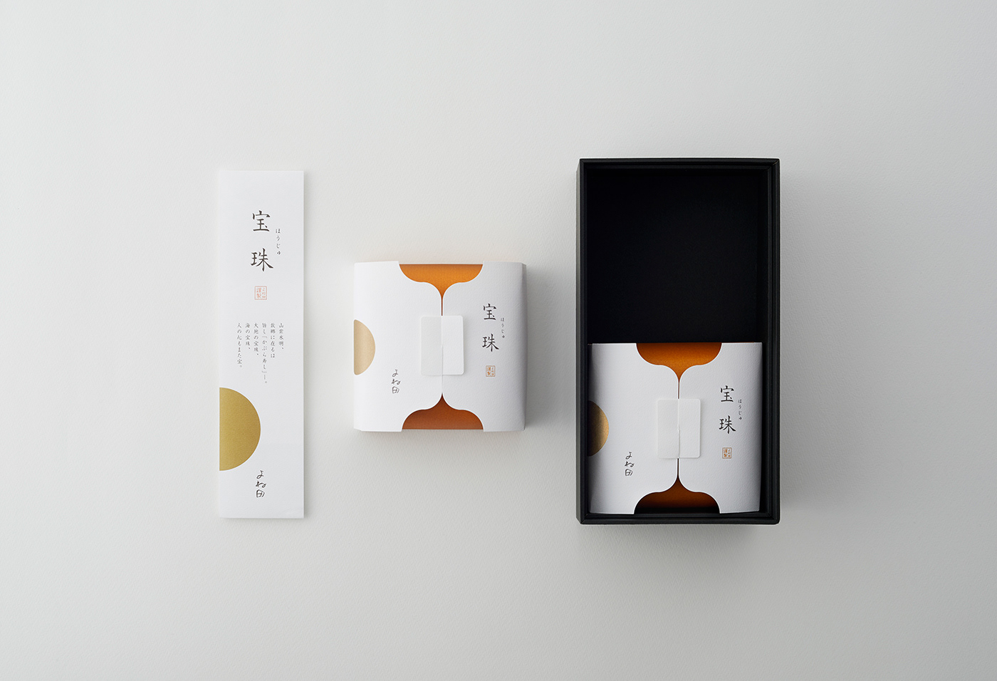
GIFT PACKAGE
HOUJYU(Kabura-zushi)
ART DIRECTION, DESIGN, PACKAGING CONSTRUCTION WORK : PACKAGE
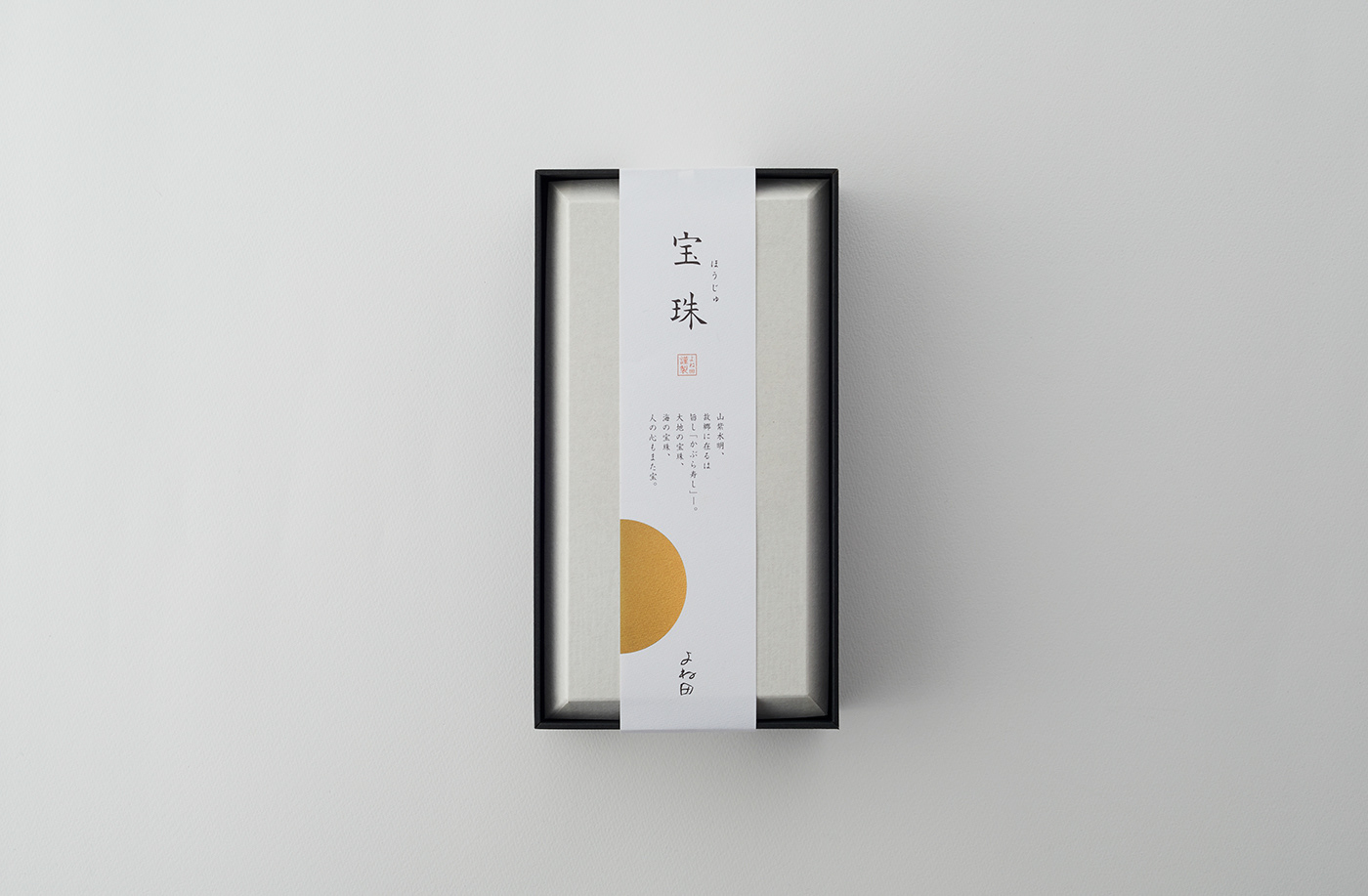
富山の名産品として親しまれている、かぶら寿司の贈答用パッケージデザイン。
見た目からも、贈る人の「感謝の気持ち」が自然に伝わる佇まいとは何か。その問いから、本プロジェクトは始まった。
見た目からも、贈る人の「感謝の気持ち」が自然に伝わる佇まいとは何か。その問いから、本プロジェクトは始まった。
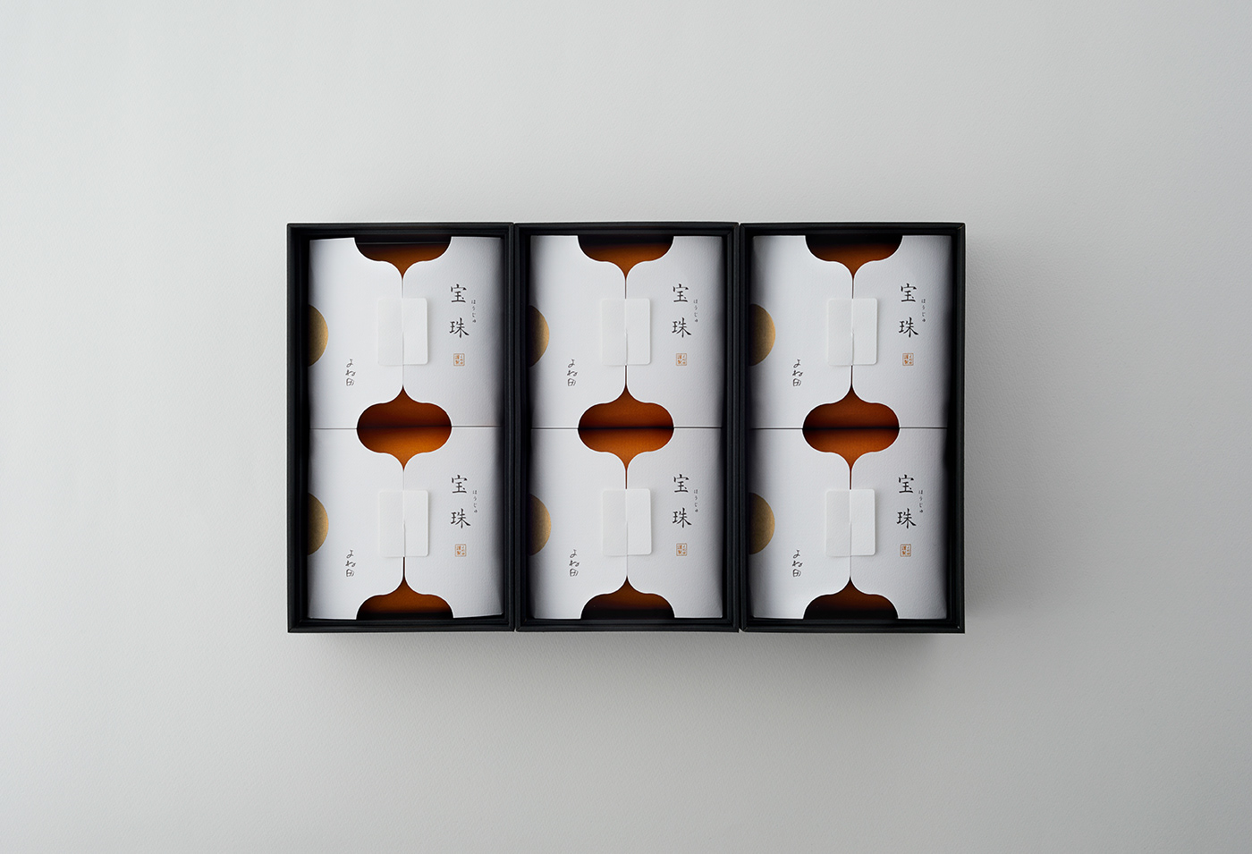
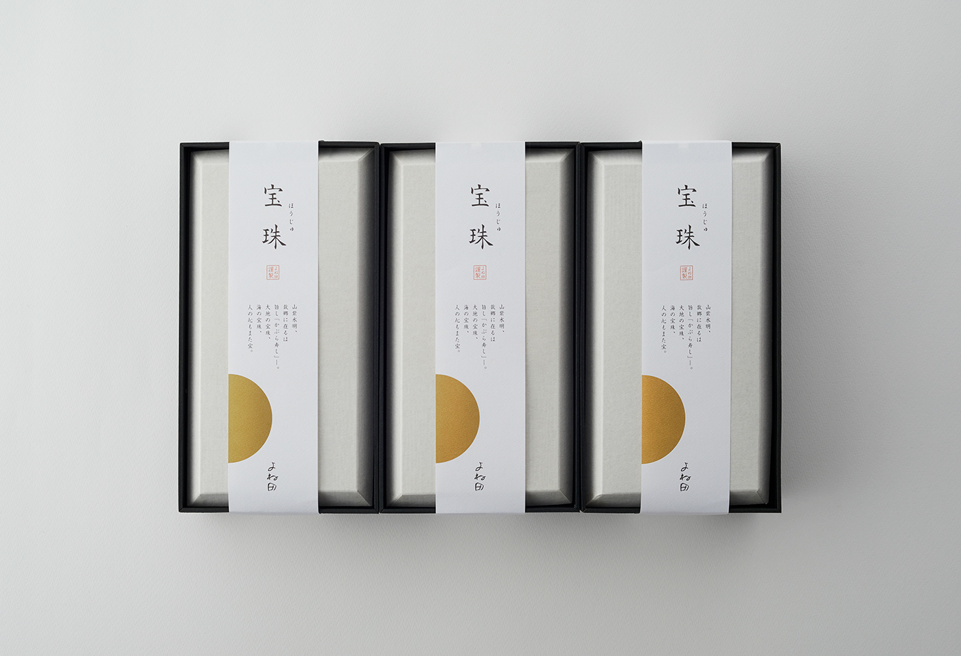
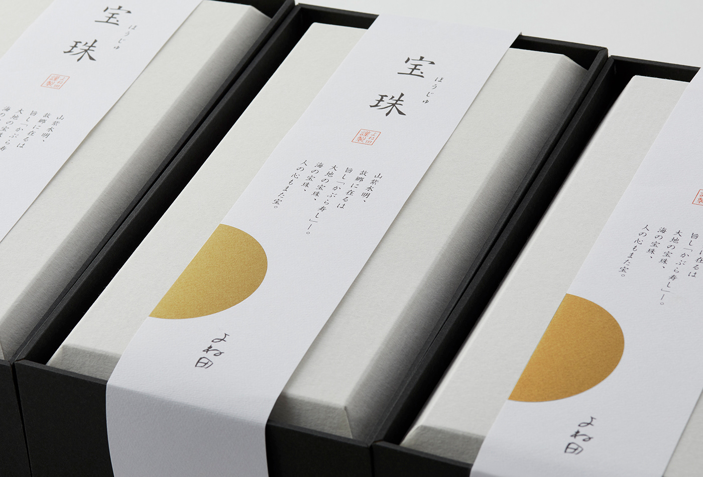
最初に目に入る外箱には、富山の食文化を背景に持つ名産品としての品格と、贈答品ならではの心遣いが、五感を通して伝わることを重視。
色味や素材の風合いはもちろん、箱を手に取った瞬間の質感にもこだわり、試作を重ねながら最適な紙の材質を丁寧に検討した。
色味や素材の風合いはもちろん、箱を手に取った瞬間の質感にもこだわり、試作を重ねながら最適な紙の材質を丁寧に検討した。
Gift package design for kabura-zushi, a local delicacy cherished in Toyama.
The project began with a fundamental question: What kind of presence can naturally convey a sense of gratitude, even at first glance?
The project began with a fundamental question: What kind of presence can naturally convey a sense of gratitude, even at first glance?
For the outer box—the first element to catch the eye—we placed importance on ensuring that both the dignity of a regional specialty rooted in Toyama’s food culture and the thoughtfulness inherent to a gift could be perceived through all five senses.
Beyond color and material appearance, particular attention was paid to the tactile sensation when the box is held, with repeated prototyping undertaken to carefully select the most appropriate paper material.
Beyond color and material appearance, particular attention was paid to the tactile sensation when the box is held, with repeated prototyping undertaken to carefully select the most appropriate paper material.
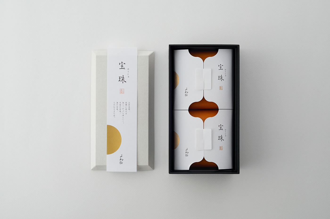
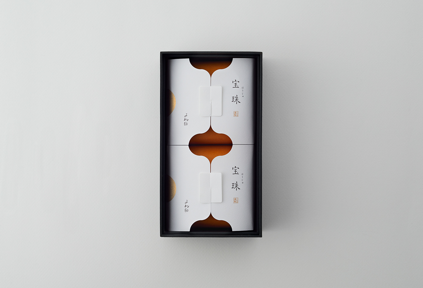
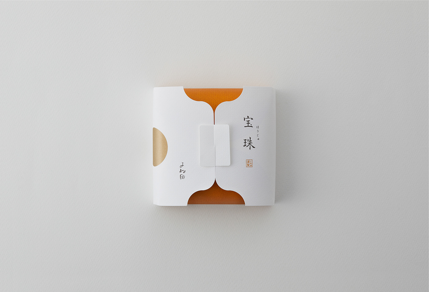
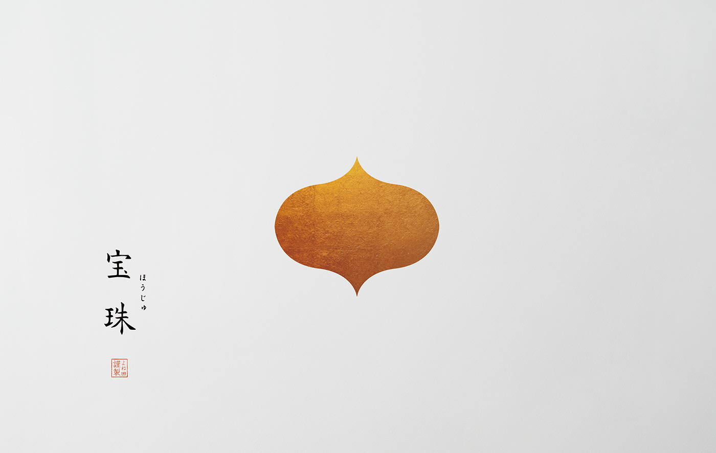
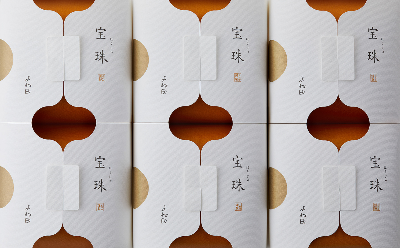
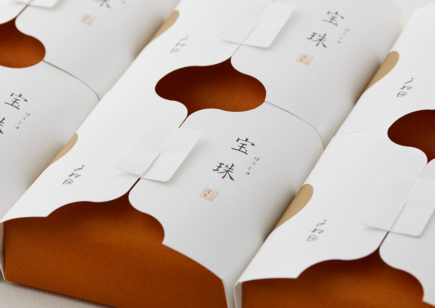
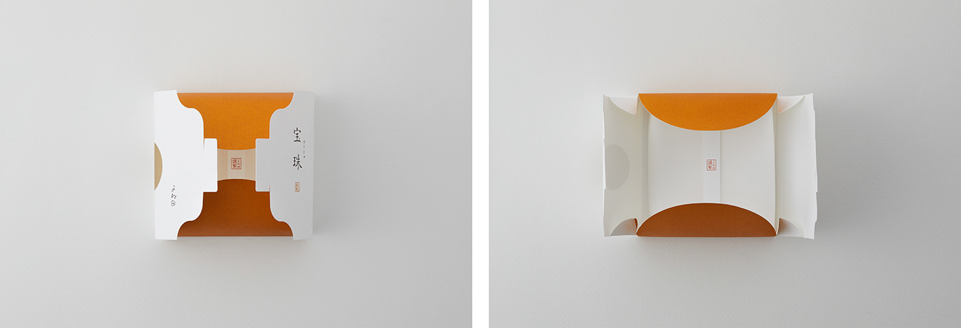
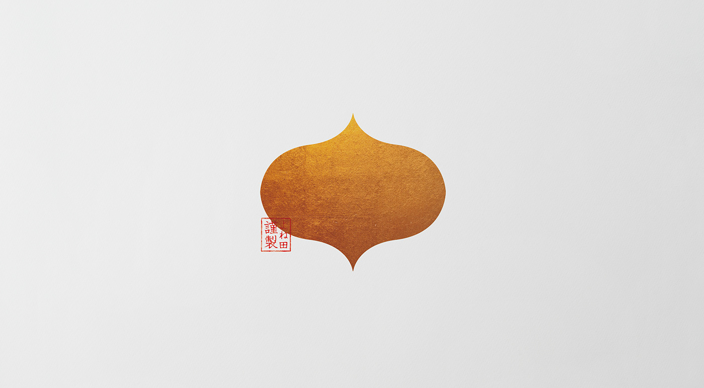
個包装のパッケージデザインには、かぶら寿司の象徴である「かぶ」のシルエットをモチーフとして取り入れている。
これは、「個包装が上下に並ぶという商品の特性をデザインに活かせないか」という視点から導き出した表現である。
これは、「個包装が上下に並ぶという商品の特性をデザインに活かせないか」という視点から導き出した表現である。
二つのパッケージが上下に並ぶことで、かぶのシルエットが自然と浮かび上がる仕掛けとしている。
また、かぶの存在感をやさしく印象づけるため、柔らかな白を基調とし、素材感のある紙を採用。視覚だけでなく、
手に取ったときの感触からも、商品の持つ繊細さと丁寧さが伝わる表現を目指した。
For the individual packaging, the silhouette of a turnip—the symbol of kabura-zushi—was incorporated as a central motif.
This expression was derived from the perspective of exploring how the product’s characteristic of being arranged vertically could be translated into the design. When two packages are stacked one above the other, the silhouette of a turnip naturally emerges.
This expression was derived from the perspective of exploring how the product’s characteristic of being arranged vertically could be translated into the design. When two packages are stacked one above the other, the silhouette of a turnip naturally emerges.
To gently emphasize the presence of the turnip, a soft white color palette was adopted along with a textured paper material. This approach allows the delicacy and care inherent in the product to be conveyed not only visually, but also through the tactile experience of holding the package.
CLIENT:YONEDA CO.,LTD.
ART DIRECTION, DESIGN, PACKAGING CONSTRUCTION:JUNICHI HAKOYAMA (RHYTHM INC.)
ART DIRECTION, DESIGN, PACKAGING CONSTRUCTION:JUNICHI HAKOYAMA (RHYTHM INC.)