
Plan Japan, BRANDING
ART DIRECTION, DESIGN WORK :
BRANDING, LOGOTYPE(Japanese logotype), ADVERTISING

Plan Japanは、イギリスに本部を置き、子どもの権利の推進と、貧困や差別のない社会の実現を目指して、世界70カ国以上で活動する国際NGO。
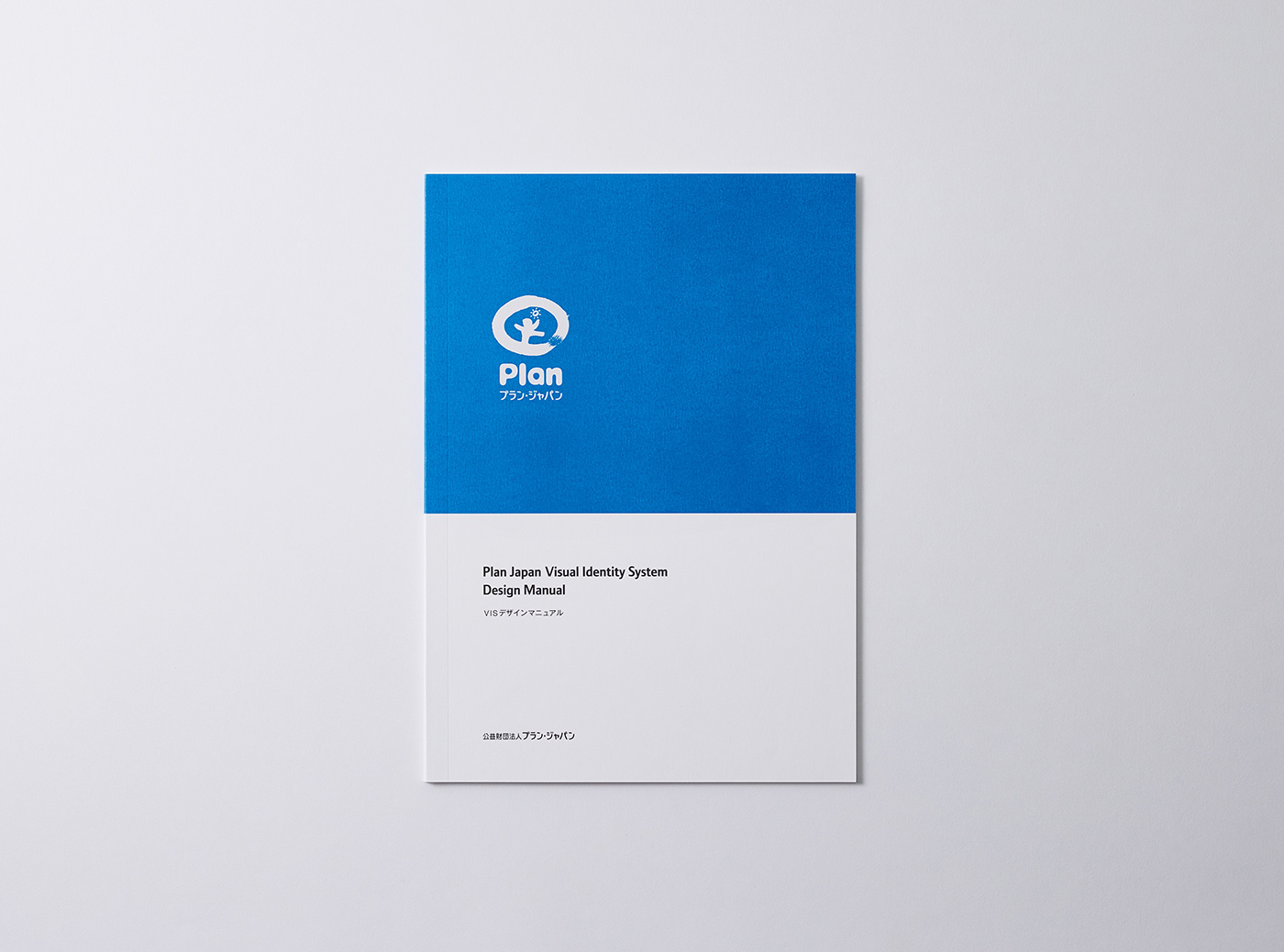
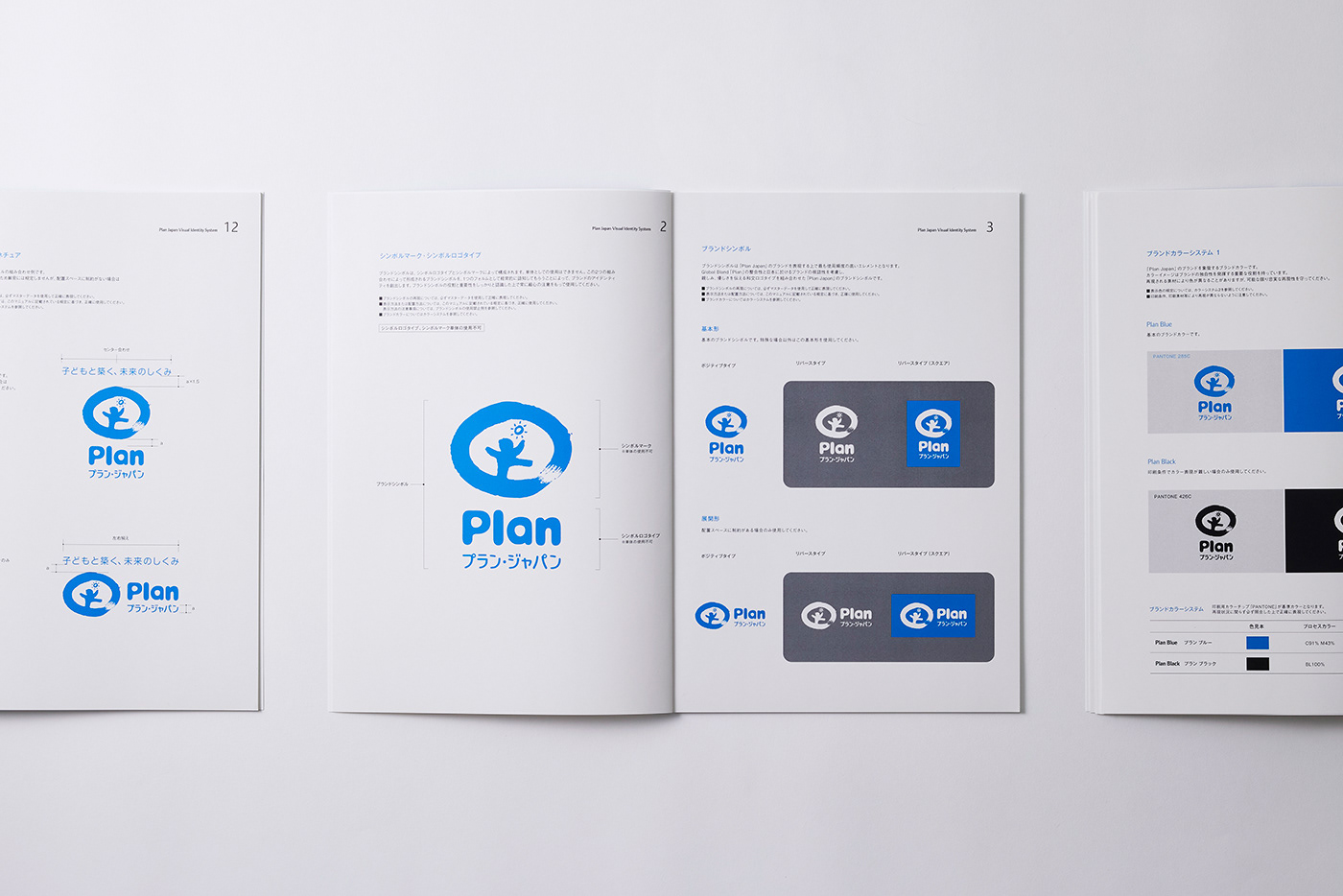
とりわけ、女の子や女性への支援に注力していることで知られている。私たちは2009年から2018年にかけて、Plan Japanのブランディングを担当。マークとロゴタイプはグローバルで共通のものが定められていたため、日本での展開に向けて和文ロゴタイプを開発し、グローバルマークとの統一性を保ちながらデザインを構築した。さらに、ステーショナリーからパワーポイントフォーマットに至るまで、一貫したビジュアルアイデンティティを確立するため、さまざまな使用シーンを想定した使用規定マニュアルを整備。国内におけるブランド表現の基盤づくりを行った。
Plan Japan is an international NGO headquartered in the United Kingdom, working in more than 70 countries worldwide to promote children’s rights and to help build a society free from poverty and discrimination. The organization is particularly known for its strong focus on supporting girls and women. From 2009 to 2018, we were responsible for the branding of Plan Japan. While the organization’s symbol mark and logotype were defined globally, we developed a Japanese logotype for use in the domestic market, carefully designing it to maintain consistency with the global mark.
In addition, to establish a cohesive visual identity across all touchpoints—from stationery to PowerPoint presentation formats—we created comprehensive usage guidelines covering a wide range of applications. This work laid the foundation for consistent brand expression within Japan.

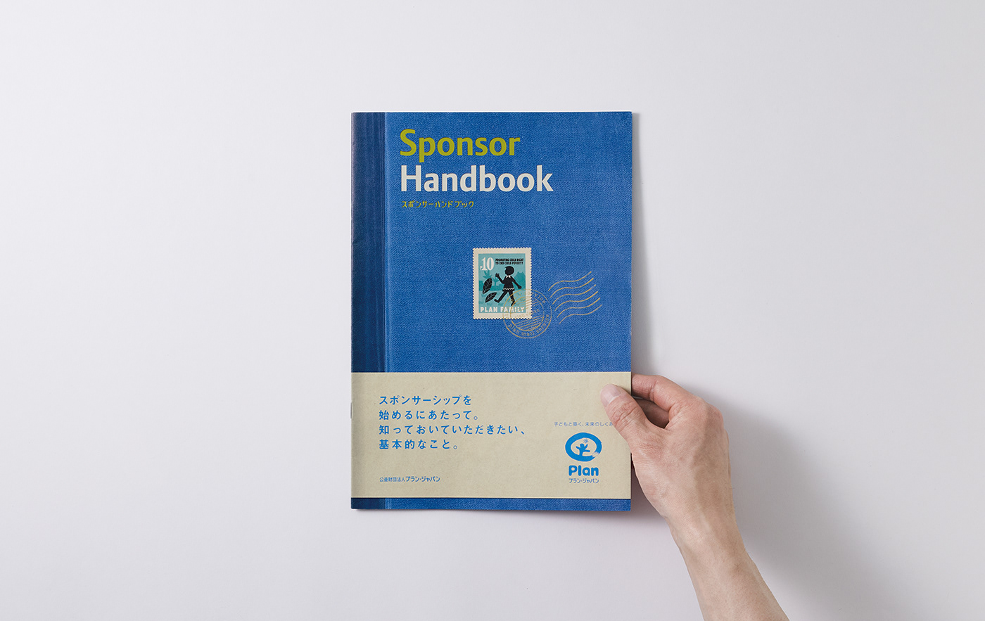
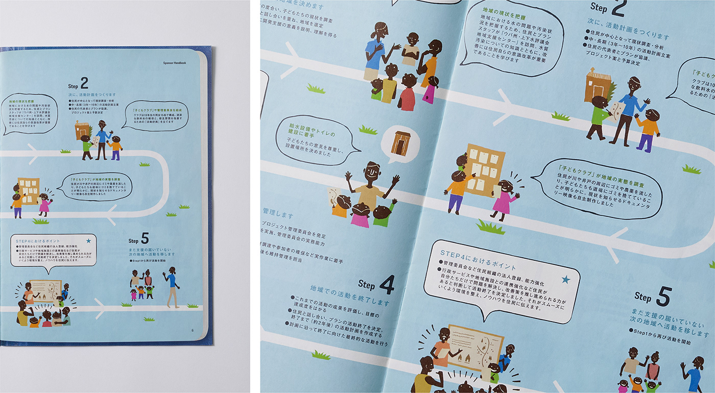
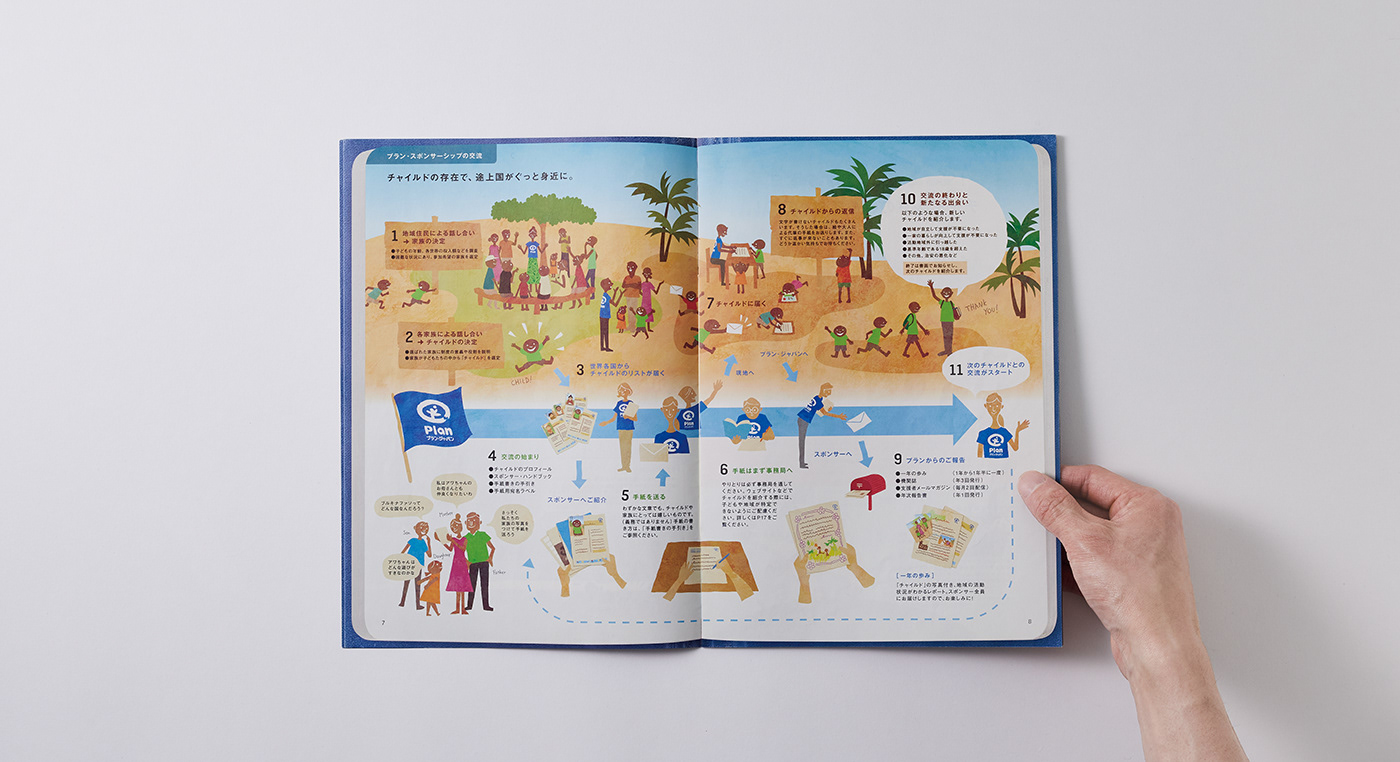
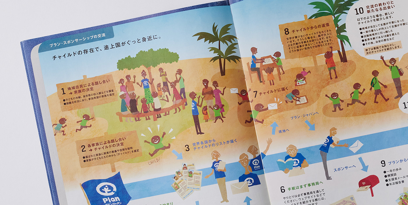

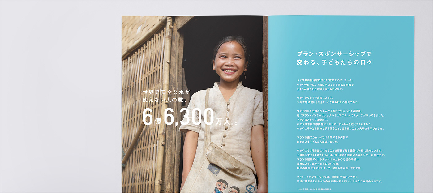
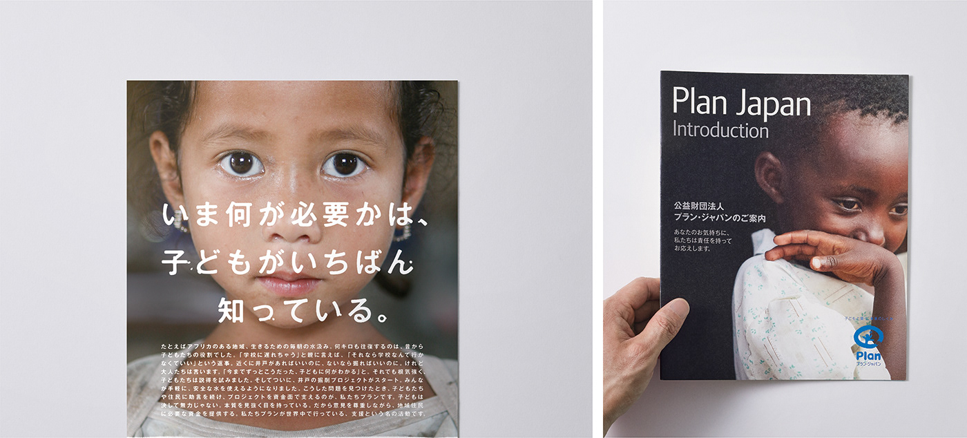
「支援」は、モノやサービスを購入する行為とは異なり、支援によってどのような価値が生まれるのかを理解してもらうことが重要になる。
そのため、Plan Japanの活動を伝えるビジュアル制作においては、コピーライターと幾度も検討を重ねながら、「支援の価値を的確に伝える言葉の選定」に特に配慮した。また、日本と支援国、そして支援者との関係性や仕組みなど、言葉だけでは伝えづらい要素については、イラストや写真を用いた表現を検討。視覚的に理解しやすいコミュニケーション設計を行った。
そのため、Plan Japanの活動を伝えるビジュアル制作においては、コピーライターと幾度も検討を重ねながら、「支援の価値を的確に伝える言葉の選定」に特に配慮した。また、日本と支援国、そして支援者との関係性や仕組みなど、言葉だけでは伝えづらい要素については、イラストや写真を用いた表現を検討。視覚的に理解しやすいコミュニケーション設計を行った。
“Support” differs from the act of purchasing goods or services; it is essential for supporters to understand what kind of value is created through their support. For this reason, when developing visual materials to communicate Plan Japan’s activities, we worked closely with copywriters through repeated discussions, placing particular emphasis on the careful selection of words that accurately convey the value of support.
In addition, for aspects that are difficult to communicate through words alone—such as the relationships and mechanisms between Japan, the countries receiving support, and the supporters themselves—we explored visual approaches using illustrations and photography. These elements were designed to create communication that is clear and easy to understand at a glance.

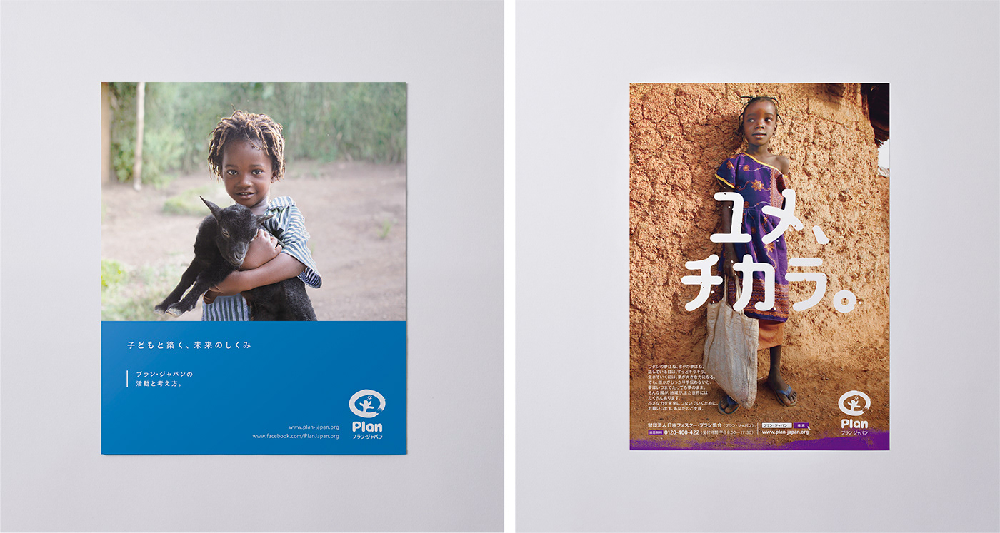
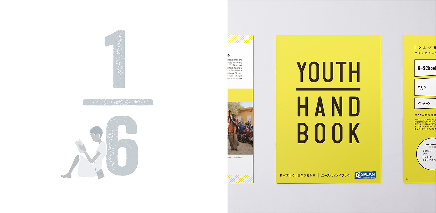
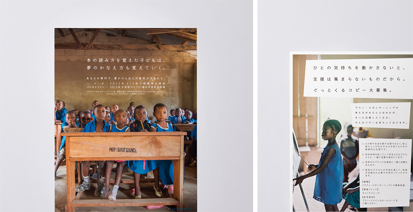
ポスターやパンフレットなど、外部に向けて発信する主要なビジュアル制作も担当。各デザインにおいては、コンセプトの軸となるメッセージの統一を図りながら、それぞれの媒体特性に応じた最適なコミュニケーション方法を検討した。こうした一貫性のあるブランディングを継続的に行うことで、国内におけるPlan Japanの認知度向上と、ブランドイメージの定着に寄与している。
We were also responsible for the creation of key visual materials distributed externally, including posters and pamphlets.
For each design, we maintained a unified core message while carefully considering the most effective communication approach suited to the characteristics of each medium. Through this consistent branding effort over time, the project contributed to increased awareness of Plan Japan in Japan and to the establishment of a clear and cohesive brand image.
For each design, we maintained a unified core message while carefully considering the most effective communication approach suited to the characteristics of each medium. Through this consistent branding effort over time, the project contributed to increased awareness of Plan Japan in Japan and to the establishment of a clear and cohesive brand image.
CLIENT:Plan Japan
ART DIRECTION,:JUNICHI HAKOYAMA (RHYTHM INC.)
GRAPHIC DESIGN : JUNICHI HAKOYAMA (RHYTHM INC.)
ILLUSTRATION:YOSUKE EDA (RHYTHM INC.)