
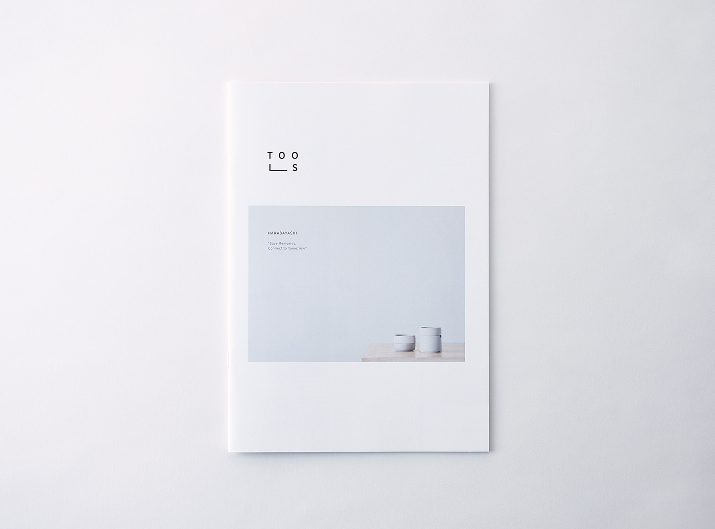

STATIONERY BROCHURE “TOOLS”
ART DIRECTION, DESIGN, ILLUSTRATION WORK : BROCHURE
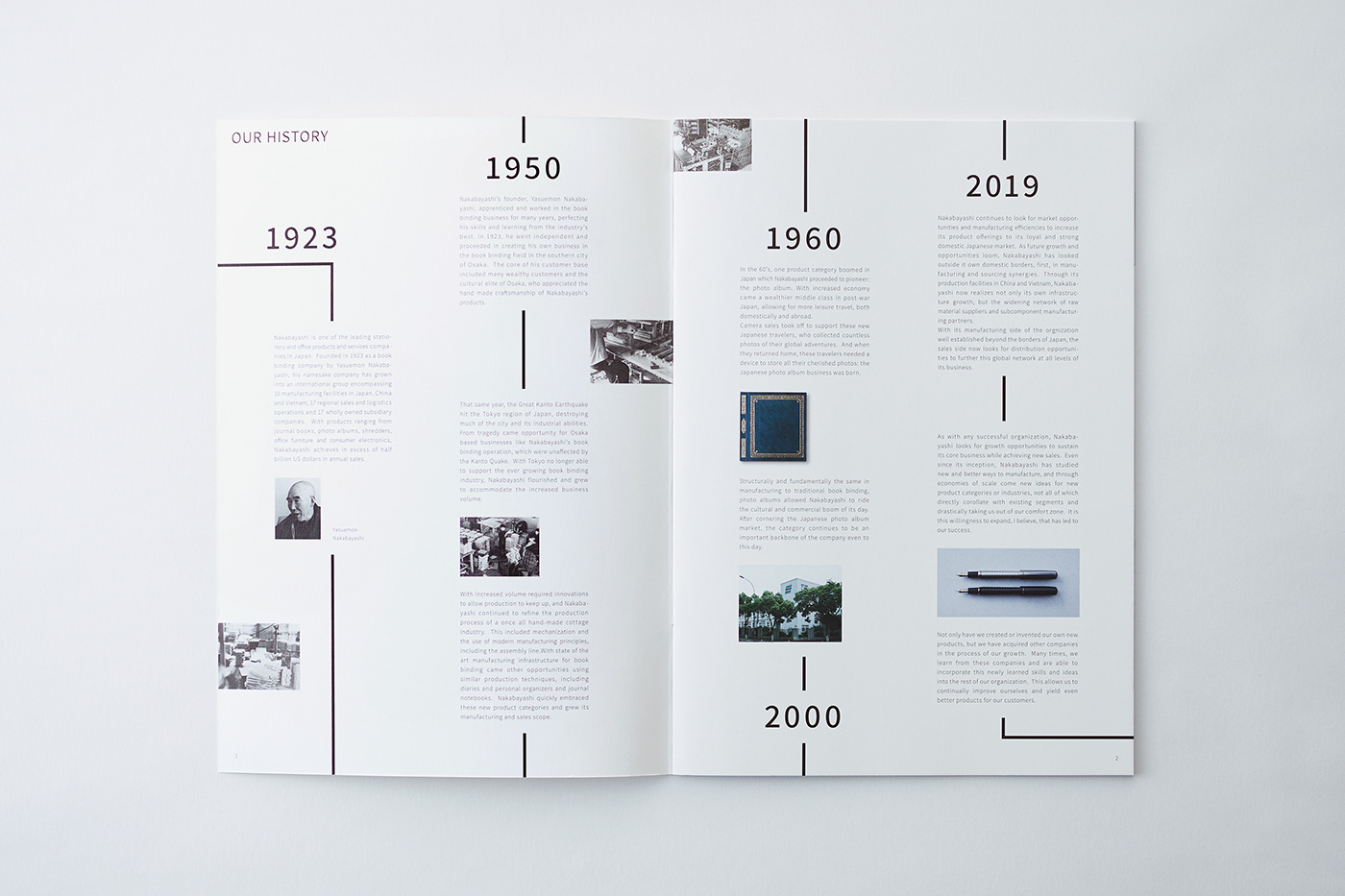
アルバム・製本事業において国内最大級のシェアを誇るステーショナリーブランド「ナカバヤシ」。
看板商品である「フエルアルバム」は、多くの人に親しまれてきたロングセラーアイテムとして知られている。
看板商品である「フエルアルバム」は、多くの人に親しまれてきたロングセラーアイテムとして知られている。
欧米を中心とする海外市場でのさらなる販路拡大に向け、自社製品が持つ高い機能性と、日本ブランドならではの品質価値を
より強く訴求したいという背景から、ブランドパンフレットの制作が求められた。
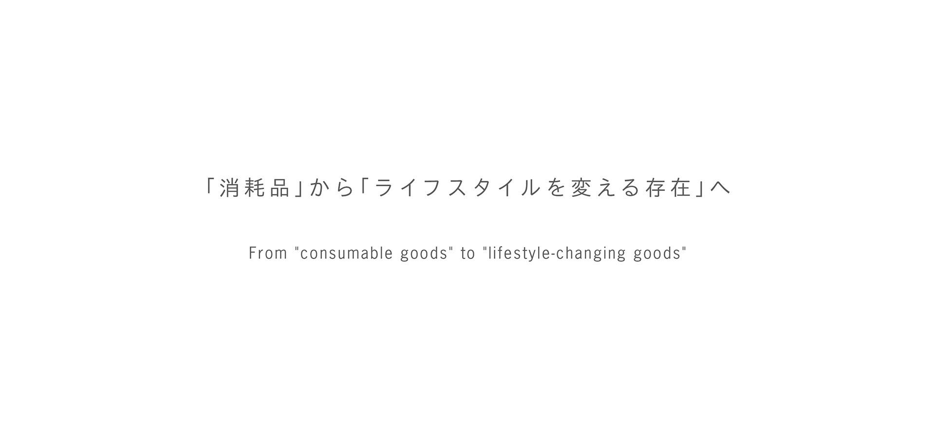
そうした課題に対し、私たちがまず向き合ったのは、「今の時代において、文具が持つ付加価値をどのように伝えるべきか」という視点である。
Nakabayashi is a stationery brand that holds one of the largest market shares in Japan in the album and bookbinding sector.
Its flagship product, the Fueru Album, is widely known as a long-selling item that has been cherished by many people over the years.
Its flagship product, the Fueru Album, is widely known as a long-selling item that has been cherished by many people over the years.
As part of an effort to further expand into overseas markets—particularly in Europe and North America—there was a strong desire to more clearly communicate the high functionality of its products along with the quality associated with Japanese brands. This led to the development of a brand brochure.
In response to this challenge, our initial focus was on how the added value of stationery should be communicated in today’s context.
現在、文具を取り巻く環境は、十数年前とは大きく様変わりしている。
かつてはノートに書き留めていたメモが、スマートフォンやパソコンに記録され、手帳に書いていたスケジュールはクラウド上のカレンダーで
かつてはノートに書き留めていたメモが、スマートフォンやパソコンに記録され、手帳に書いていたスケジュールはクラウド上のカレンダーで
管理される。こうした変化の中で、文具が担ってきた多くの機能は、デジタルデバイスへと置き換えられつつある。
さらに、「ナカバヤシ」が主なターゲットとして想定していた海外市場では、文具は「使い捨ての消耗品」として捉えられる傾向が強い。
そのため、いかに品質が高くても、価格帯の高い日本の文具をそのままの文脈で受け入れてもらうことは難しく、新たなアプローチが求められていた。
Today, the role of stationery is markedly different from what it was a decade or more ago.
Tasks that were once handled with notebooks are now recorded on smartphones or computers, and schedules that used to be written in planners are increasingly managed through cloud-based calendars. As a result, many of the traditional functions of stationery have gradually been replaced by digital devices.
Tasks that were once handled with notebooks are now recorded on smartphones or computers, and schedules that used to be written in planners are increasingly managed through cloud-based calendars. As a result, many of the traditional functions of stationery have gradually been replaced by digital devices.
In addition, in overseas markets—particularly those Nakabayashi identified as key targets—stationery is often perceived as a disposable commodity. Under these conditions, even products of exceptionally high quality face challenges in gaining acceptance if they are positioned simply as premium-priced stationery from Japan. This made it clear that a different approach was required in order to succeed in international markets.
商品の機能性や品質だけを前面に押し出すカタログでは、十分な訴求力を持たないのではないか。
そこで私たちが着目したのは、「ナカバヤシの文具が、日々のライフスタイルをどのように変えてくれるのか」という視点だった。
そこで私たちが着目したのは、「ナカバヤシの文具が、日々のライフスタイルをどのように変えてくれるのか」という視点だった。
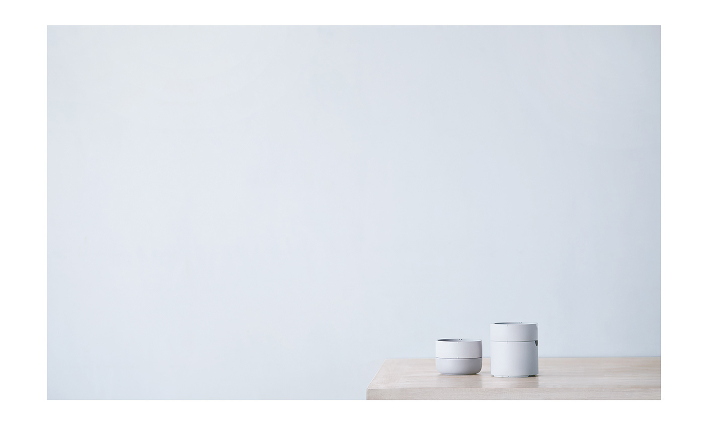
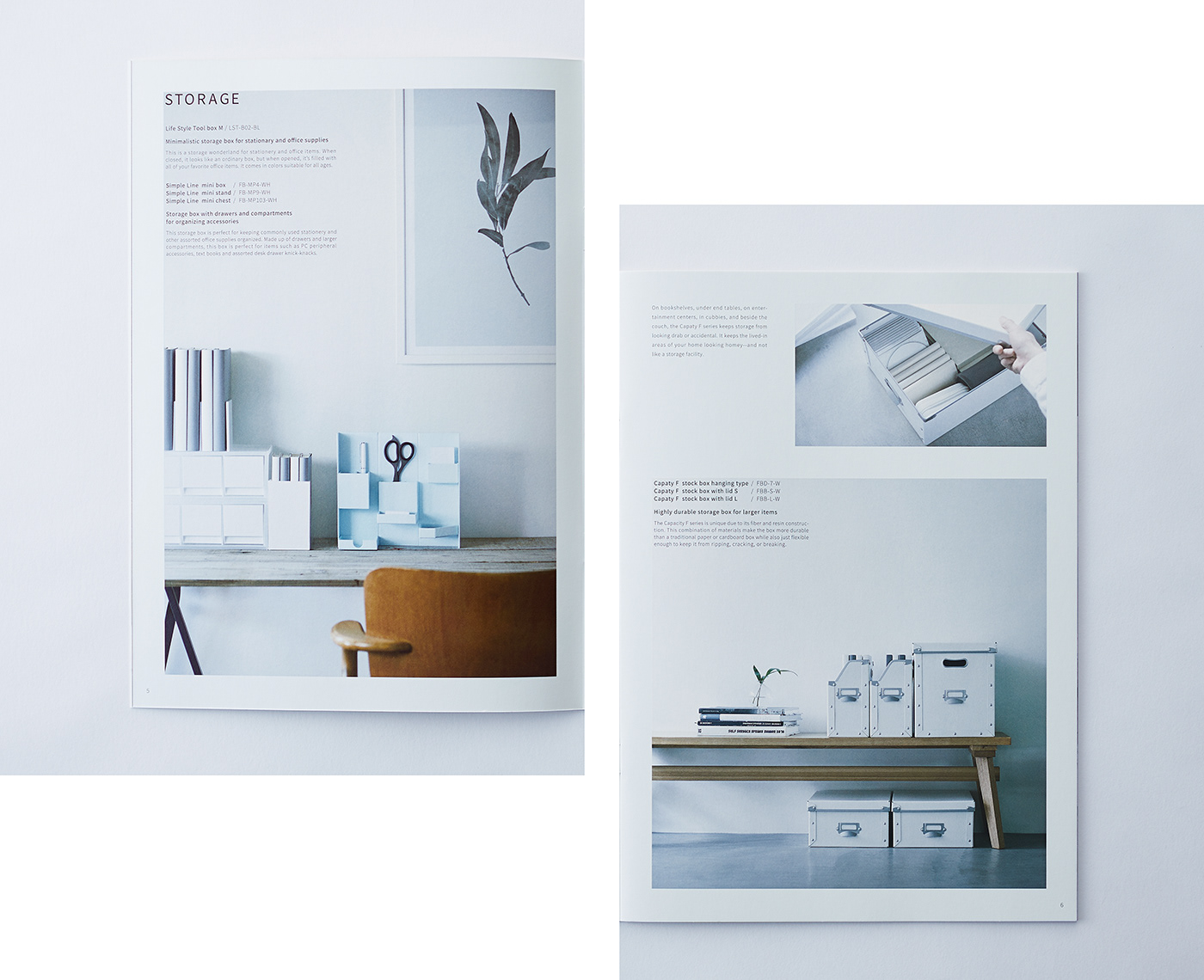
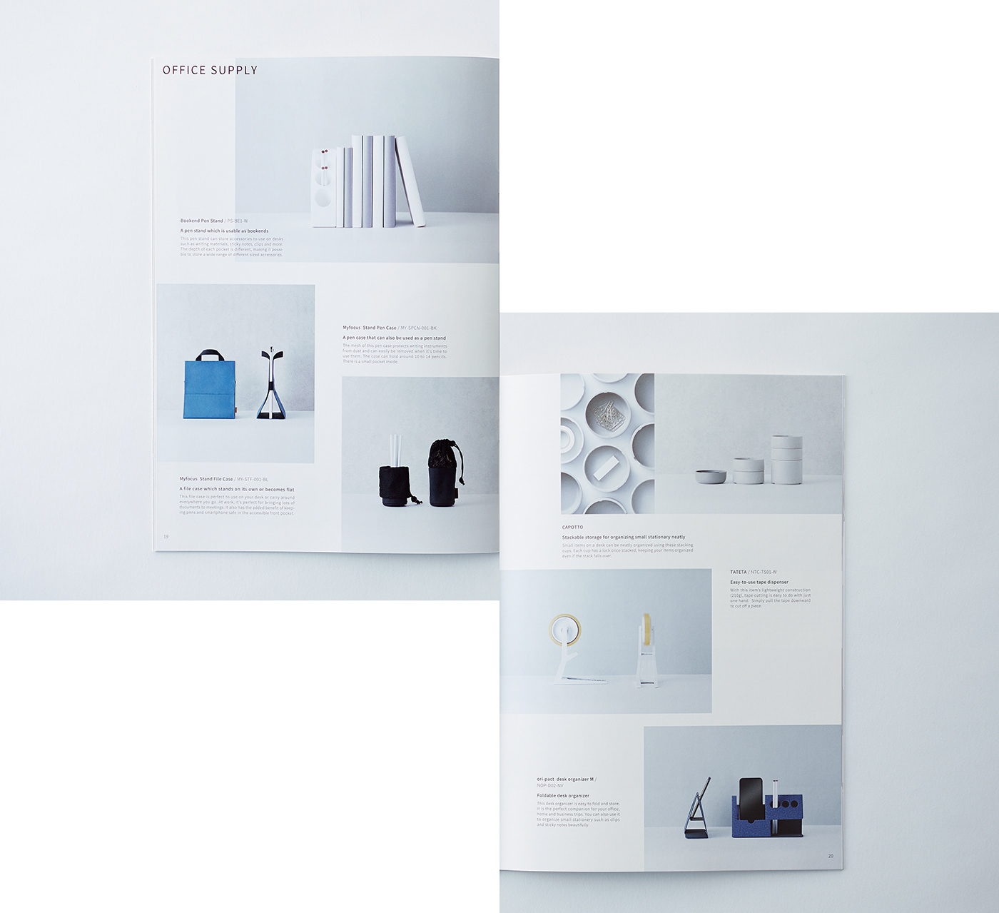
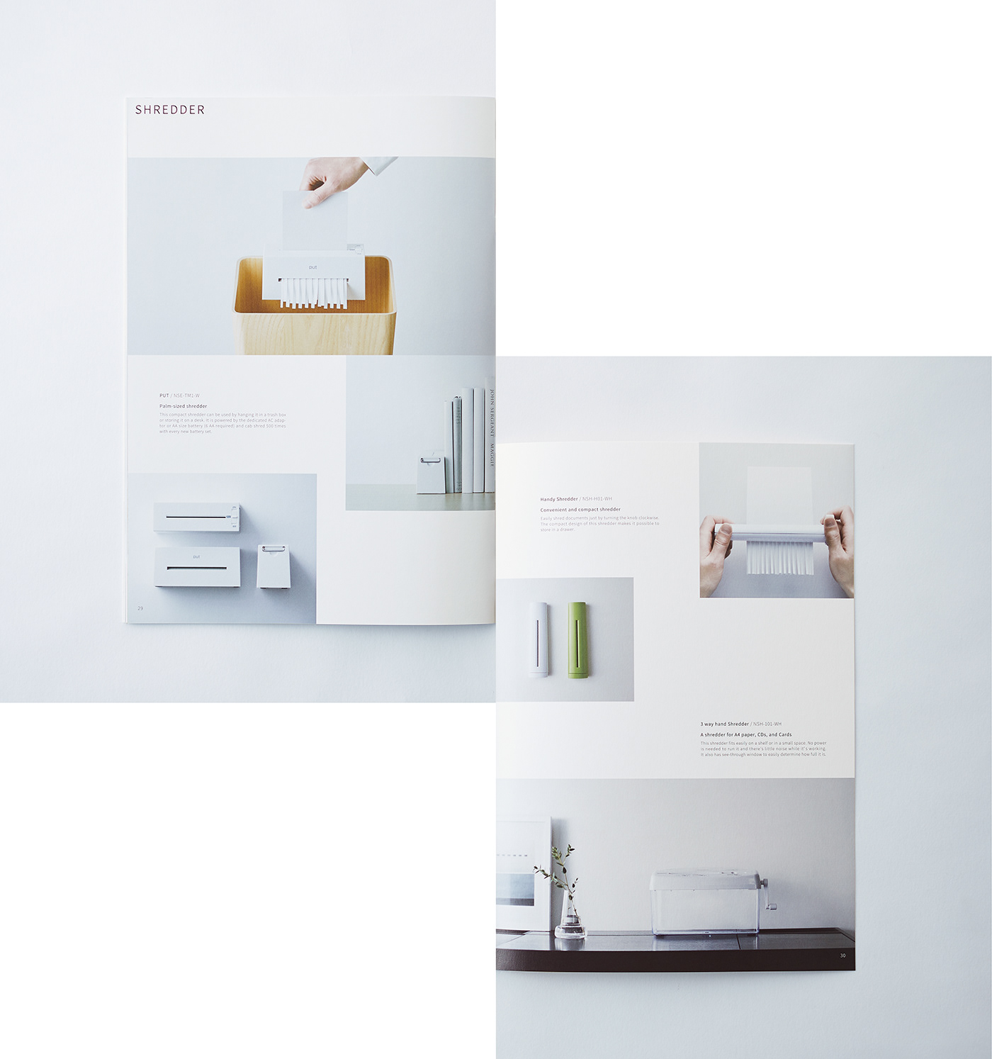
部屋のインテリアに自然と馴染む、機能美にあふれた文具。
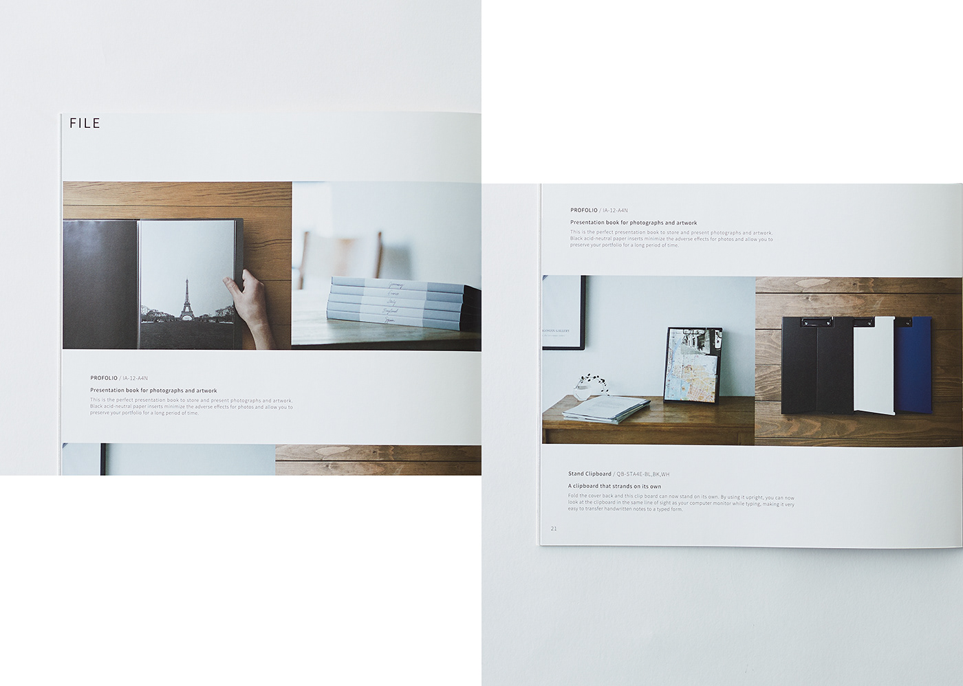
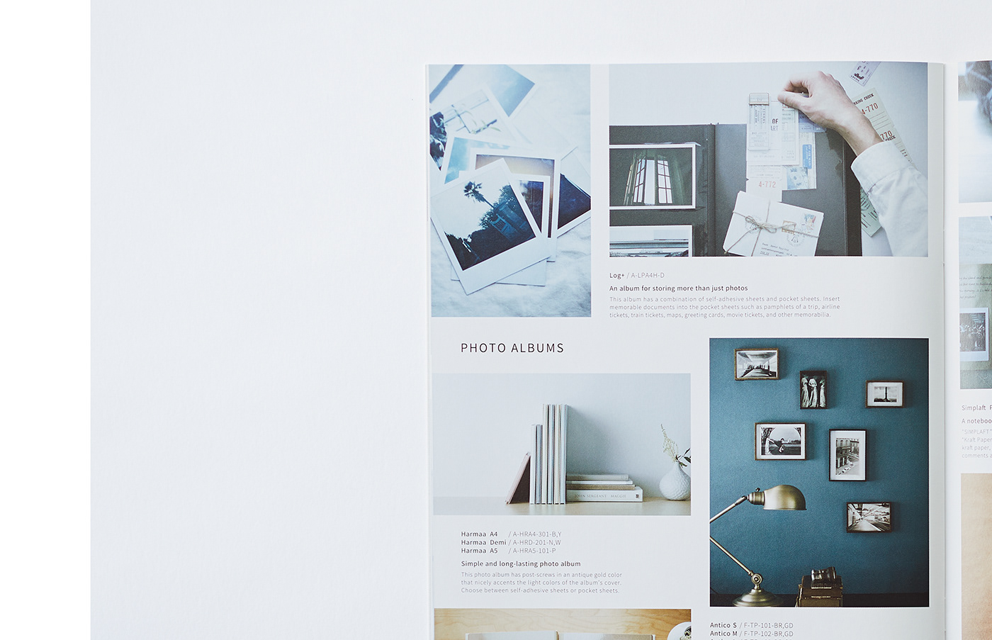
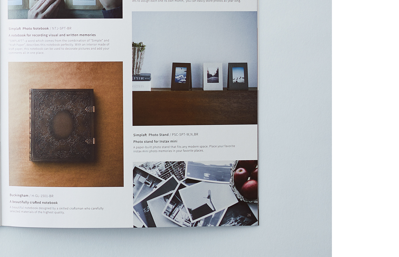
写真を整理する時間そのものが楽しくなる、美しいアルバム。
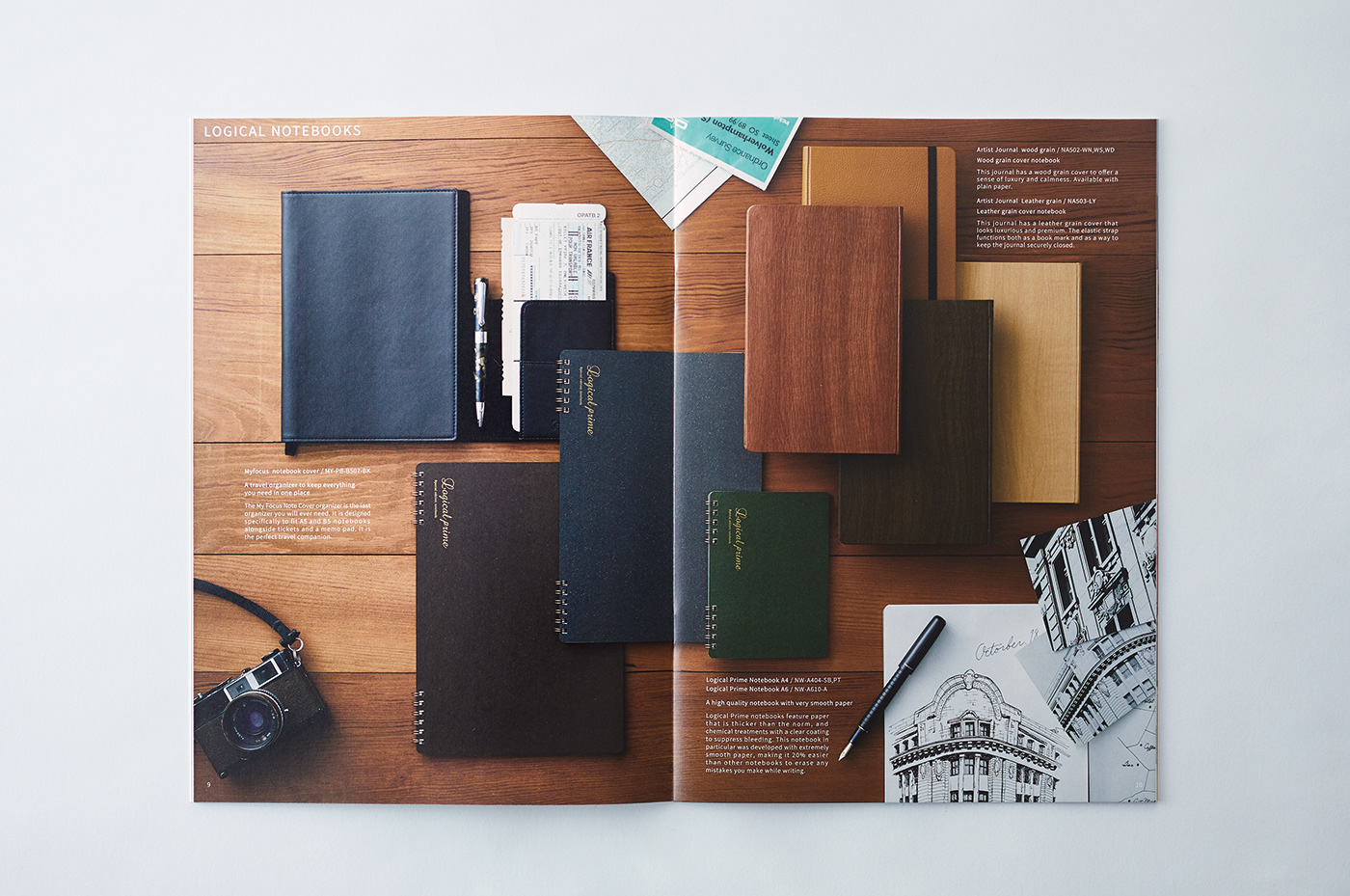
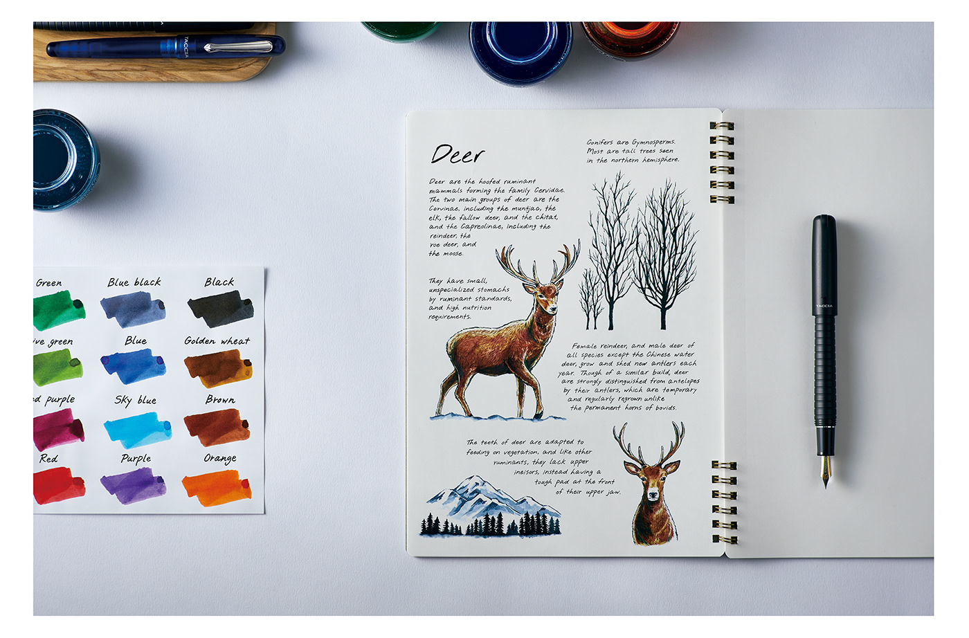
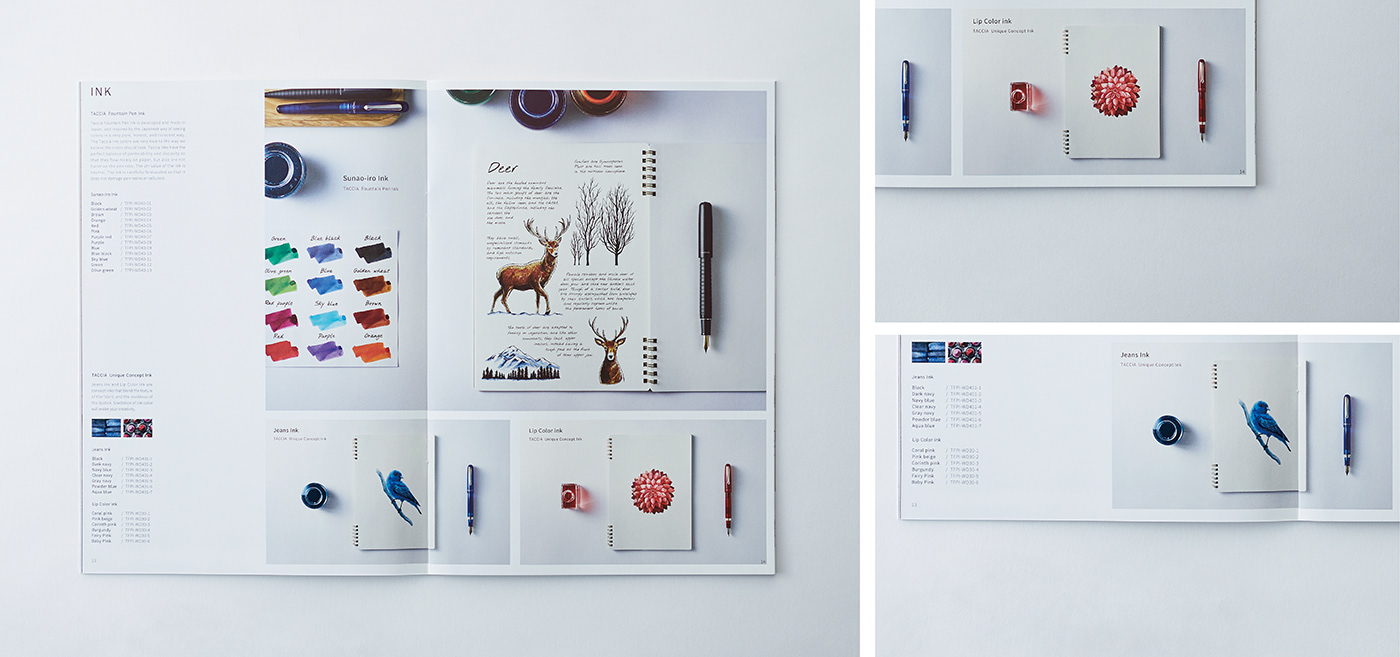
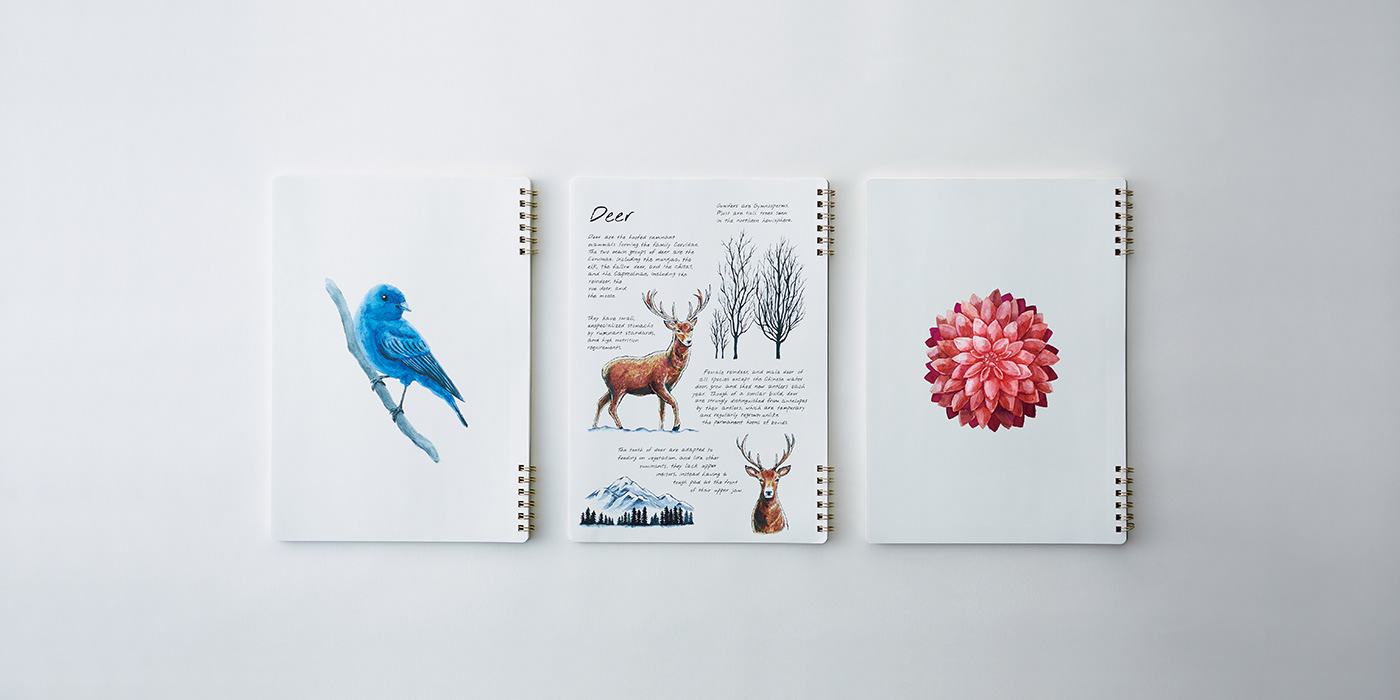
思わずノートに絵を描きたくなるような、奥行きのある鮮やかなインク。
写真や文章を通じて、文具の先に広がる生活の情景を描くことで、新たなライフスタイルを提案するカタログを構想した。
写真を整理する時間そのものが楽しくなる、美しいアルバム。
思わずノートに絵を描きたくなるような、奥行きのある鮮やかなインク。
写真や文章を通じて、文具の先に広がる生活の情景を描くことで、新たなライフスタイルを提案するカタログを構想した。
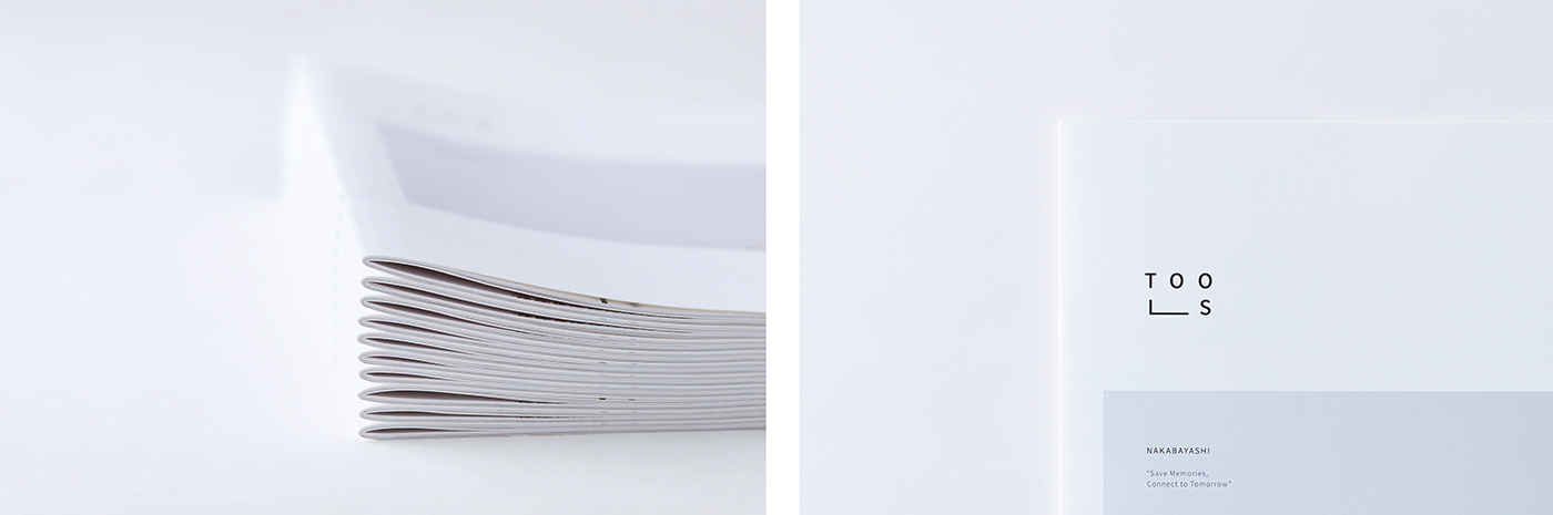
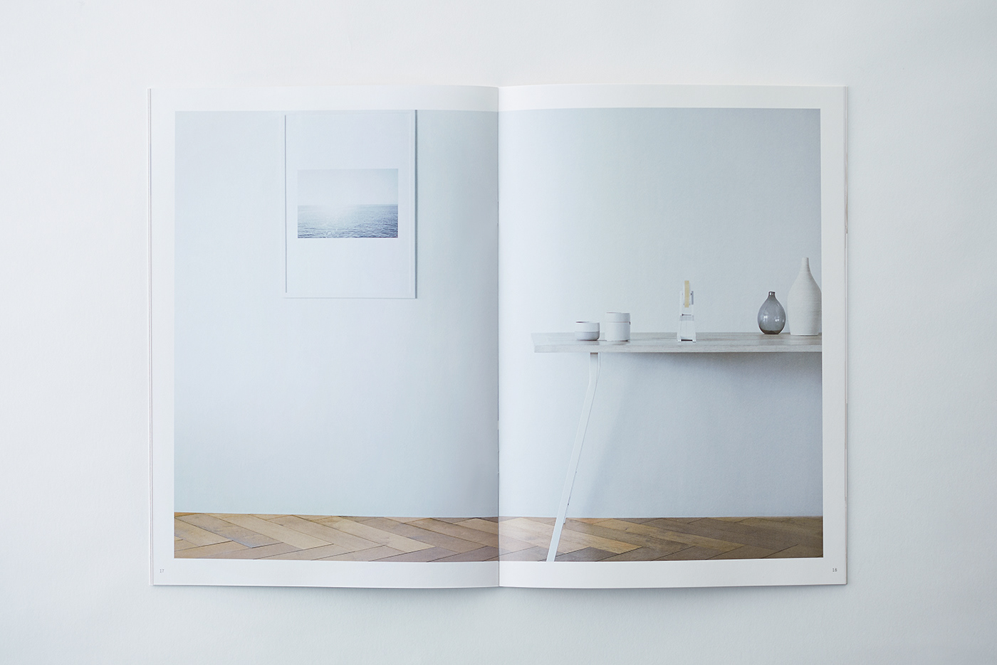
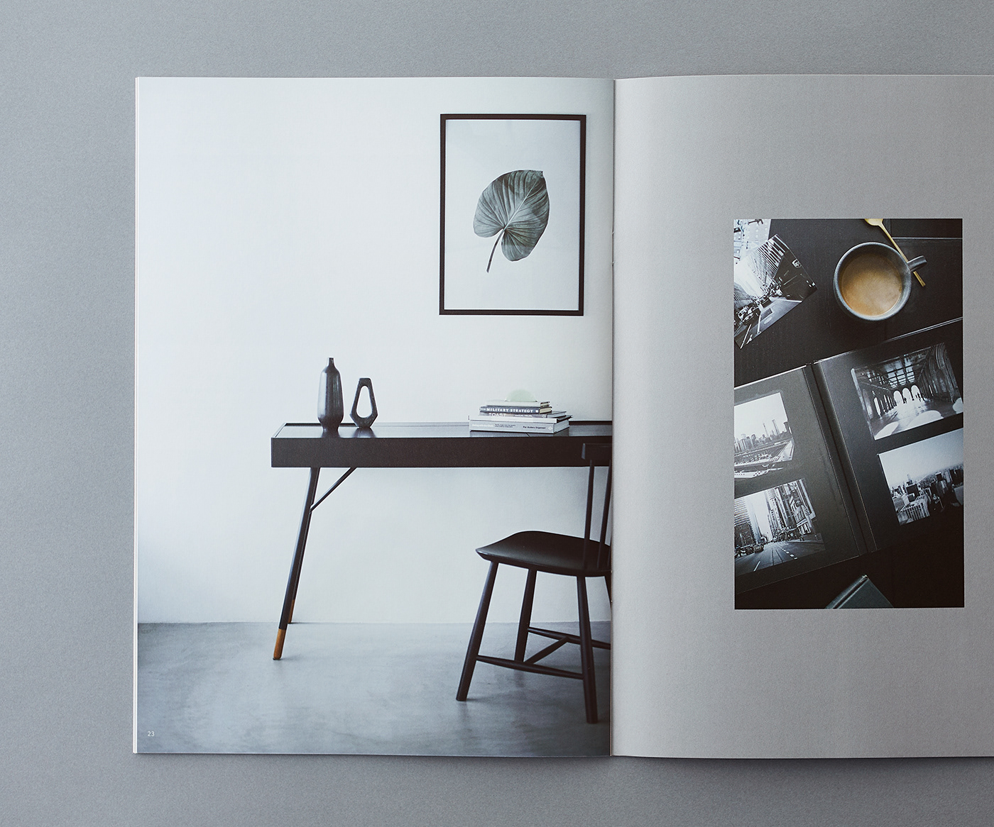
その考えのもと、カタログでは「空間の空気感が伝わること」を重視し、余白を生かした写真表現で統一。
商品情報は必要最低限にとどめ、シンプルに整理することで、世界観が自然に伝わる構成とした。
商品情報は必要最低限にとどめ、シンプルに整理することで、世界観が自然に伝わる構成とした。
A catalog that focuses solely on product functionality and quality may not be compelling enough.
Instead, we chose to explore and express how Nakabayashi stationery can transform everyday life, creating a worldview within the catalog that centers on lifestyle rather than specifications.
Instead, we chose to explore and express how Nakabayashi stationery can transform everyday life, creating a worldview within the catalog that centers on lifestyle rather than specifications.
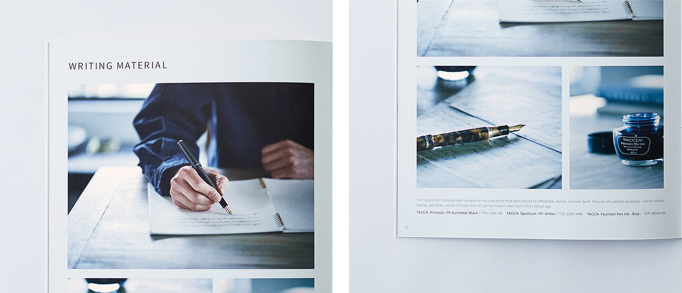
Stationery characterized by functional beauty that naturally fits into interior spaces.
Albums that make the act of organizing photographs an enjoyable experience.
Rich, vivid inks that inspire the urge to sketch or draw in a notebook.
Through imagery and text, the catalog presents life beyond stationery, offering users a new perspective on how these tools can enrich their daily routines.
With a clear focus on proposing “life beyond stationery,” the catalog was unified through spacious photography that conveys the atmosphere of each setting. Product information was intentionally kept to a minimum and presented in a simple, restrained manner, allowing the overall worldview to take precedence.


CLIENT : NAKABAYASHI CO.,LTD.
ART DIRECTION, DESIGN: JUNICHI HAKOYAMA (RHYTHM INC. )
ILLUSTRATION : KATSUYA YOSHIZAWA (RHYTHM INC.)
PHOTO : TATSURO MASAKI, HIROKI OHASHI (MASAKI PHOTOS Co., Ltd. )
STYLIST : YOSHIE MATSUDA
ART DIRECTION, DESIGN: JUNICHI HAKOYAMA (RHYTHM INC. )
ILLUSTRATION : KATSUYA YOSHIZAWA (RHYTHM INC.)
PHOTO : TATSURO MASAKI, HIROKI OHASHI (MASAKI PHOTOS Co., Ltd. )
STYLIST : YOSHIE MATSUDA