
KANEKA CORPORATION
SPANION
BRANDING WORK: BRAND LOGOTYPE, PACKAGE, BROCHURE


「スパイス+オニオン」を意味する「SPANION」。高品質なスパイスやクオリティの高いレトルト食品など、幅広いラインナップを展開する同ブランドは、高級レストランを主なターゲットとしている。
そこで本プロジェクトでは、高級店の厨房空間に調和することを意識しながら、「SPANION」が持つ素材へのこだわりやプロフェッショナルな姿勢をコンセプトとして設定。商品デザインを通じて、統一感のあるブランドの世界観を構築した。
“SPANION,” a name derived from “Spice + Onion.”
The brand offers a wide range of products, including high-quality spices and premium ready-made foods, and is primarily targeted toward fine-dining restaurants. For this project, the design concept was developed to align with the atmosphere of professional restaurant kitchens. Emphasizing SPANION’s commitment to quality ingredients and its professional character, we created a cohesive brand world through product design.
The brand offers a wide range of products, including high-quality spices and premium ready-made foods, and is primarily targeted toward fine-dining restaurants. For this project, the design concept was developed to align with the atmosphere of professional restaurant kitchens. Emphasizing SPANION’s commitment to quality ingredients and its professional character, we created a cohesive brand world through product design.
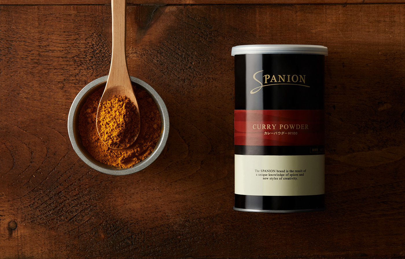

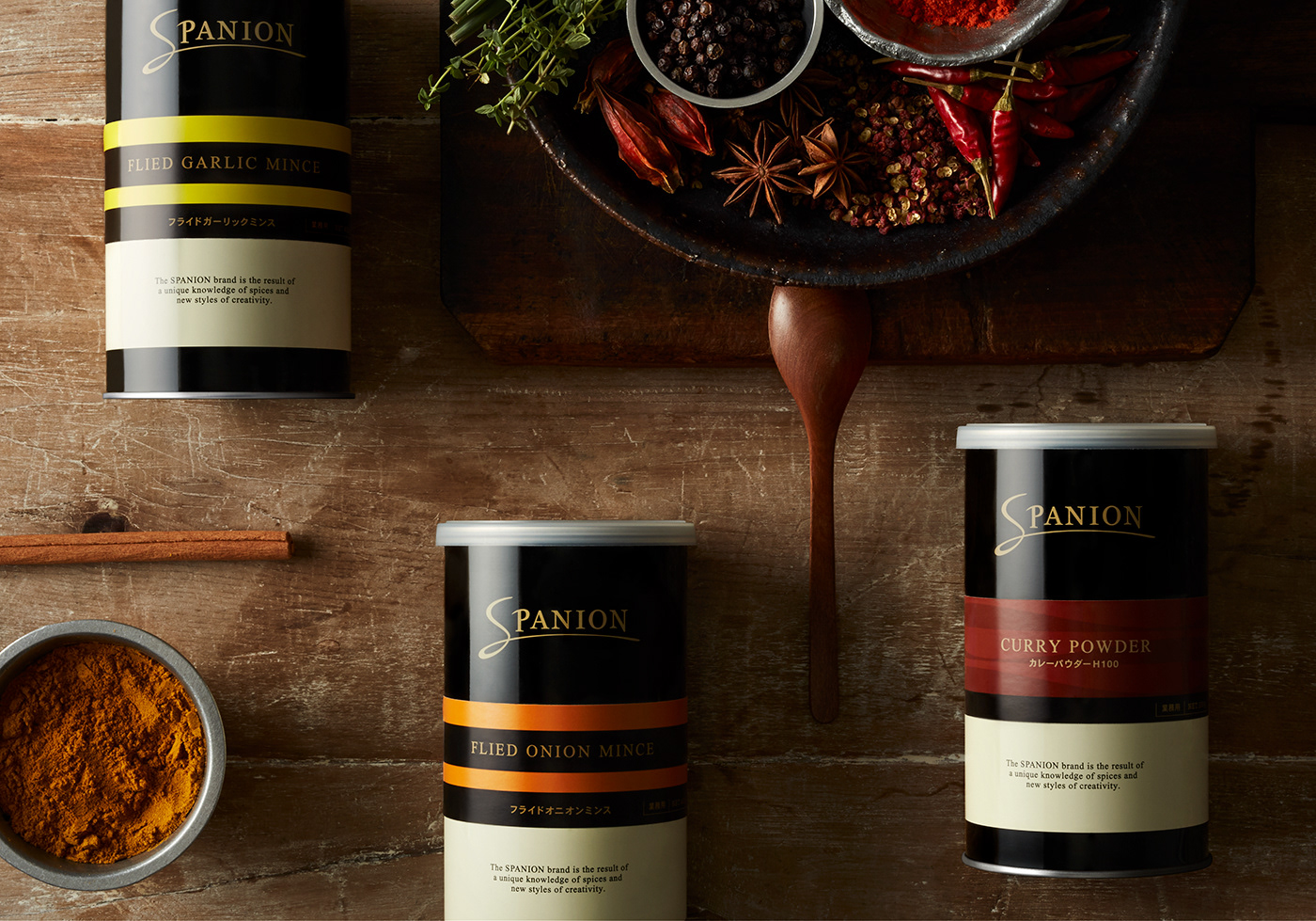
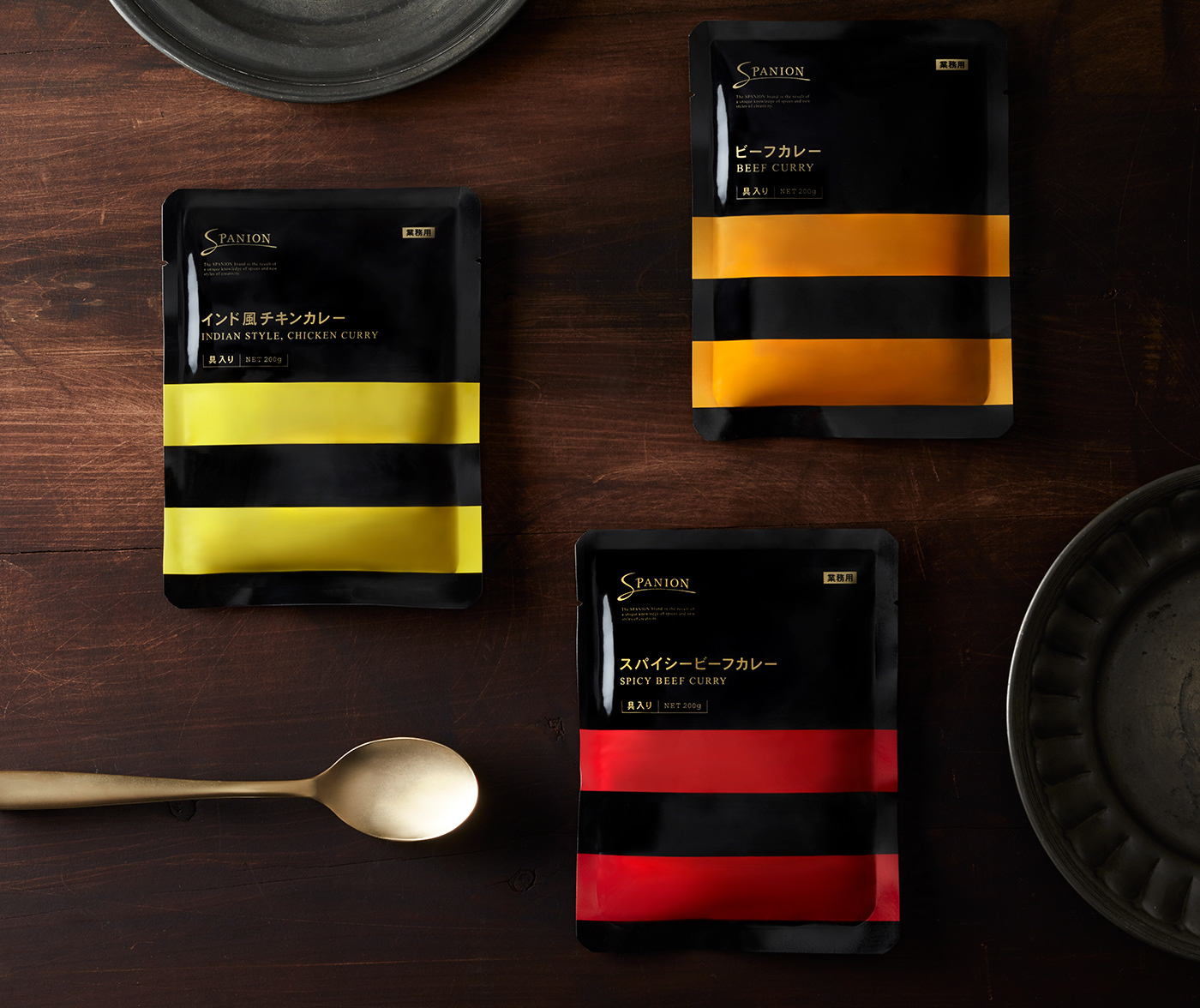
「SPANION」の多くの商品は、厨房での使用を想定している。
そのため本プロジェクトでは、シェフにとって使いやすいパッケージとは何かを起点にデザインを検討した。
そのため本プロジェクトでは、シェフにとって使いやすいパッケージとは何かを起点にデザインを検討した。
特に重視したのは、ひと目で中身が判別できること。
料理という創造的な作業において、調味料はシェフの重要なパートナーであり、迷いなく手に取れる存在である必要がある。
料理という創造的な作業において、調味料はシェフの重要なパートナーであり、迷いなく手に取れる存在である必要がある。
その考えから、識別情報をパッケージ中央に集約し、ラインカラーを見るだけで内容が分かる構成を採用。プロフェッショナルの現場を支えるための、明快で機能的なデザインを目指した。
Many SPANION products are designed for use in professional kitchens.
For this reason, the starting point of the design process was to consider what kind of packaging would be most practical and intuitive for chefs.
For this reason, the starting point of the design process was to consider what kind of packaging would be most practical and intuitive for chefs.
A key priority was immediate clarity of contents.
In the creative process of cooking, seasonings serve as essential partners for chefs and must be easy to identify and select without hesitation.
In the creative process of cooking, seasonings serve as essential partners for chefs and must be easy to identify and select without hesitation.
Based on this thinking, identifying information was concentrated at the center of the package, and a color-coded line system was introduced so that the contents can be recognized at a glance. The result is a clear and functional design that supports professionals in their daily work.
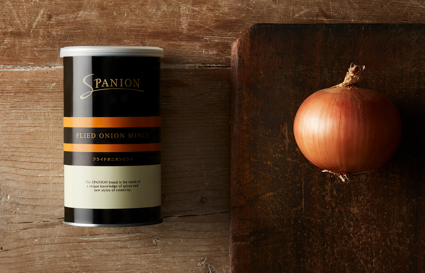
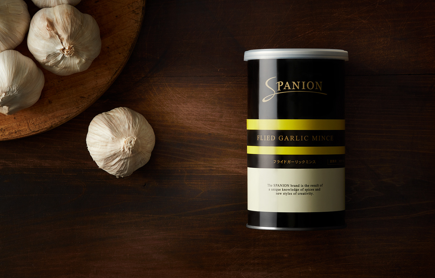

あわせて意識したのは、高級レストランの整った厨房やオープンキッチンで多用される、ステンレスのグレートーンに
自然に調和するデザインであること。カラーリングは落ち着きのあるブラックを基調とし、中央に配置した各商品の識別カラーが、
より明確に際立つ構成とした。
At the same time, the design was developed to harmonize with the stainless-steel gray tones commonly found in refined professional and open kitchens of high-end restaurants. By adopting a calm black base color, the package design allows each product’s identification color—placed at the center—to stand out with greater clarity.

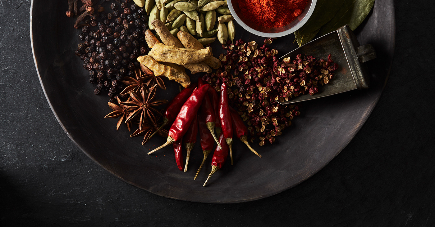
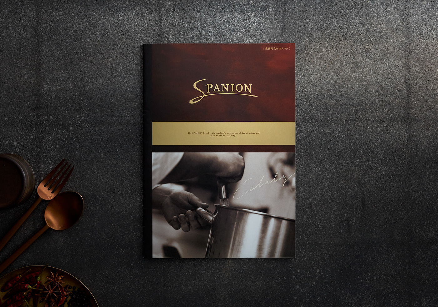
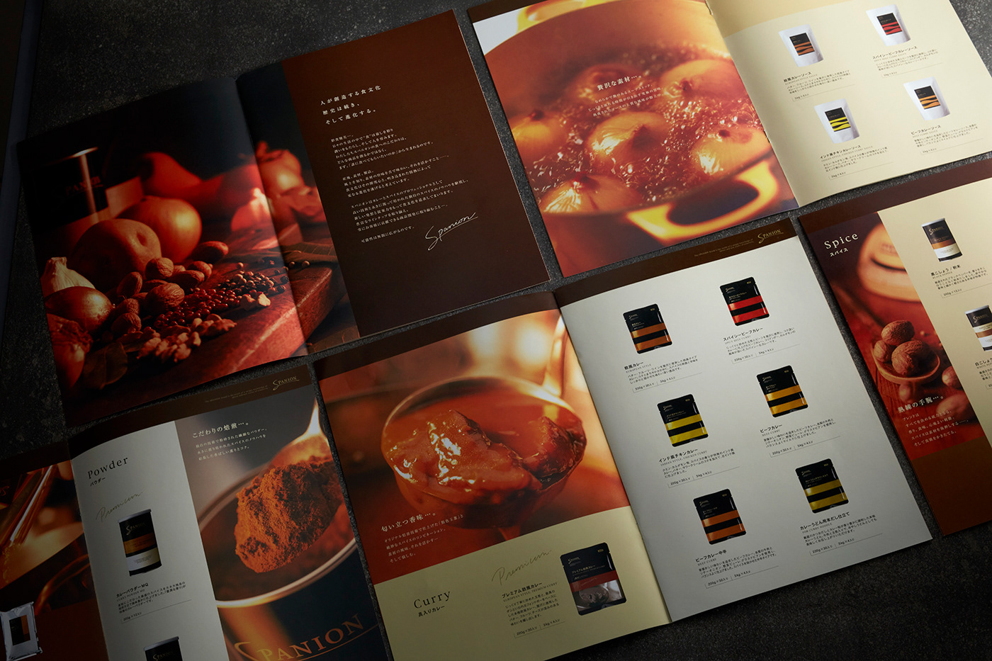
カタログ制作においては、イメージ写真の撮影を通じて「品質感」を伝えることを重視。
ブランドが持つ高いクオリティが直感的に伝わるよう、シズル感のある表現を多く取り入れた。
ブランドが持つ高いクオリティが直感的に伝わるよう、シズル感のある表現を多く取り入れた。
写真とデザインの双方からブランドの本質が感じ取れるよう構成し、視覚表現を通じて一貫した世界観を提示している。
For the catalog production, particular emphasis was placed on conveying a sense of quality through photography.
To communicate the brand’s high standards, visuals with a strong sense of sizzle and freshness were widely used.
To communicate the brand’s high standards, visuals with a strong sense of sizzle and freshness were widely used.
The catalog was structured so that the essence of the brand could be felt through both the imagery and the overall design, presenting a consistent and cohesive brand world through visual expression.
CLIENT : KANEKA CORPORATION
ART DIRECTION, DESIGN: JUNICHI HAKOYAMA(RHYTHM INC.)