
SOBA GOYOMI
DESIGN, ART DIRECTION WORK : BROCHURE, PACKAGE
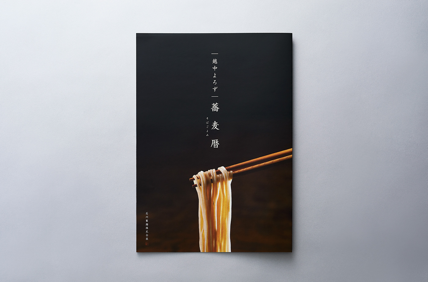
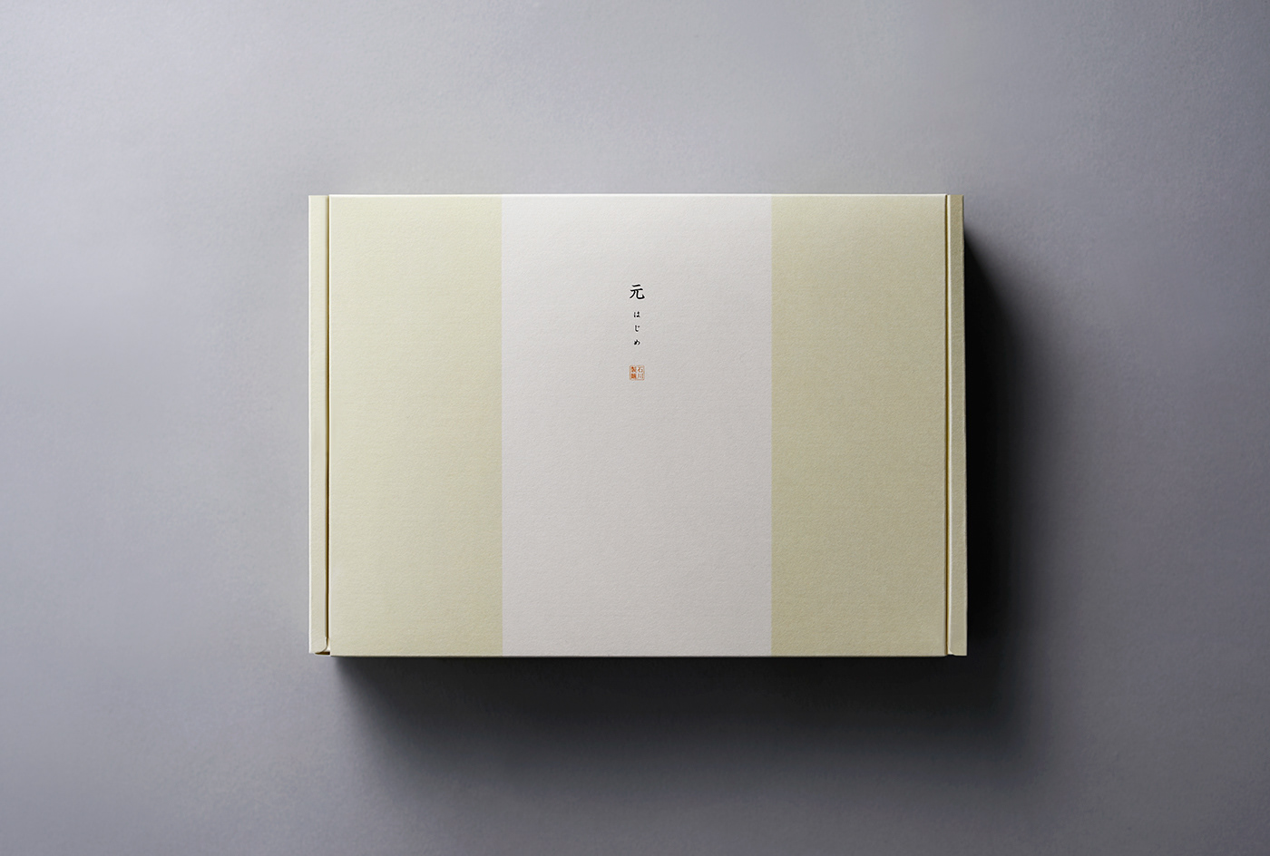
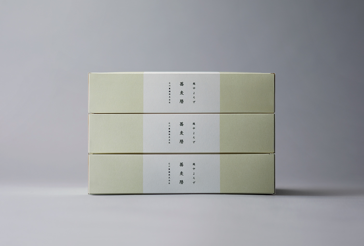
石川製麺(富山県)による頒布会商品「蕎麦暦(そばごよみ)」のパッケージおよびパンフレットデザイン。
月に一度、ふるさとの名品を届ける頒布会商品のひとつとして企画された「蕎麦暦」は、蕎麦の魅力を一年を通して伝えるために生まれた。
月に一度、ふるさとの名品を届ける頒布会商品のひとつとして企画された「蕎麦暦」は、蕎麦の魅力を一年を通して伝えるために生まれた。
蕎麦は日本人にとって身近な存在でありながら、その素材や味わい方については、意外と知られていないことも多い。
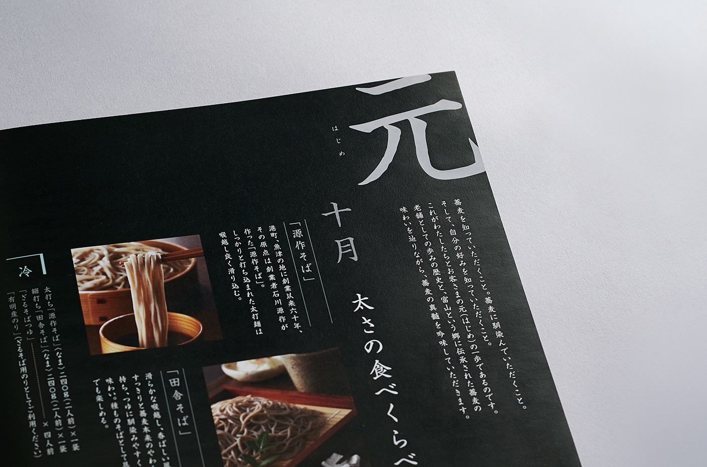
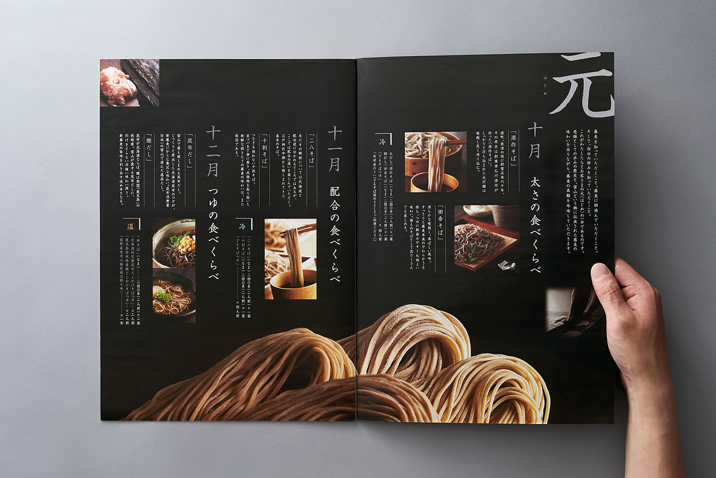
そこで本商品では、カレンダーをめくるように季節を重ねながら、蕎麦をさまざまな角度から楽しんでもらうという発想をコンセプトに設定。月ごとのテーマとともに、蕎麦の奥深さを伝える構成とした。
そこで本商品では、カレンダーをめくるように季節を重ねながら、蕎麦をさまざまな角度から楽しんでもらうという発想をコンセプトに設定。月ごとのテーマとともに、蕎麦の奥深さを伝える構成とした。
Package and pamphlet design for “Soba-goyomi,” a subscription product by Ishikawa Seimen (Toyama, Japan).
“Soba-goyomi” is a subscription-based product that delivers regional specialties once a month, created to convey the appeal of soba noodles throughout the year.
“Soba-goyomi” is a subscription-based product that delivers regional specialties once a month, created to convey the appeal of soba noodles throughout the year.
Although soba is a familiar food for many people in Japan, its ingredients, variations, and ways of enjoying it are not always widely understood.
With this in mind, the concept was developed to allow people to experience soba from multiple perspectives over the course of a year—much like turning the pages of a calendar—revealing its depth and richness with each passing month.
With this in mind, the concept was developed to allow people to experience soba from multiple perspectives over the course of a year—much like turning the pages of a calendar—revealing its depth and richness with each passing month.
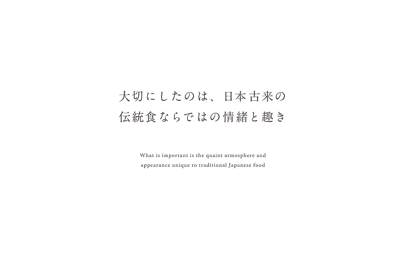
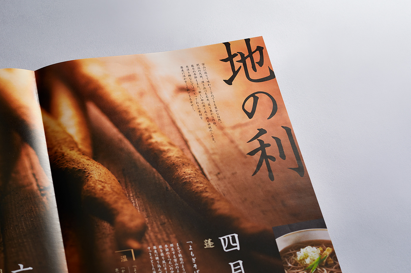
パンフレット制作にあたって重視したのは、美しい水と空気、そして自然豊かな山々に囲まれた富山だからこそ生まれる「蕎麦のおいしさ」を、いかに紙面上で表現するかという点である。
蕎麦が日本に古くから受け継がれてきた伝統的な食品であることを踏まえ、日本の情緒や文化的背景を感じさせる表現を意識。土地の風土と歴史に寄り添うデザインとして仕上げている。
In developing the pamphlet, our primary focus was on how to express the unique “deliciousness of soba” made possible by Toyama’s pristine water, clean air, and surrounding natural mountains through printed media.
Recognizing soba as a traditional food that has long been part of Japanese culture, the design was approached with an emphasis on conveying a sense of Japanese sensibility and cultural context. The result is a design that draws from the region’s climate and history, translating them into a calm and authentic visual expression.
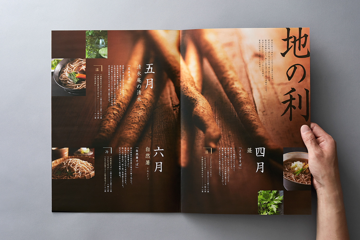
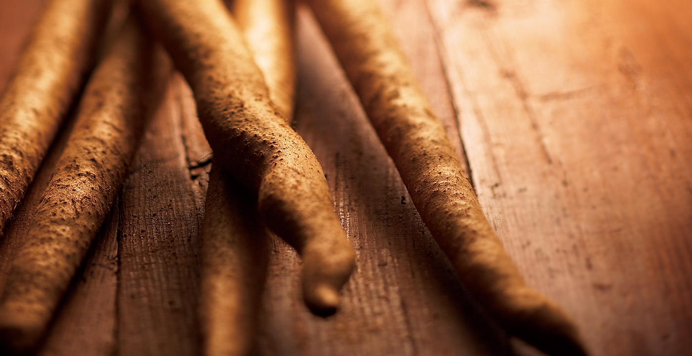
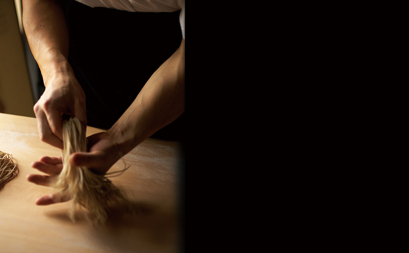
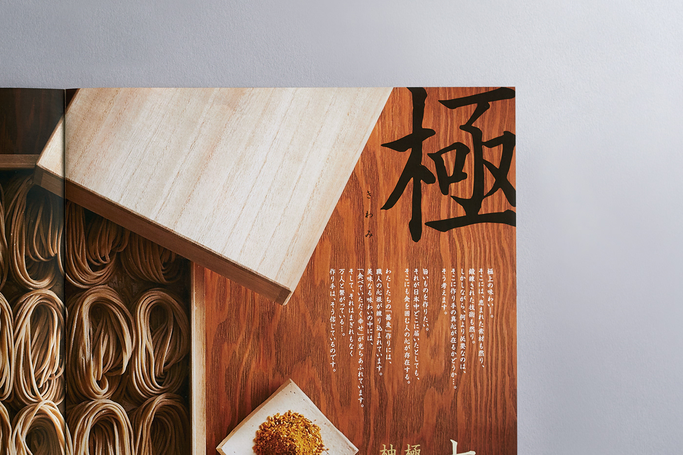
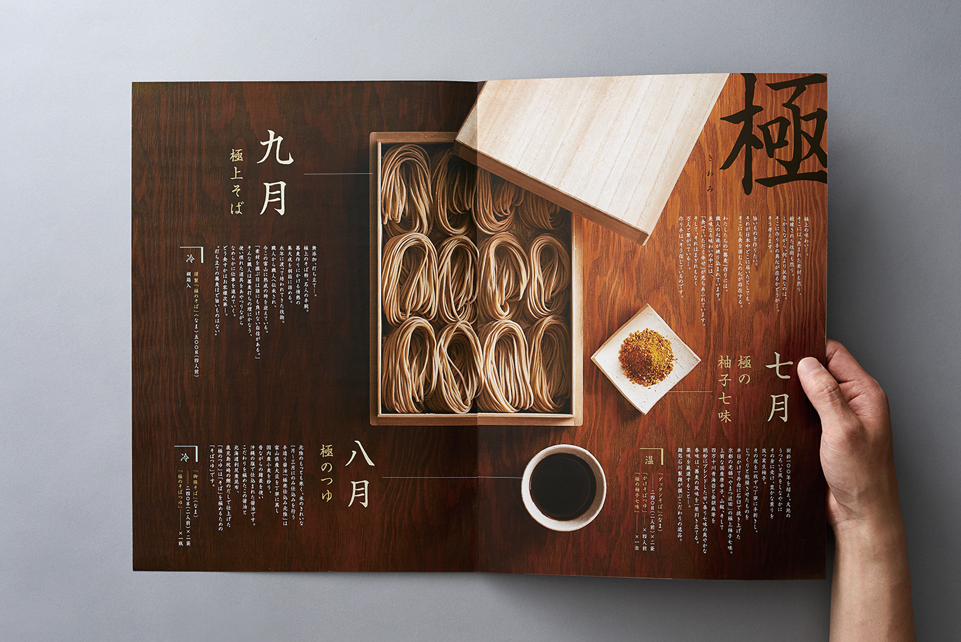
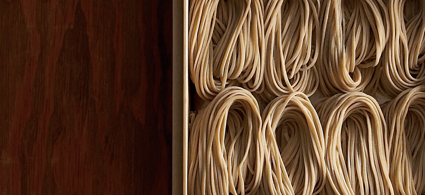
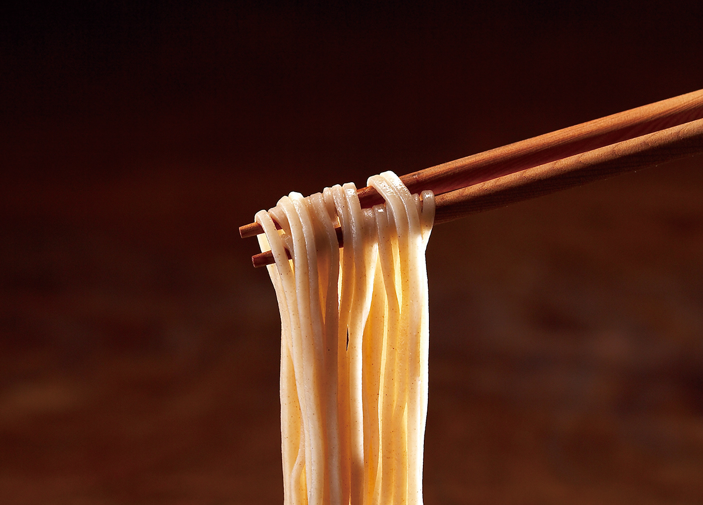
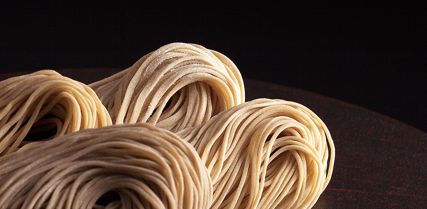
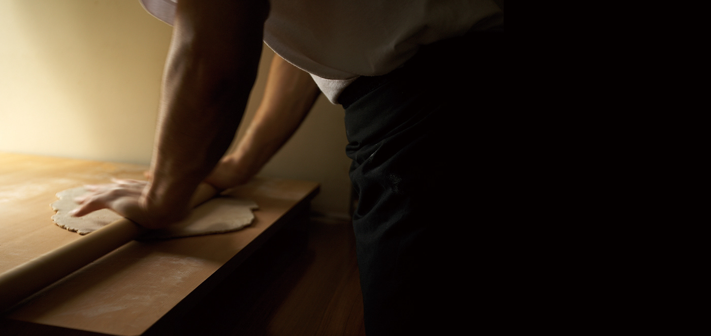
富山の蕎麦が持つ素材本来の魅力を伝えるため、誌面の大きさを生かした写真表現を採用。
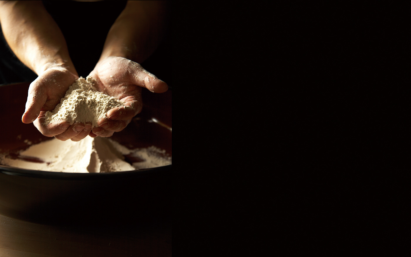
職人が打ち、切り出したばかりの蕎麦から、艶やかに茹で上げられた麺まで、その質感や手仕事へのこだわりが伝わるよう、写真に漂う空気感を大切にした。
職人が打ち、切り出したばかりの蕎麦から、艶やかに茹で上げられた麺まで、その質感や手仕事へのこだわりが伝わるよう、写真に漂う空気感を大切にした。
「蕎麦暦」では、蕎麦に加え、自然薯やます寿し、日本酒など、富山を代表する名産品とともに味わえるセットも展開。
豊かな大地に育まれた食材そのものの魅力はもちろん、それらを育んだ富山という土地の風土や背景まで感じ取ってもらえるよう、写真表現を通じて世界観を構築している。
豊かな大地に育まれた食材そのものの魅力はもちろん、それらを育んだ富山という土地の風土や背景まで感じ取ってもらえるよう、写真表現を通じて世界観を構築している。
To convey the natural quality of Toyama’s soba, full use was made of the generous page size to present the photography. From freshly cut noodles made by skilled craftsmen to beautifully cooked soba with a smooth, glossy texture, careful attention was paid to capturing the atmosphere within each image so that both the texture of the noodles and the artisans’ dedication could be felt.
“Soba-goyomi” also offers sets that pair soba with regional specialties such as natural yam, masu-zushi (pressed trout sushi), and sake. Beyond highlighting the appeal of Toyama’s fresh agricultural produce and abundant seafood, the visual approach was designed to communicate the charm of Toyama itself—the land and environment that give rise to these local products—by expressing this worldview through photography.

CLIENT : ISHIKAWA SEIMEN
ART DIRECTION, DESIGN: RHYTHM INC. (JUNICHI HAKOYAMA)