
SKYMARK AIRLINES
BRANDING
BRANDING WORK: SYMBOL MARK, LOGOTYPE, AIRCRAFT LIVERY,
CHECK-IN COUNTER, STATIONERY
リーズナブルな価格で、より多くの人に快適な空の旅を提供するスカイマーク。機体や空港カウンターなどに使用されるロゴマークをはじめ、ブランドイメージに関わる各種デザインを担当した。
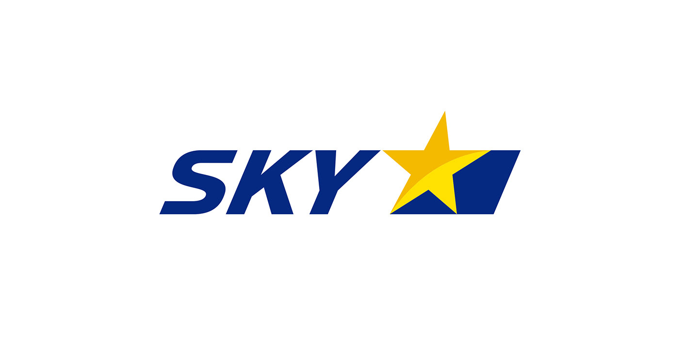
LCCとしてのスカイマークが掲げるコンセプトは「カジュアル」。その価値が直感的に伝わるよう、ロゴマークには軽快さとアクティブ感を軸としたデザインを構築。従来の、複数の星で構成された複雑なロゴから、力強さを保ちながらも記憶に残りやすい、シンプルな形状へと刷新している。
シンボルである星はひとつに集約し、直線的なフォルムの中に流れるような曲線を組み込むことで、アクティブな印象を演出。さらに、前へと進む力強さと安定感を表現するため、まっすぐに伸びるブルーのラインを構成要素として取り入れた。
カラーリングには、スカイマークのシンボルカラーであるイエローを重視。アクティブで視認性の高い色彩をブランドカラーとして効果的に用いることで、「スカイマーク=イエロー」というブランド認知の強化を図っている。
Skymark provides comfortable air travel at affordable prices, making flying accessible to a wider audience. We were responsible for a range of brand-related designs, including the logomark used on aircraft and airport counters.
As a low-cost carrier, Skymark’s core concept is “casualness.” To communicate this value intuitively, the logomark was designed with a focus on lightness and an active, dynamic feel. The previous logo—composed of multiple stars and a complex form—was reimagined into a simpler, more memorable design while retaining a sense of strength and presence.
The star, a key symbol of the brand, was refined into a single iconic element. Flowing curves were incorporated within a linear form to enhance a sense of motion and activity. In addition, a straight blue line was introduced to convey both forward momentum and stability.
In terms of color, particular emphasis was placed on yellow, Skymark’s signature brand color. By effectively using this active and highly visible hue as the primary brand color, the design strengthens brand recognition and reinforces the association of “Skymark = Yellow.”
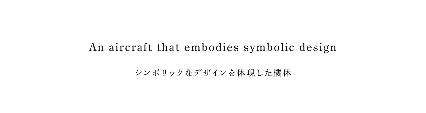
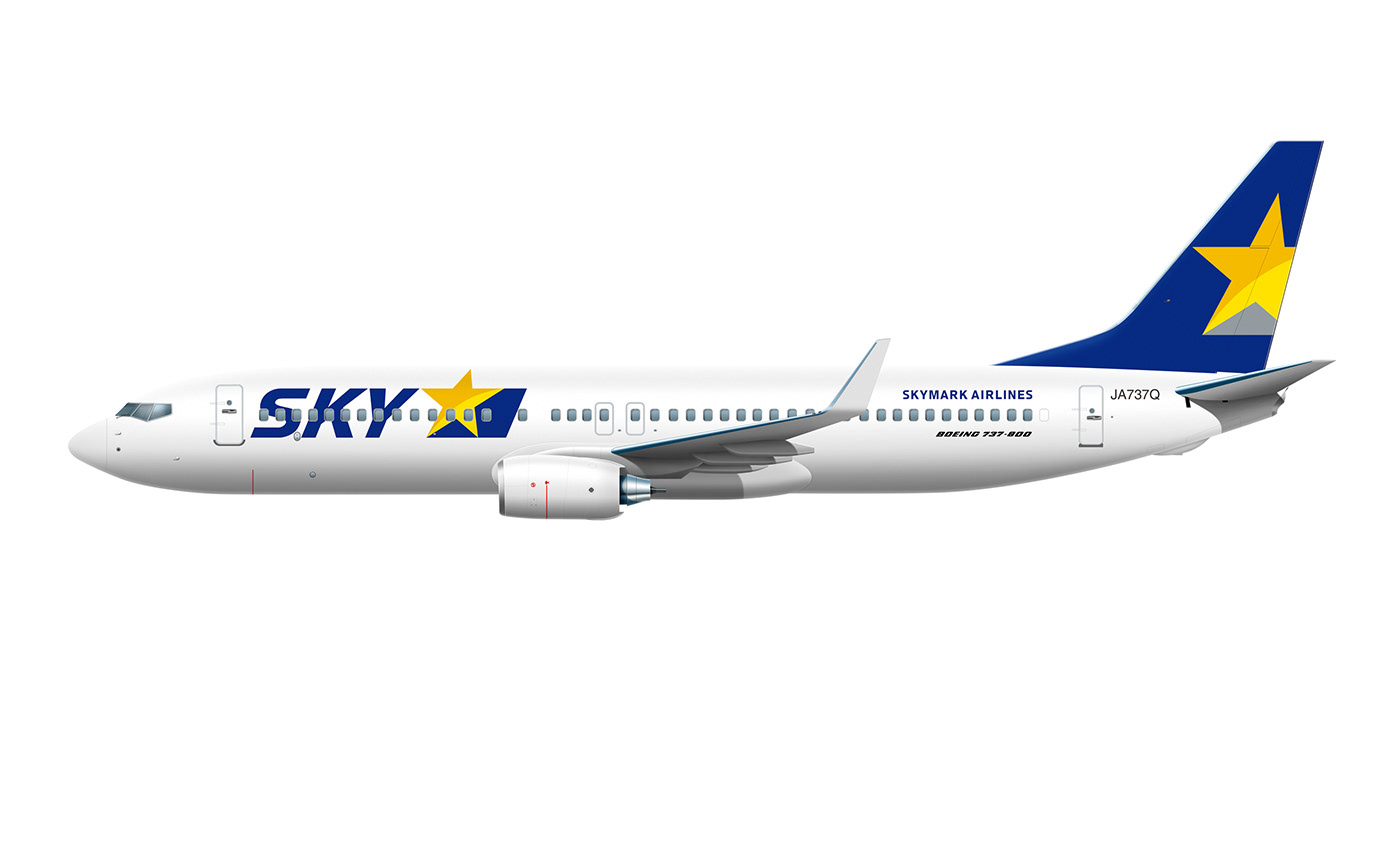
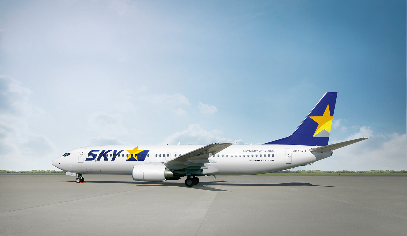
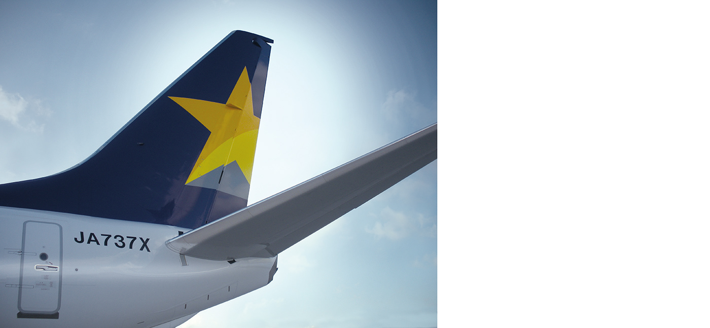
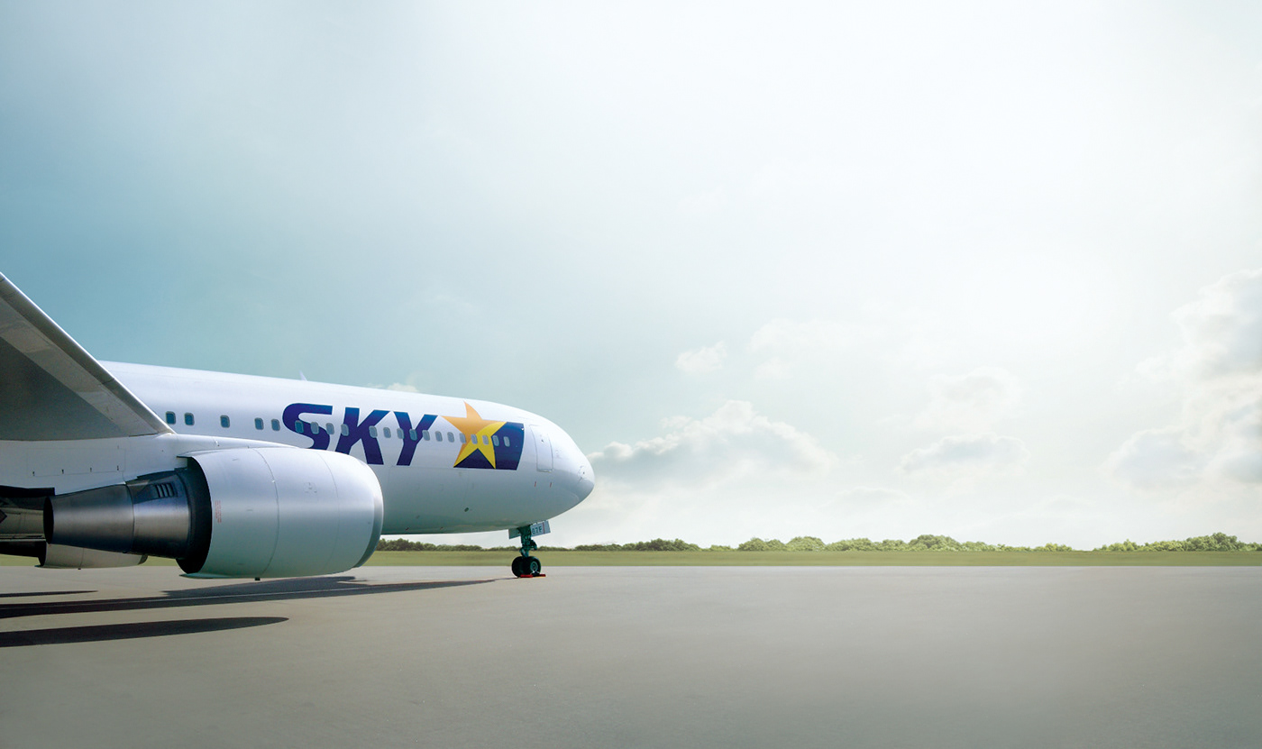
ブランドのアイデンティティを体現する機体デザインには、高い象徴性が求められる。
そこで本プロジェクトでは、「シンボリックであること」「堂々とした力強さ」「強いインパクト」という三つのテーマを掲げ、検討を重ねた。
そこで本プロジェクトでは、「シンボリックであること」「堂々とした力強さ」「強いインパクト」という三つのテーマを掲げ、検討を重ねた。
各航空会社の個性が最も際立つ尾翼部分には、ロゴマークを可能な限り大きく配置。大胆なスケールで視認性と存在感を高め、シンボリックかつ印象的な機体デザインを実現している。
Aircraft design, as a direct expression of brand identity, requires a high level of symbolic presence.
For this project, three key themes guided the design process: symbolism, a bold and confident sense of strength, and strong visual impact.
For this project, three key themes guided the design process: symbolism, a bold and confident sense of strength, and strong visual impact.
The tail fin—where each airline’s identity is most clearly expressed—features the logomark at the largest possible scale. This bold approach enhances visibility and presence, resulting in an aircraft design that is both highly symbolic and visually striking.

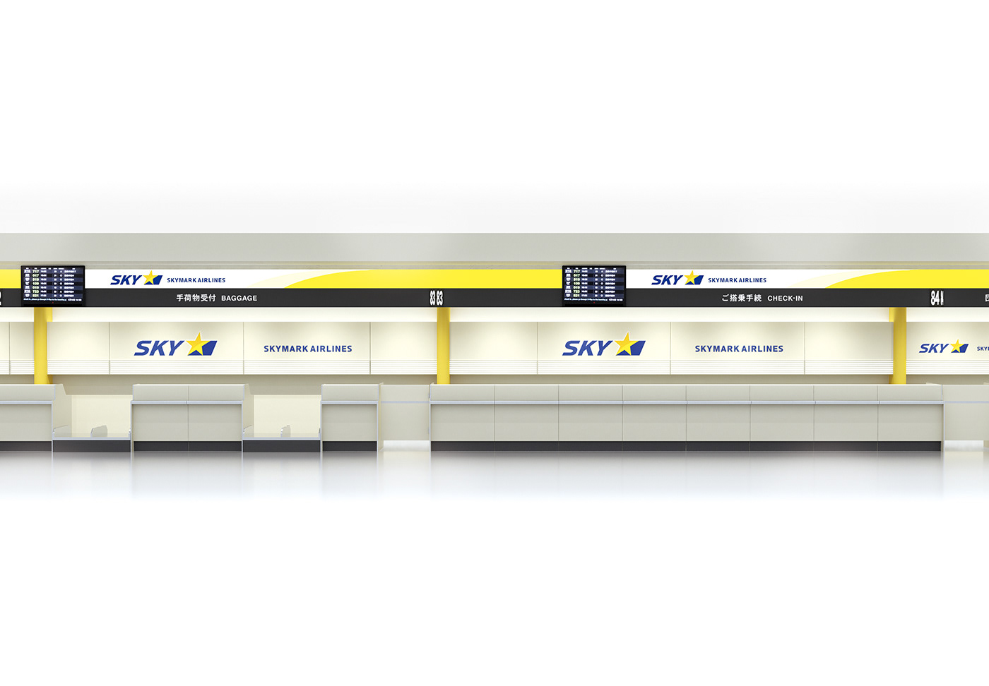
空港カウンターのデザインにおいて、ブランドカラーであるイエローが重要な役割を担っている。
アクティブで前向きな印象を持つイエローを空間全体に取り入れることで、旅への期待感や高揚感を引き出すことを意識している。
アクティブで前向きな印象を持つイエローを空間全体に取り入れることで、旅への期待感や高揚感を引き出すことを意識している。
空間の雰囲気を左右する要素として重視したのは素材選び。
スカイマークのブランドコンセプトである「カジュアル」を踏まえつつ、重厚になりすぎない中にも奥行きのある表情を持たせることで、心地よい空間を構築した。
スカイマークのブランドコンセプトである「カジュアル」を踏まえつつ、重厚になりすぎない中にも奥行きのある表情を持たせることで、心地よい空間を構築した。
グラフィックにおけるイエローの使用にとどまらず、空間全体を通してブランドカラーが自然に印象づけられるよう、トータルな空間設計を行っている。
In the design of the airport counters, the brand color yellow plays a central role.
By incorporating yellow throughout the space—an active and uplifting color—we aimed to create an environment that enhances the sense of anticipation and excitement associated with travel.
By incorporating yellow throughout the space—an active and uplifting color—we aimed to create an environment that enhances the sense of anticipation and excitement associated with travel.
Material selection was another key factor in shaping the atmosphere.
While respecting Skymark’s brand concept of “casualness,” the design avoids an overly heavy feel, instead creating a space with depth and warmth that remains welcoming and approachable.
While respecting Skymark’s brand concept of “casualness,” the design avoids an overly heavy feel, instead creating a space with depth and warmth that remains welcoming and approachable.
Beyond the use of yellow in graphic elements, the brand color is subtly integrated throughout the entire space. This holistic spatial design ensures that the brand identity is naturally and consistently conveyed.

CLIENT: SKYMARK AIRLINES INC.
ART DIRECTION, DESIGN: JUNICHI HAKOYAMA(RHYTHM INC.)