
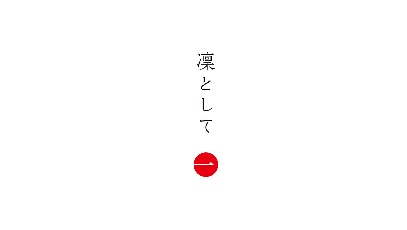
凜 と し て
SKINCARE / BRANDING
CONCEPT, ART DIRECTION, DESIGN WORK: LOGOTYPE, PACKAGE, BROCHURE,
WEBSITE, DISPLAY, PROMOTIONAL SALES ITEMS
富山県・大協紙商事のせっけんシャンプー「凜として」のブランディング。
多くの市販シャンプーには、合成せっけんや合成界面活性剤が使用されている。そうした成分は汚れを素早く落とし、
使用直後の手触りを良くする一方で、長期的な使用によって髪や肌に負担をかけてしまう可能性も否定できない。
「体にも環境にもやさしく、誰もが安心して使えるシャンプーをつくりたい」。その想いから生まれたのが、
「体にも環境にもやさしく、誰もが安心して使えるシャンプーをつくりたい」。その想いから生まれたのが、
せっけんシャンプー「凜として」だった。
素材を厳選し、不要なものを加えず、身体にとって本当に必要なものだけでつくられた「凜として」は、発売以降、
敏感肌に悩む人々から高い評価を得てきた。
一方で、今後さらに多くの人に届けていくためには、商品の価値や思想をより的確に伝える必要があるとして、
一方で、今後さらに多くの人に届けていくためには、商品の価値や思想をより的確に伝える必要があるとして、
既存商品のブランディングについて相談を受けた。
すでに決定していた「凜として」という商品名が示す通り、本商品は明確なポリシーを持ち、品質面においても完成度の高いプロダクトである。
ただし、せっけんシャンプーは長期的に使用することで真価を発揮する一方、短期間では効果が実感しにくい側面もある。
そこで私たちは、一過性の流行に左右される層ではなく、品質や思想といった本質的な価値を理解し、
そこで私たちは、一過性の流行に左右される層ではなく、品質や思想といった本質的な価値を理解し、
長く使い続けてくれるユーザーとの関係性を築くべきだと考えた。
Branding for “Rin to Shite,” a soap shampoo by Daikyo Shoshi (Toyama, Japan).
Many commercially available shampoos rely on synthetic soaps and surfactants. While these ingredients can remove dirt quickly and improve the immediate feel of the hair, long-term use may place stress on both hair and skin.
“Rin to Shite” was born from a desire to create a shampoo that is gentle on the body and the environment, and that anyone can use with confidence.
“Rin to Shite” was born from a desire to create a shampoo that is gentle on the body and the environment, and that anyone can use with confidence.
Made with carefully selected ingredients and without unnecessary additives, “Rin to Shite” is formulated using only what is truly beneficial for the body. Since its launch, the product has earned strong support from users with sensitive skin.
At the same time, in order to reach a wider audience, there was a need to communicate the product’s value and philosophy more clearly, which led to a request to revisit and refine its branding.
At the same time, in order to reach a wider audience, there was a need to communicate the product’s value and philosophy more clearly, which led to a request to revisit and refine its branding.
As its name suggests, “Rin to Shite” embodies a clear and uncompromising policy, and stands as a highly refined product in terms of quality. However, while soap shampoo reveals its true benefits through continued, long-term use, its effects can be difficult to perceive in the short term.
For this reason, we concluded that the brand should focus not on trend-driven, light users, but on cultivating relationships with users who value quality and understand the product’s essential merits, and who are willing to use it over time.
For this reason, we concluded that the brand should focus not on trend-driven, light users, but on cultivating relationships with users who value quality and understand the product’s essential merits, and who are willing to use it over time.


この商品の価値をより的確に伝えるために、デザインとしてどのようなアプローチができるか。
その検討の起点となったのが、「凜として」が掲げる「余計なものは足さない」という基本コンセプトだった。
その検討の起点となったのが、「凜として」が掲げる「余計なものは足さない」という基本コンセプトだった。
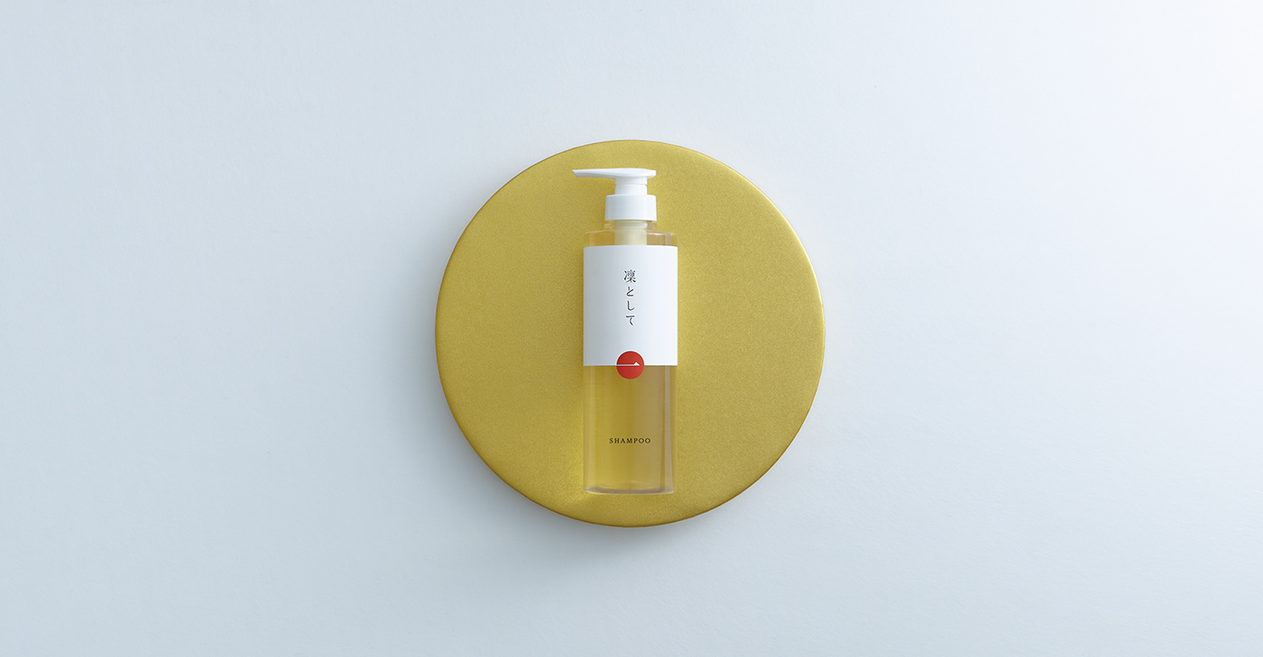
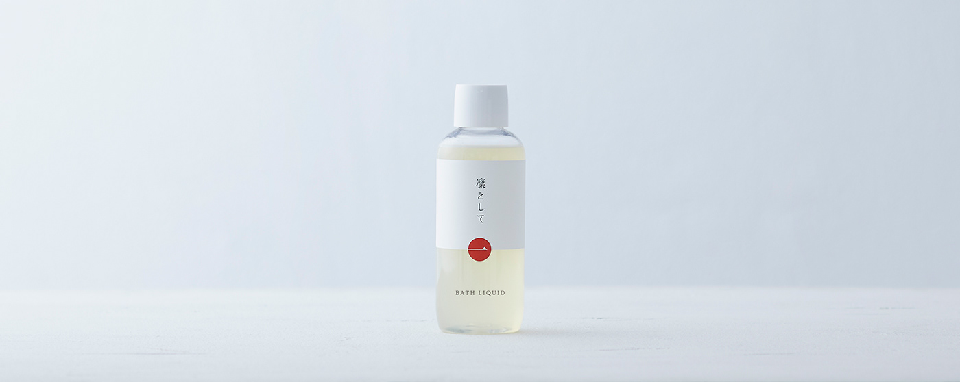
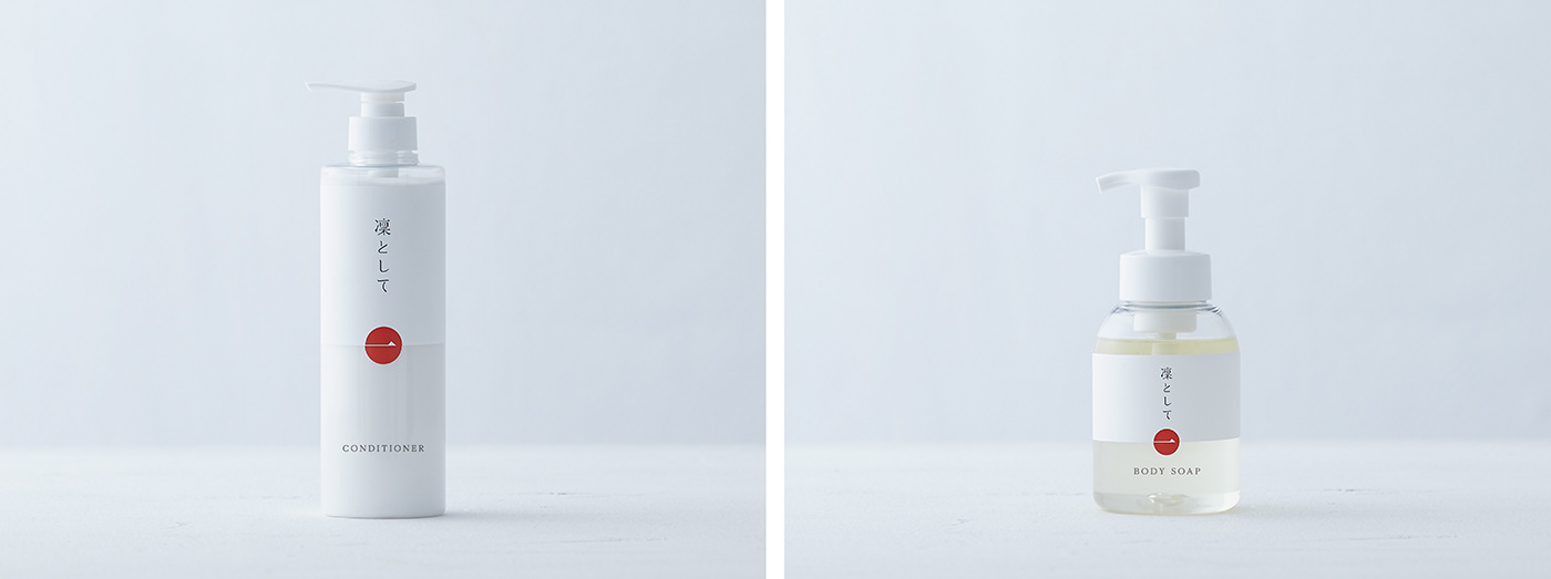
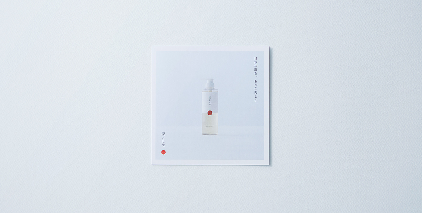
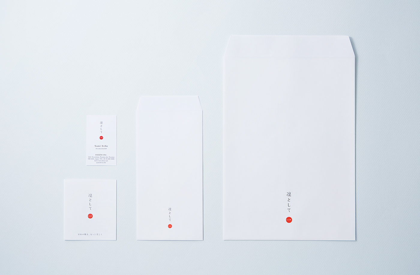
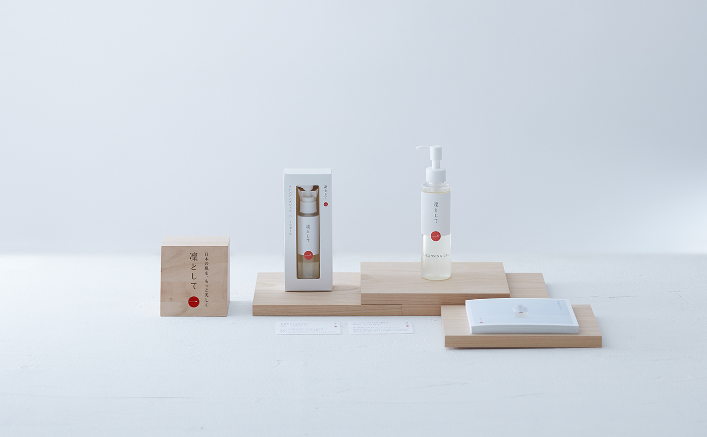
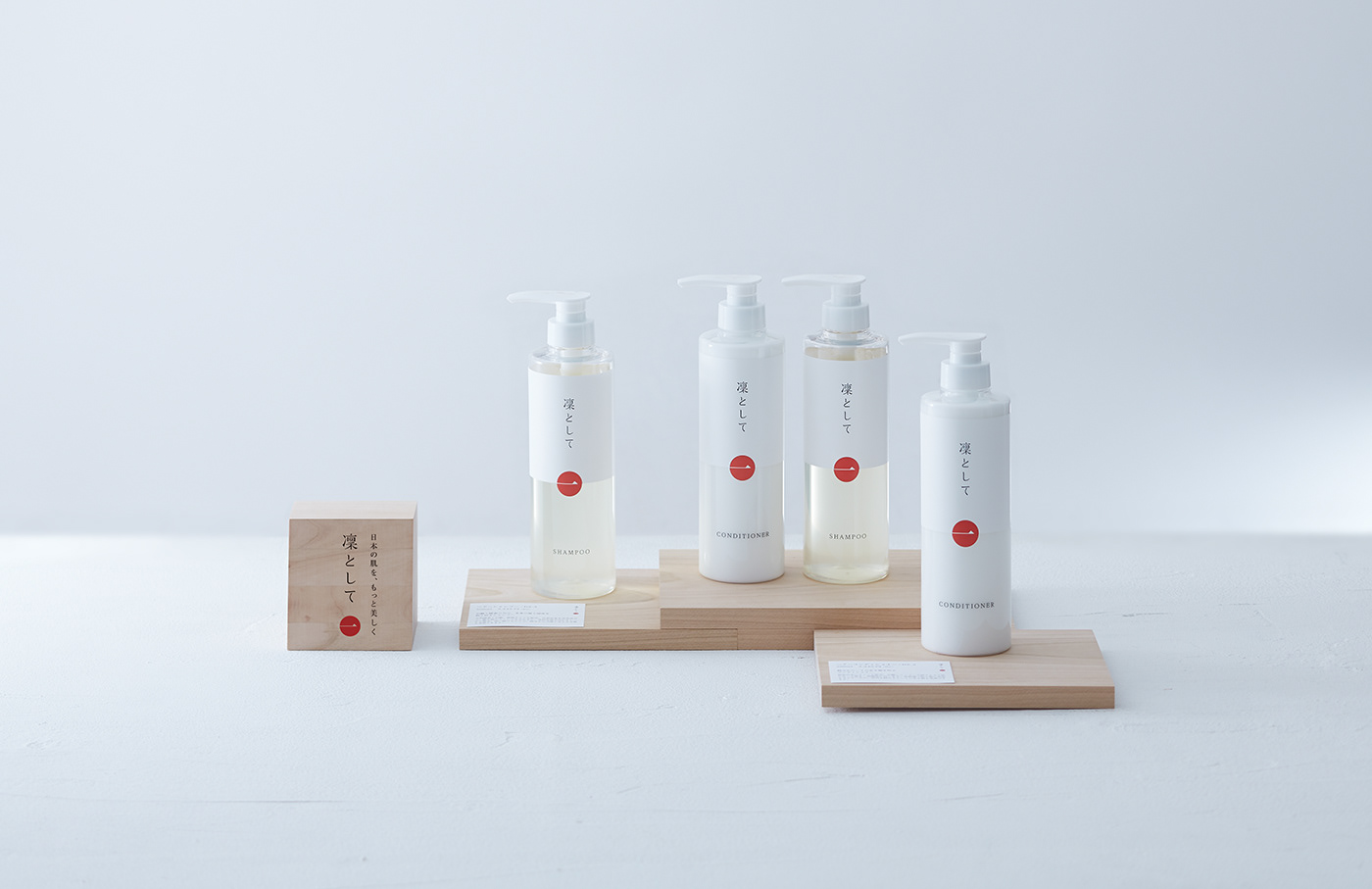
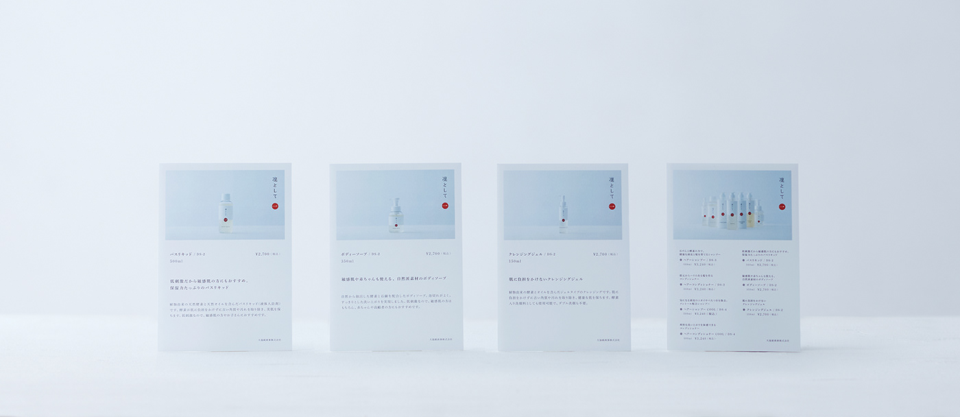
まずはその思想を踏襲し、徹底的に要素を削ぎ落としたミニマルなデザインを設計。商品名以外の装飾は極力排し、
フォルムもシンプルに整えることで、“凜とした”ぶれない姿勢をプロダクトそのものから感じ取れる表現を目指した。
もう一つ重視したのが「日本らしさ」という要素である。
「凜として」は富山の小さな会社が丁寧につくり上げる製品であり、大手メーカーによる大量生産品とは異なる、
「凜として」は富山の小さな会社が丁寧につくり上げる製品であり、大手メーカーによる大量生産品とは異なる、
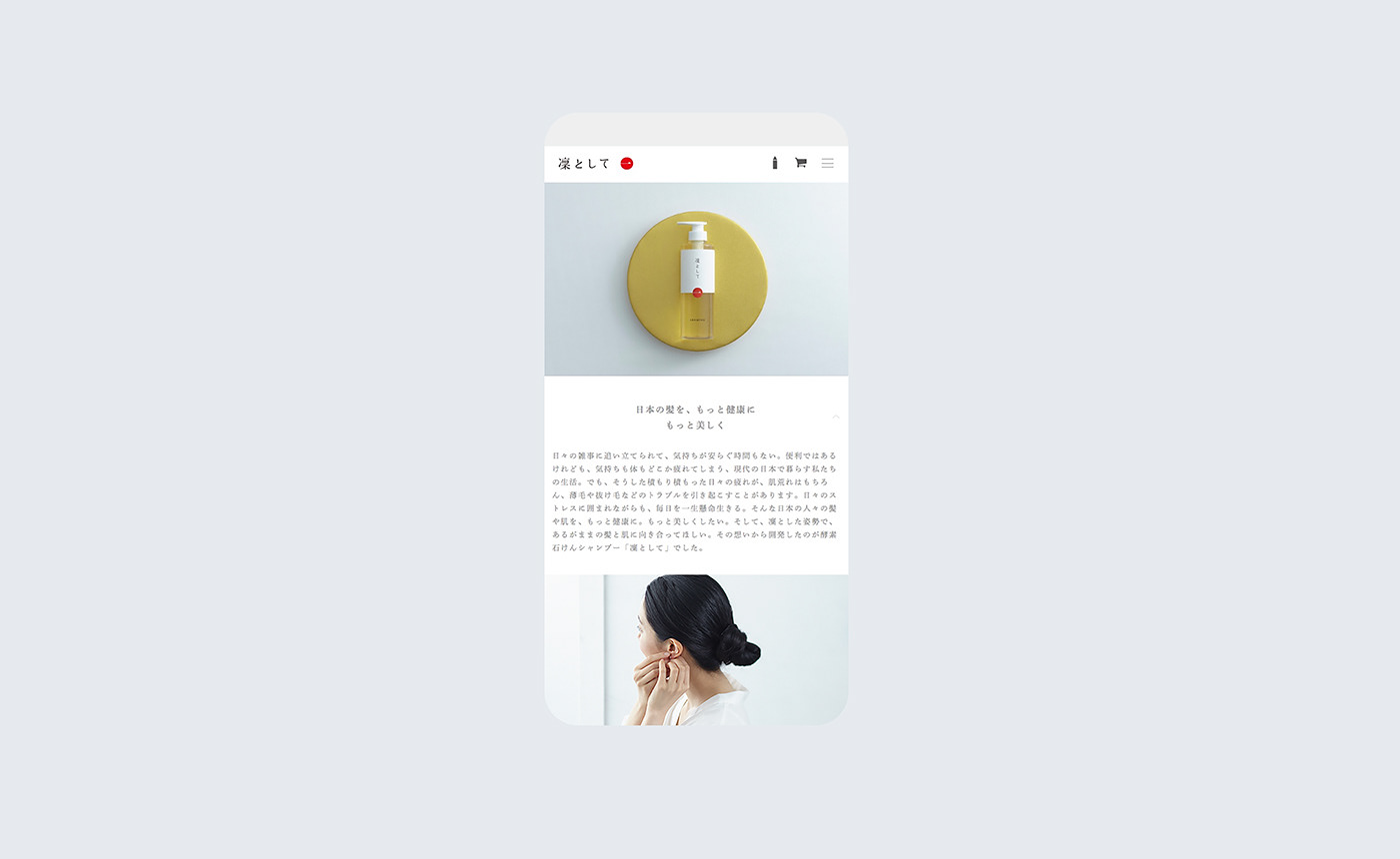
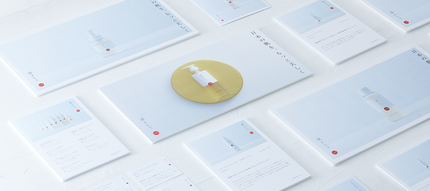
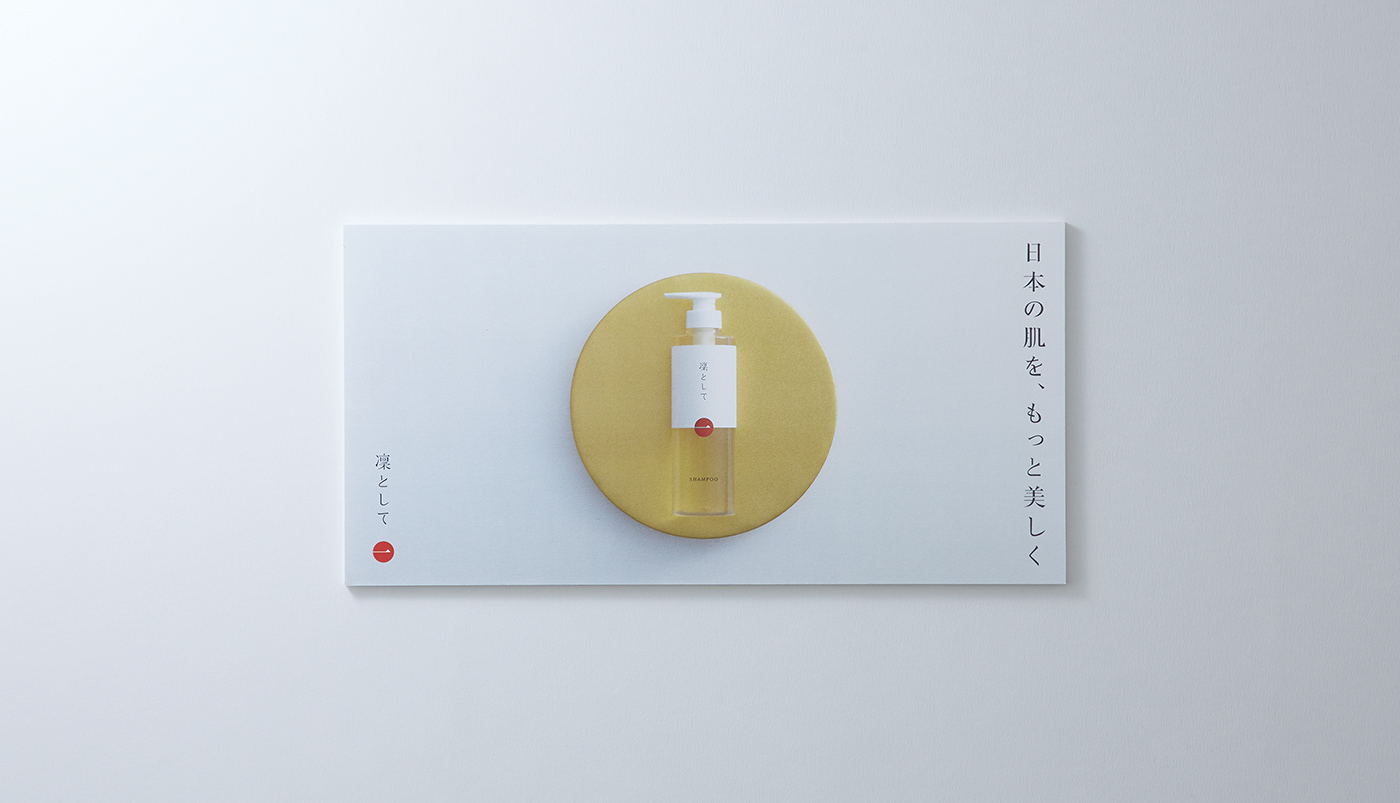
日本ならではのものづくりの価値が宿っている。そこで、赤と白を基調とした配色を採用し、静かな強さと日本的な佇まいを印象づけるデザインへと構築した。パッケージにとどまらず、ホームページや販促パンフレットに至るまで、表現全体を「余計なものを足さず、
日本らしさを感じるデザイン」へと統一。新しい世界観を一貫した形で立ち上げることを意識した。
To help communicate the true value of the product, we explored how design could be used as an effective means of approach.
The starting point of this process was the core philosophy of “Rin to Shite”: adding nothing unnecessary.
The starting point of this process was the core philosophy of “Rin to Shite”: adding nothing unnecessary.
Guided by this principle, we pursued a thoroughly minimal design by eliminating all superfluous elements. Ornamentation was reduced to an absolute minimum, with only the product name retained, and the form was simplified to its essence. The goal was to create a design that conveys a clear, unwavering stance—rin, or dignified and resolute—through the product itself.
Another key focus was the expression of a sense of “Japanese-ness.”
“Rin to Shite” is a carefully crafted product made by a small company in Toyama, embodying the accumulated skills of Japanese craftsmanship rather than mass production by a large manufacturer. To express this quality, a color palette centered on red and white was adopted, evoking a quiet strength and a distinctly Japanese sensibility.
“Rin to Shite” is a carefully crafted product made by a small company in Toyama, embodying the accumulated skills of Japanese craftsmanship rather than mass production by a large manufacturer. To express this quality, a color palette centered on red and white was adopted, evoking a quiet strength and a distinctly Japanese sensibility.
Beyond the package design, the same approach was applied across all brand touchpoints, including the website and promotional pamphlets. By unifying every expression around a design language that adds nothing unnecessary while conveying a sense of Japan, we aimed to establish a renewed and cohesive brand world.


CLIENT: DAIKYO INC.
CONCEPT, ART DIRECTION, DESIGN: JUNICHI HAKOYAMA (RHYTHM INC. )
CONCEPT, ART DIRECTION, DESIGN: JUNICHI HAKOYAMA (RHYTHM INC. )