
ART DIRECTION, GRAPHIC DESIGN WORK: PACKAGE
イギリス、ピュアカプセル社のコラーゲンパウダー・パッケージデザイン
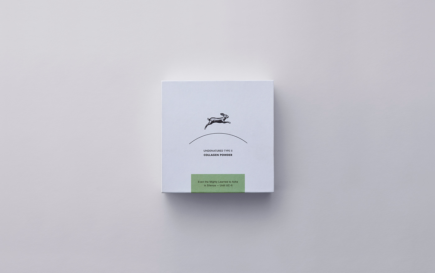
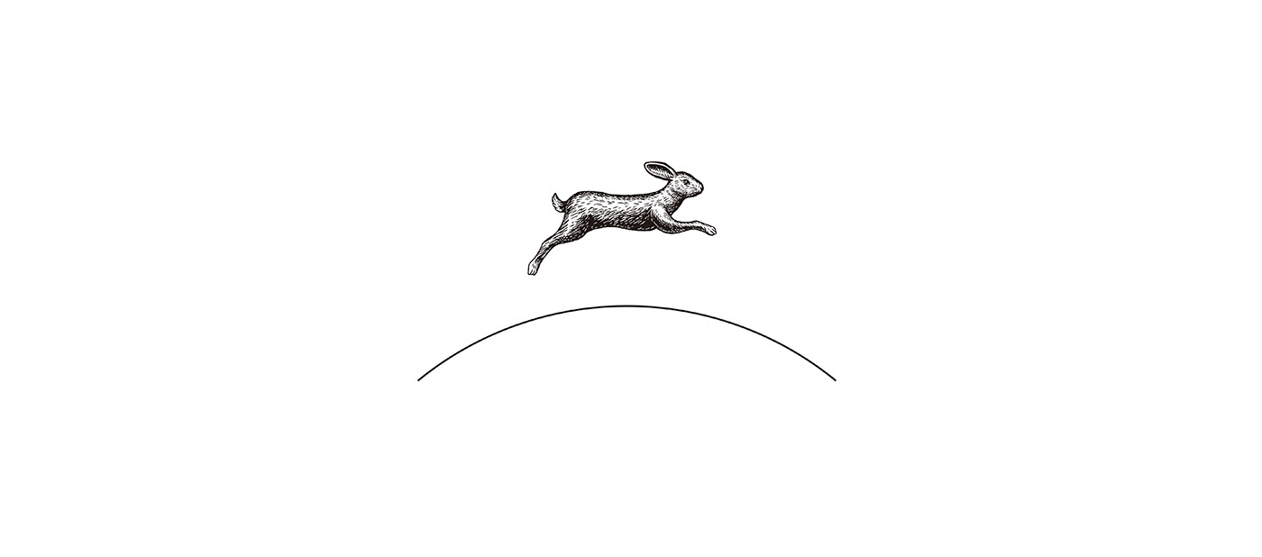
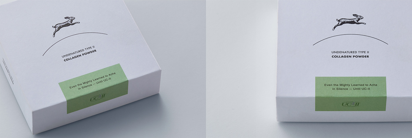
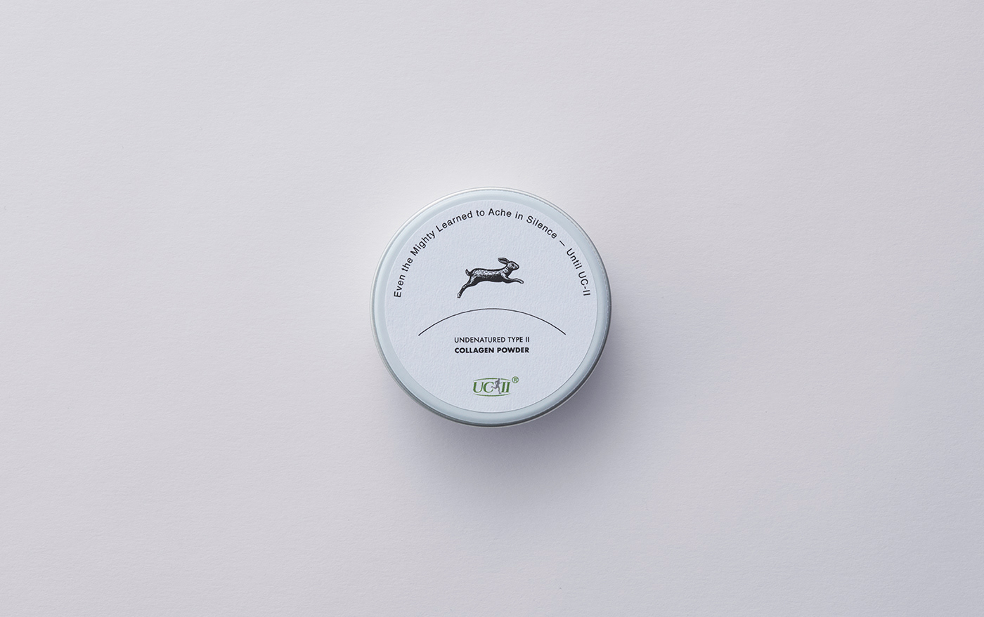
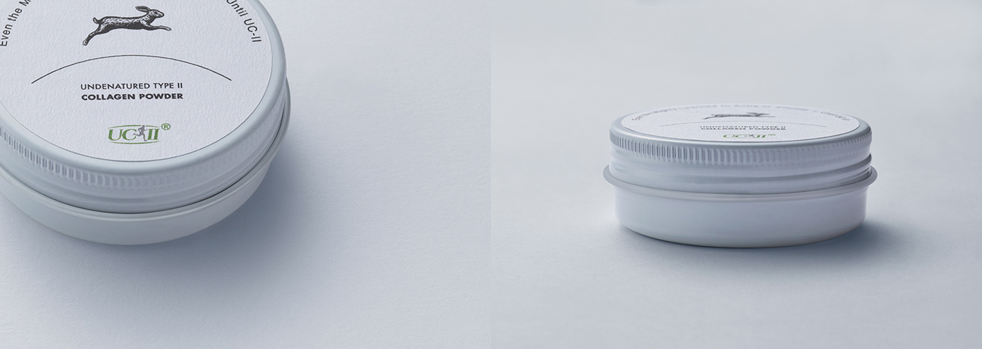
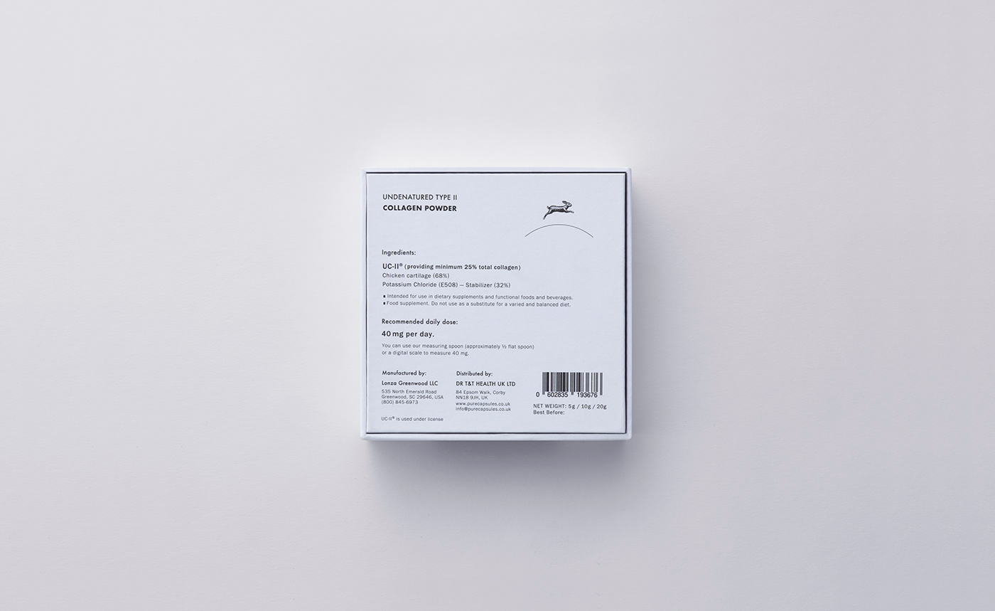
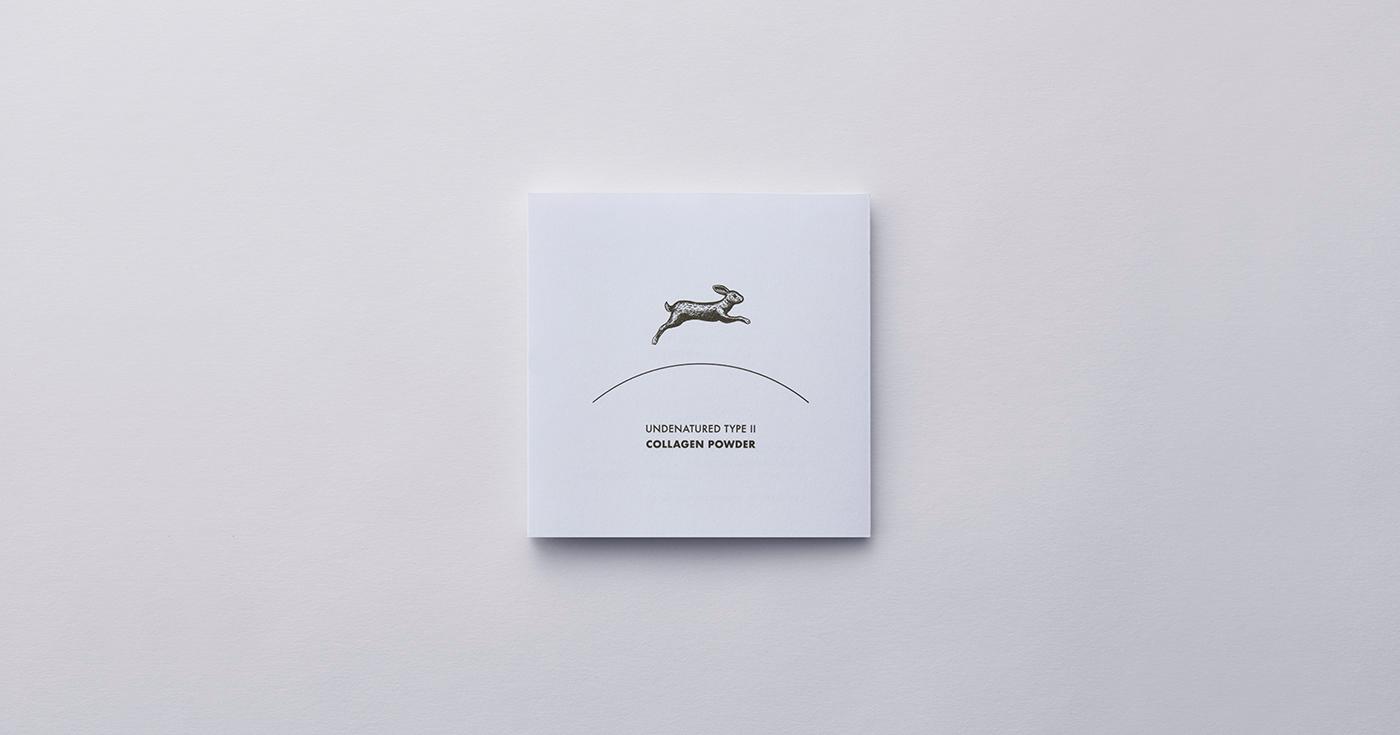
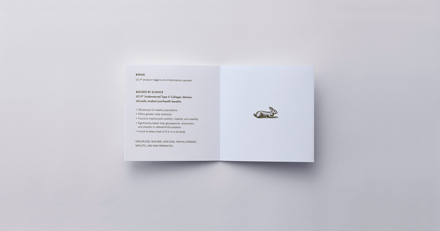
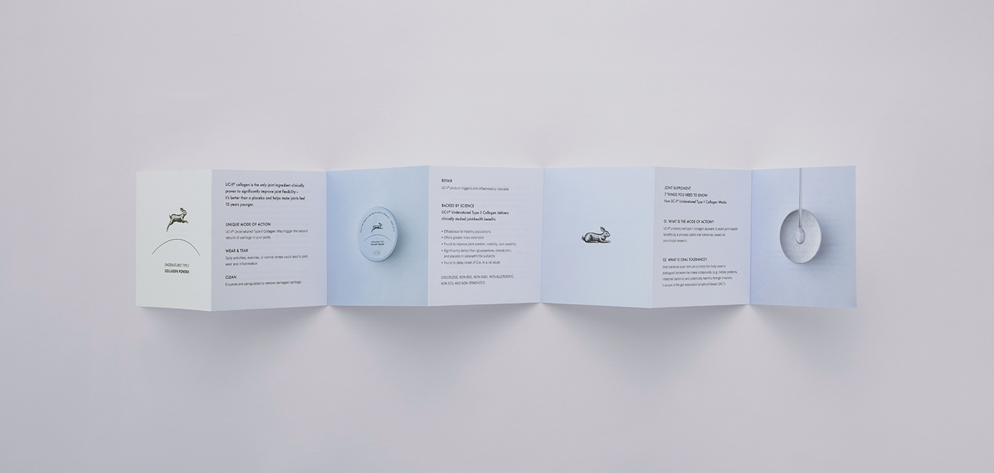
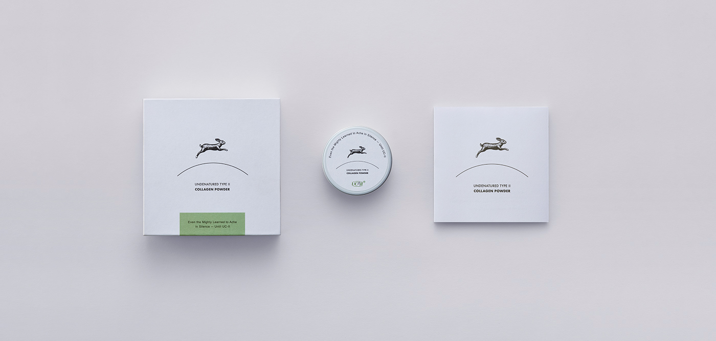
ピュアカプセル社のサプリメント、UC-Ⅱコラーゲンパウダーのパッケージデザインリニューアル。 「飛び跳ねる」「俊敏に走る」「生命力の象徴」とされるうさぎを、UC-Ⅱコラーゲンパウダーの象徴として表現。 大地を一本の曲線で描き、その上を軽やかに駆けるうさぎの姿をシンボルとして構築した。 余白を大きくとることで、サプリメントに求められる清潔感と、ブランドが持つ透明性を強調。広がりのある余白は、うさぎのアイコンをより際立たせ、視覚的なリズムと軽さを生み出している。
Collagen Powder Package Design for Pure Capsules (UK)
A renewed package design for Pure Capsules’ UC-II collagen powder supplement. A rabbit—symbolizing vitality, agility, and the ability to leap—was chosen as the emblem of the UC-II collagen powder. The ground is expressed with a single curved line, above which the rabbit runs lightly, forming the central visual motif. Generous negative space emphasizes the cleanliness expected of a supplement and highlights the brand’s sense of transparency. The open layout further accentuates the rabbit icon, creating visual rhythm and a sense of lightness throughout the design.


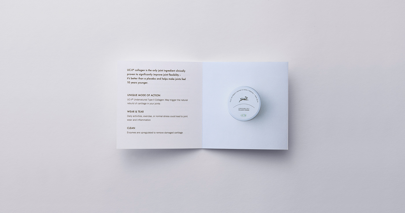
コラーゲンパウダー説明パンフレット
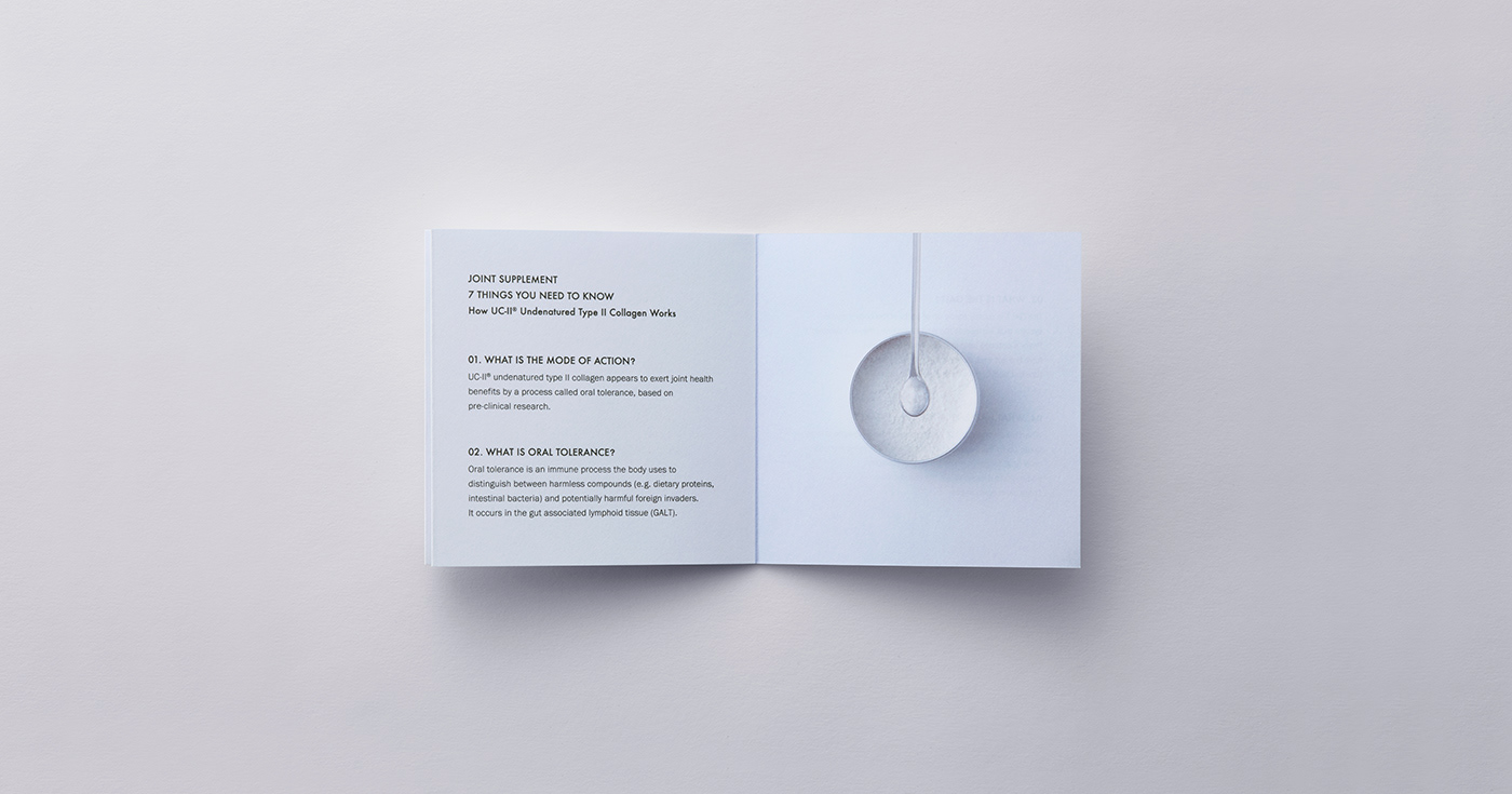
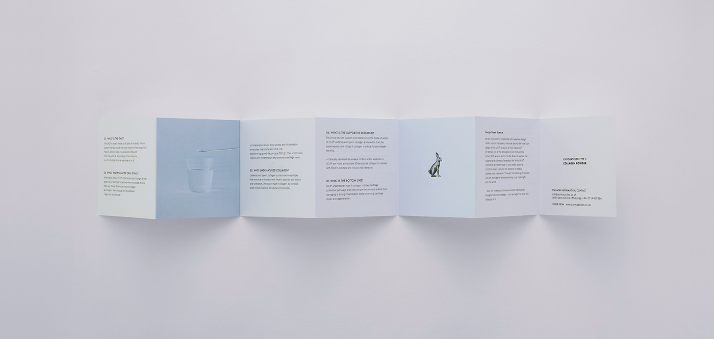
コラーゲンパウダーを摂ることで得られる「元気さ」を、ブランドキャラクターであるうさぎによってビジュアル化。軽やかさと生命力を象徴するモチーフとして、パッケージとの世界観を統一した。 さらに、使用方法を直感的に伝えるため、写真を組み合わせたシンプルなレイアウトを採用。必要な情報を過不足なく届ける構成とし、プロダクトの魅力と実用性を両立させている。
Pamphlet Design for the Collagen Powder
The sense of vitality gained from taking collagen powder is visualized through the brand’s rabbit character. As a symbol of lightness and life force, the motif aligns the pamphlet’s visuals with the world established in the packaging design. To communicate the usage method clearly and intuitively, a simple layout combining photography was adopted. The structure delivers essential information with clarity, balancing product appeal with practical ease of understanding.
CLIENT: DR T&T HEALTH UK LTD
ART DIRECTION, GRAPHIC DESIGN: JUNICHI HAKOYAMA (RHYTHM INC.)
ILLUSTRATION: KATSUYA YOSHIZAWA (RHYTHM INC.)