
Plan Japan, BRANDING
ART DIRECTION, DESIGN WORK :
BRANDING, LOGOTYPE(Japanese logotype), ADVERTISING

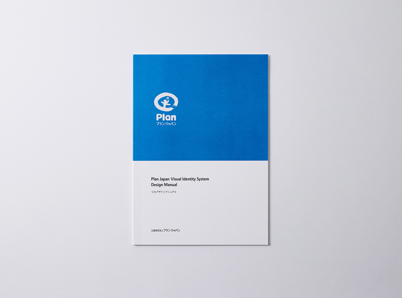
「Plan Japan」は、イギリスに本部を持ち、世界中で展開している国際NGOです。子どもの権利を推進し、貧困や差別のない社会を実現するために、途上国をはじめ世界70カ国以上で活動しており、なかでも女の子や女性への支援に力を入れていることでも知られています。私たちは、2009年から2018年までの期間、Plan Japanのブランディングを担当しました。 マークとロゴタイプについては、全世界共通のものが用意されていたため、私たちは、日本で展開するにあたっての和文ロゴタイプを開発しました。ロゴはグローバルマークとの統一性を考慮した上で、デザインを制作しました。また、ステーショナリーからパワーポイントフォーマットにいたるまで、細部にわたって一貫したビジュアルアイデンティティを持たせるため、様々な用途を想定した使用規定マニュアルも整備しました。
"Plan Japan" is an international non-governmental organization (NGO) with headquarters in the United Kingdom, which has expanded its activities all over the world. In order to promote children’s rights and realize a society free from poverty and discrimination, this NGO is active in more than 70 countries around the world, including developing countries, and in particular, it is known for its huge efforts to support girls and women. We were in charge of branding for Plan Japan from 2009 to 2018. As for the mark and logotype, we developed Japanese-style logotype for the launch in Japan since the NGO already had the universal one. The logo was designed in consideration of consistency with the mark used on the global level. In addition, in order to ensure visual identity consistent in every detail, from stationeries to powerpoint formats, we have also developed logo usage manuals available for various purposes.

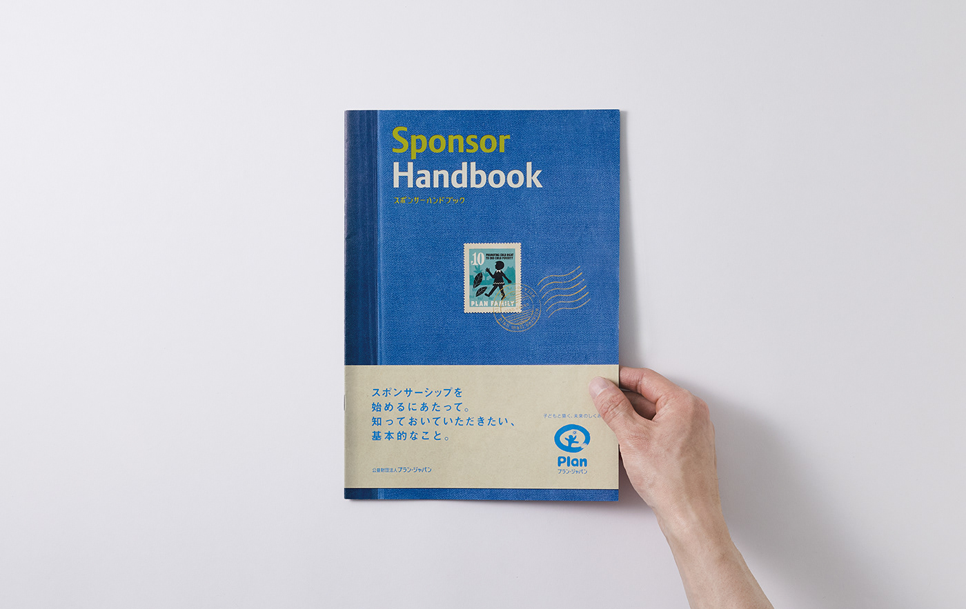
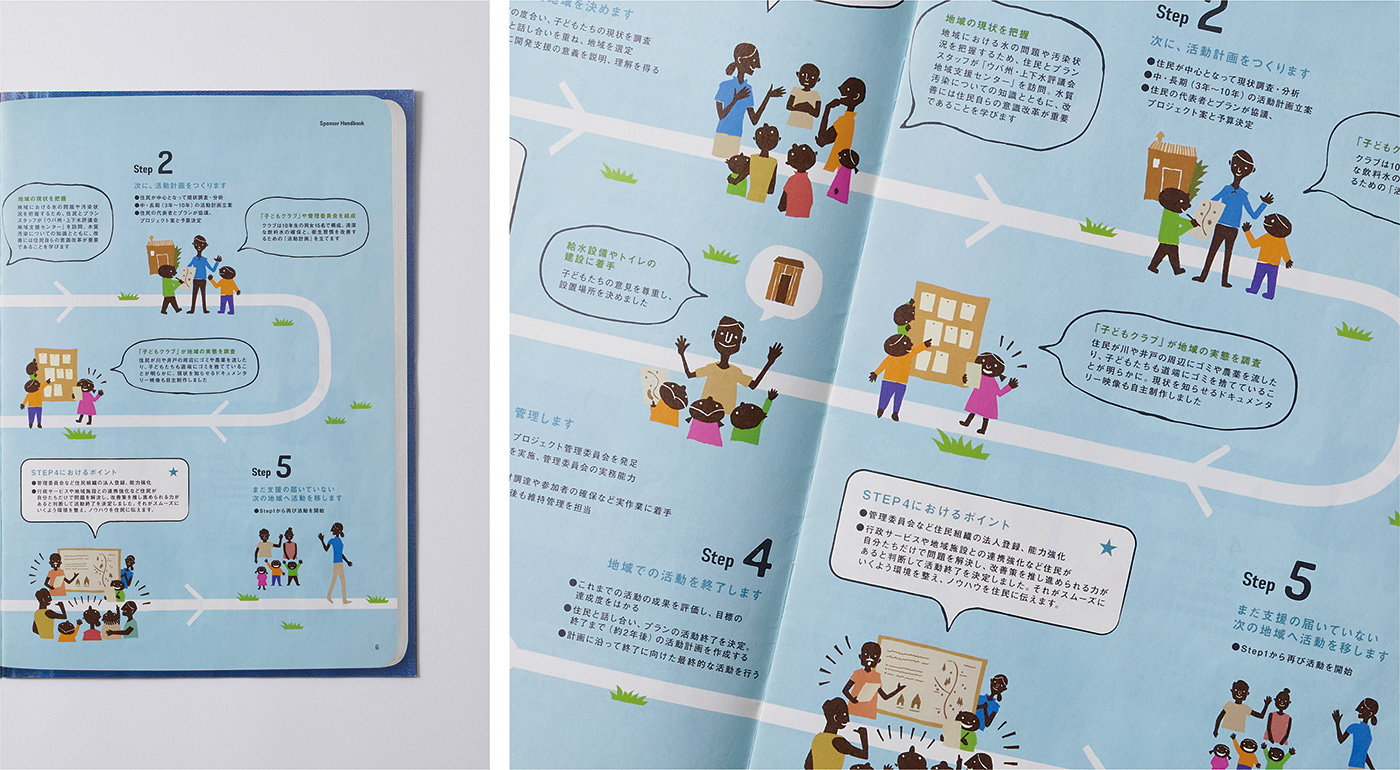
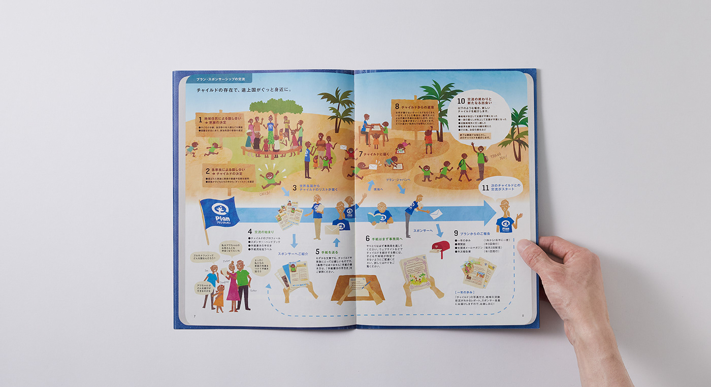
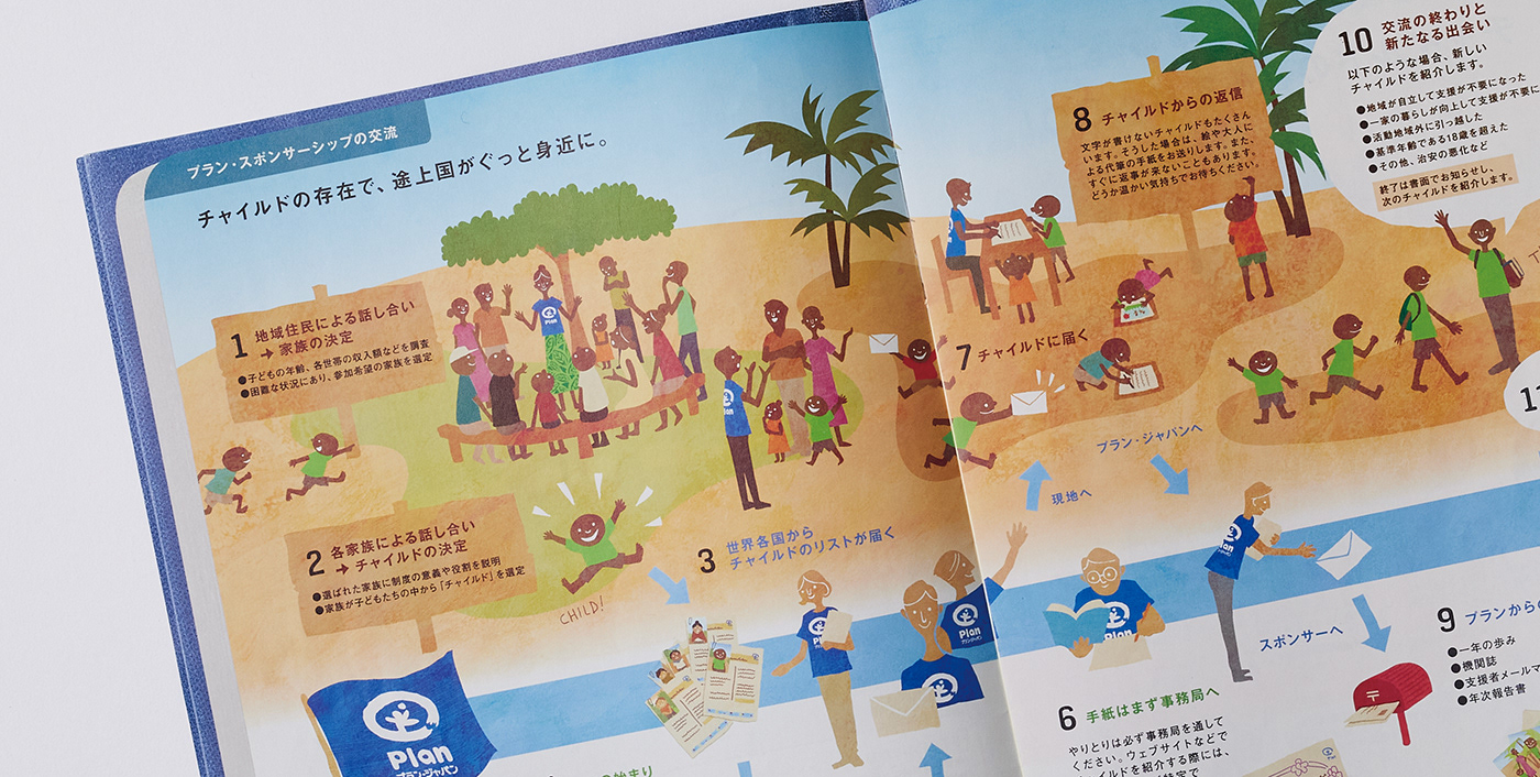

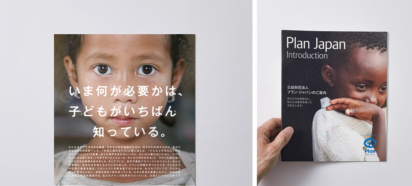
「支援」とは、モノやサービスを購入する行為とは違い、支援者の方々に「支援することでどんな価値が生まれるのか」を理解してもらうことが大切です。それだけに、Plan Japanの活動を伝えるビジュアルを制作する際は、コピーライターと何度も検討を重ねて、「支援の価値を伝える言葉を選ぶこと」に、特に配慮しました。 日本と支援国。そして、支援者の関係性やしくみなど、なかなか言葉だけでは伝えづらいものに関しては、イラストや写真によってわかりやすく伝える方法を検討し、表現しました。
As "support" is different from the act of purchasing goods and services, it is important for supporters to understand "what value is created by supporting". For this reason, when creating the visual that tells Plan Japan's activities, we worked to discuss with our copywriter many times and gave special consideration to choosing “words that convey the value of support”. Japan and supporting countries. For the information that was difficult to communicate clearly in words alone, such as the relationships with supporters and mechanism, we considered and expressed ways to convey it in an easy-to-understand manner by using illustrations and photographs.


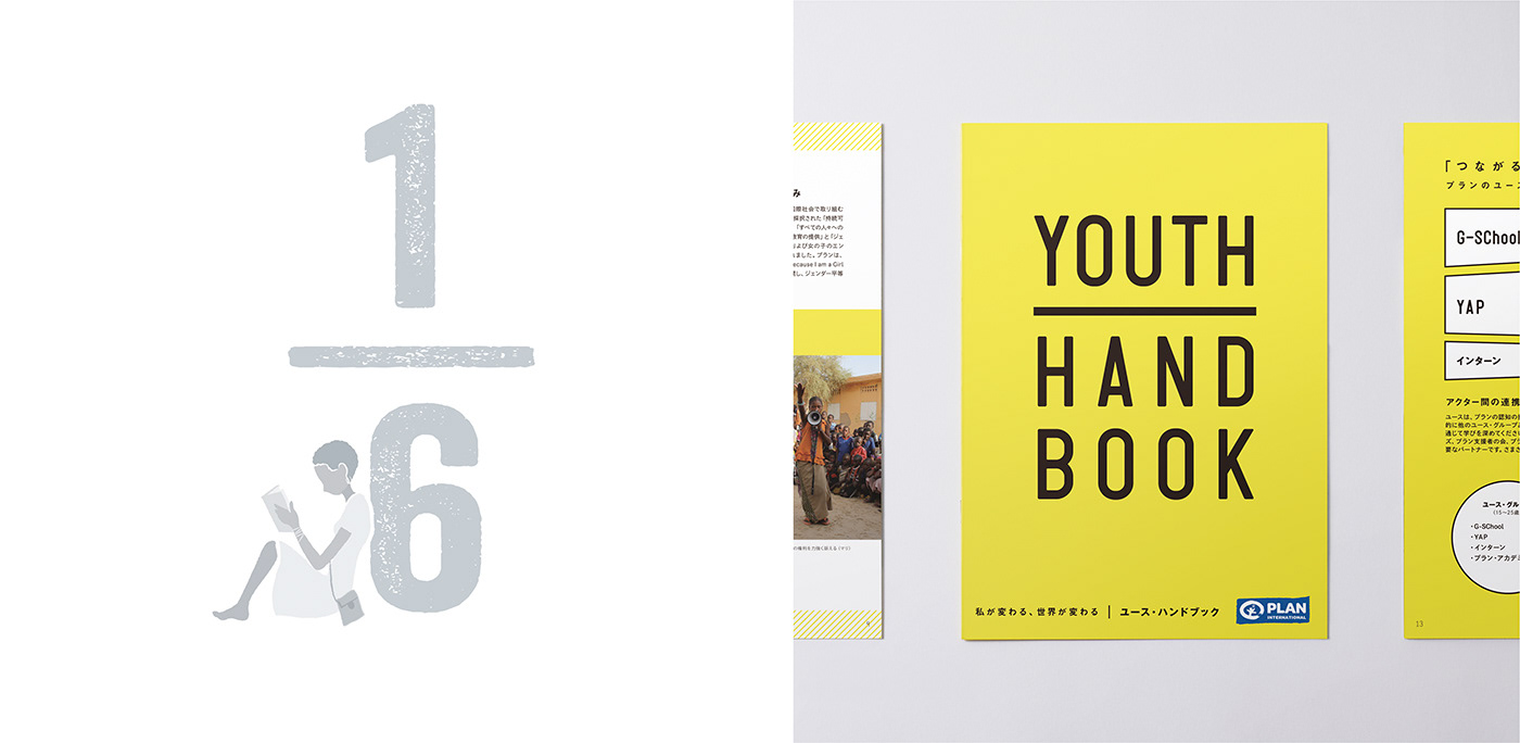
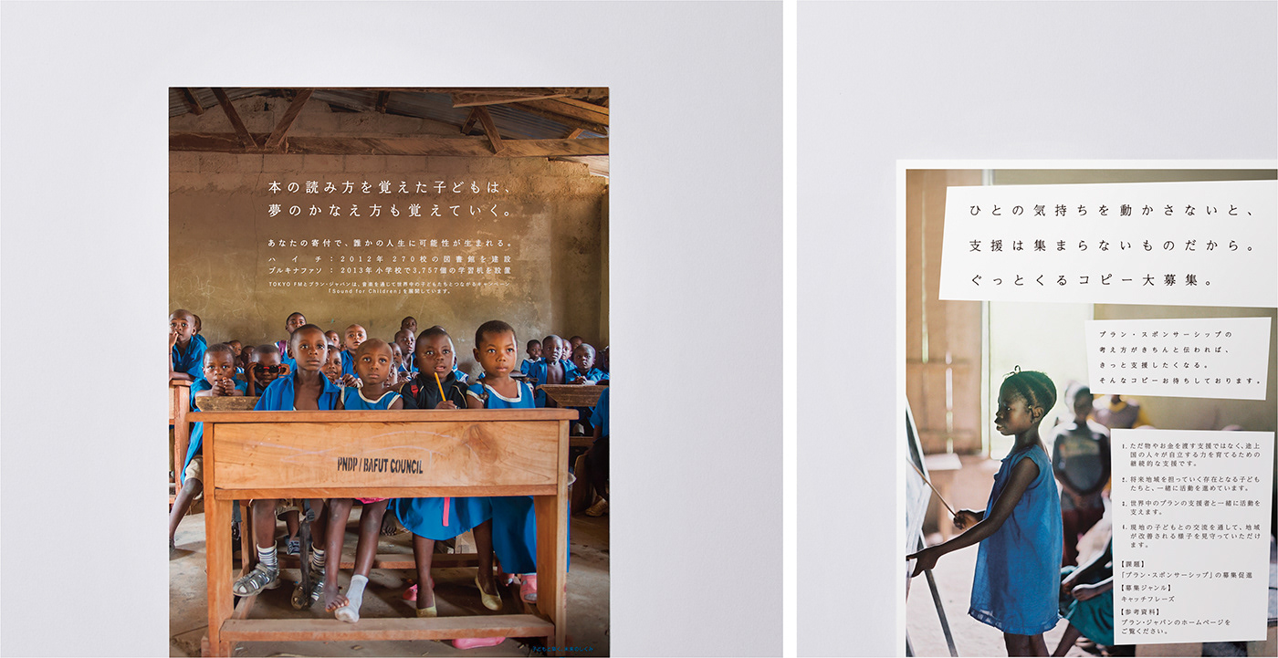
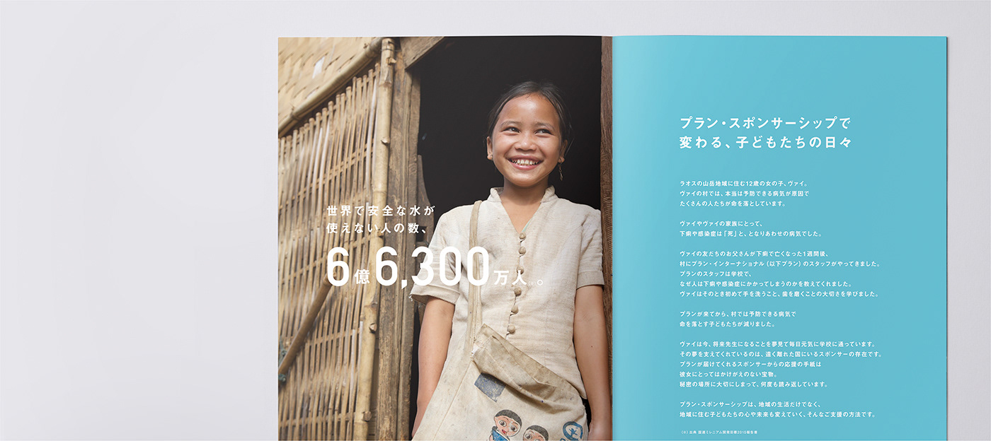
ポスターやパンフレットなど、外部に発信する大半のビジュアル制作も担当しました。それぞれのデザインを手掛ける上で意識したのは、コンセプトの軸となるメッセージの統一を図りつつも、それぞれの異なる媒体において最適なコミュニケーション方法を検討することです。こうした一貫したブランディングを行うことで、国内におけるPlan Japanの認知度の向上とブランドイメージの浸透に成功しました。
We were also in charge of most of the visual design that would be distributed externally, such as posters, pamphlets, and so on. When we worked on each design, we focused on finding the best communication for each different medium while trying to unify the messages that become the core of the concept. Through this consistent branding, we have succeeded in raising awareness of Plan Japan nationwide and penetrating its brand image.
CLIENT:Plan Japan
ART DIRECTION,:JUNICHI HAKOYAMA (RHYTHM INC.)
GRAPHIC DESIGN : JUNICHI HAKOYAMA (RHYTHM INC.)
ILLUSTRATION:YOSUKE EDA (RHYTHM INC.)