
KSCO BRANDING
BRANDING, DESIGN, WORK :
MARK, LOGOTYPE, PACKAGE, ADVERTISING
中国で化粧品事業を展開するビューティーバレーによる、スキンケアブランド「KSCO」の開発。
本プロジェクトでは、日本品質を軸に、企画から製造までを国内で一貫して行う「Made in Japan」ブランドの構築が求められた。
本プロジェクトでは、日本品質を軸に、企画から製造までを国内で一貫して行う「Made in Japan」ブランドの構築が求められた。
私たちは、コンセプト設計を起点に、商品全体の世界観構築、グラフィック制作、ブランドイメージの形成に至るまで、
スキンケアブランドとしてのトータルプロデュースを担当。日本品質の価値を明確に伝えるブランドづくりを行った。
Development of the skincare brand “KSCO” for Beauty Valley, a cosmetics company based in China.
This project called for the creation of a “Made in Japan” brand, with all processes—from planning to manufacturing—carried out entirely in Japan, rooted in the value of Japanese quality.
This project called for the creation of a “Made in Japan” brand, with all processes—from planning to manufacturing—carried out entirely in Japan, rooted in the value of Japanese quality.
Starting from concept development, we were responsible for the total production of the brand, including the construction of the overall worldview, graphic design, and brand image creation. Through this process, we built a brand that clearly communicates the value of Japanese quality.
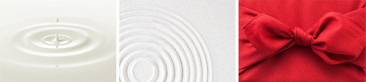

「Made in Japan」であることを前提に、商品全体の世界観を構築するビジュアル制作において、重視したのは「日本らしい佇まい」である。
各ビジュアルの制作では、細部に至るまで「日本の美しさとは何か」を問い、その考えを発想の原点として組み立てた。
各ビジュアルの制作では、細部に至るまで「日本の美しさとは何か」を問い、その考えを発想の原点として組み立てた。
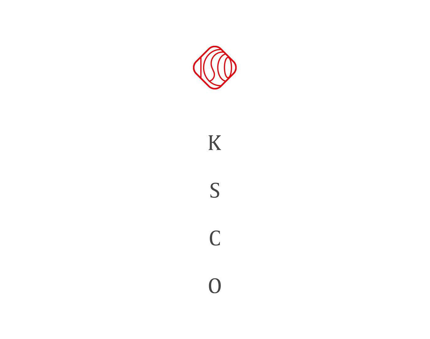
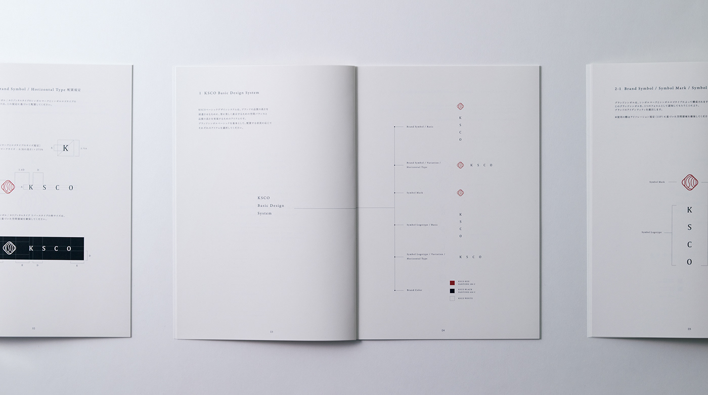
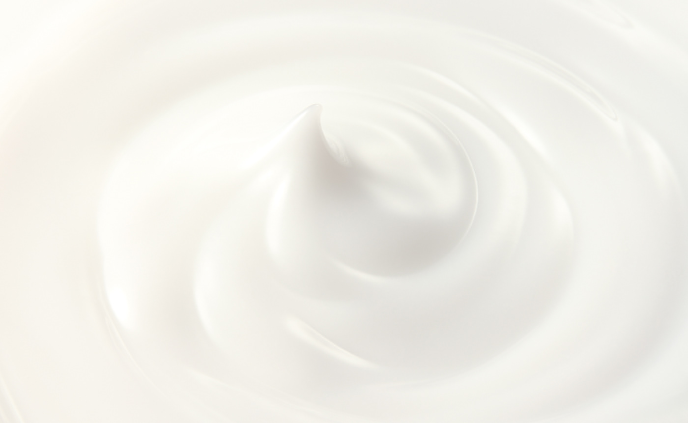
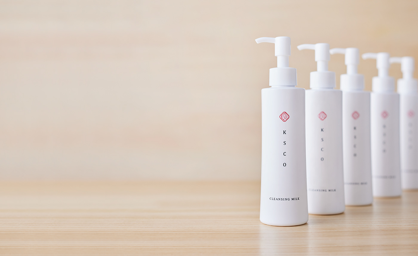
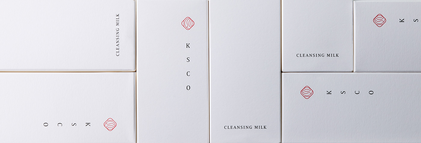
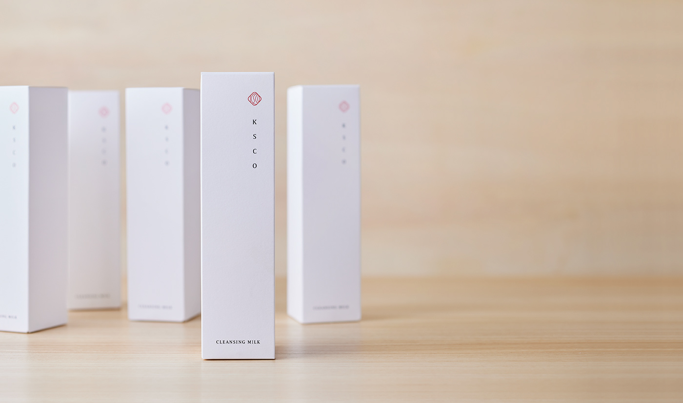
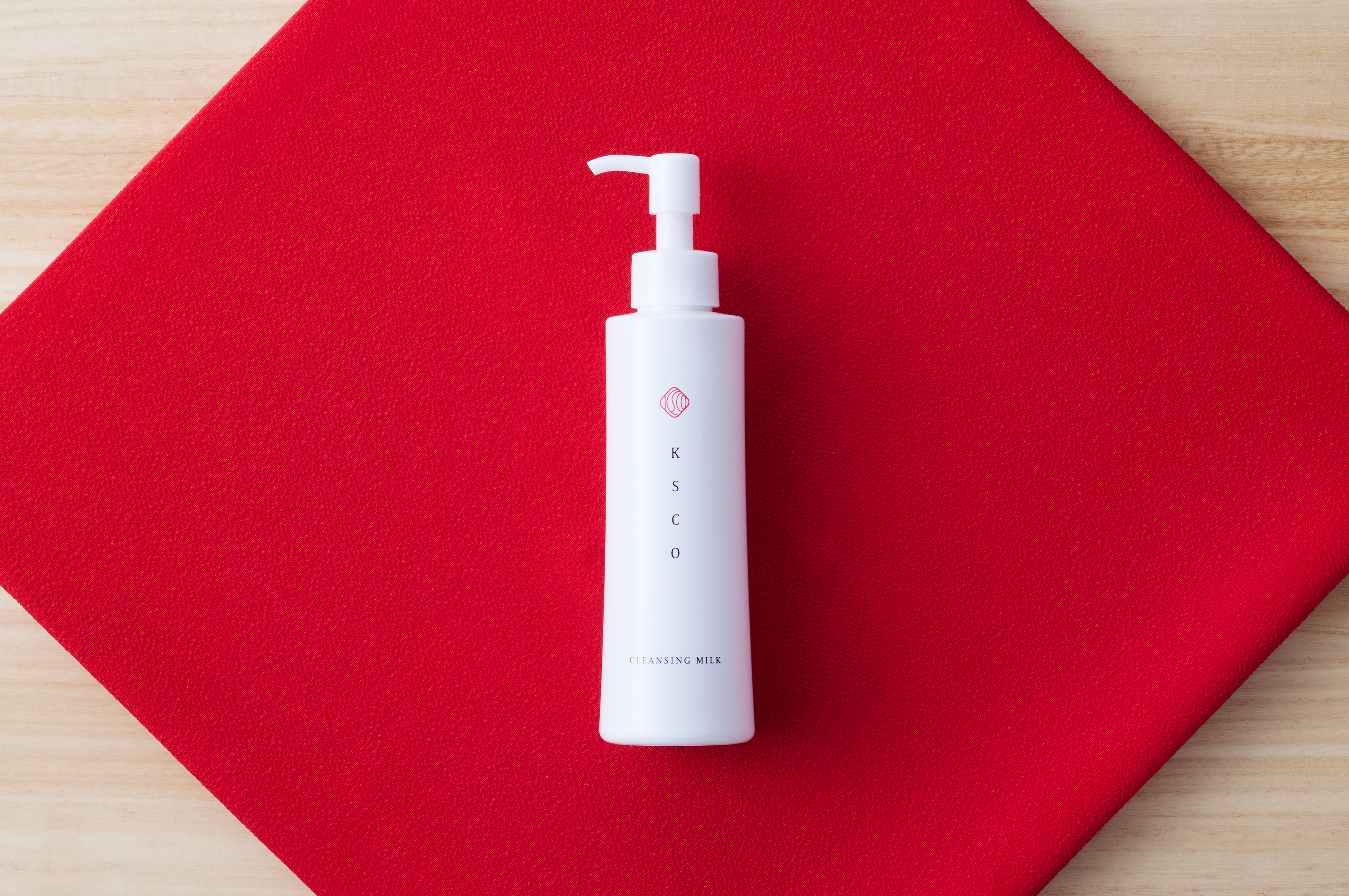
ブランドマークには、化粧水一滴から生まれる肌の潤いやみずみずしさをイメージし、波紋をモチーフとして採用。
日本を象徴する赤と白を基調に、伝統美を想起させる朱印のようなフォルム、繊細なラインで構成したロゴタイプ、
日本を象徴する赤と白を基調に、伝統美を想起させる朱印のようなフォルム、繊細なラインで構成したロゴタイプ、
さらに縦書きの表現を組み合わせることで、楚々とした品格と静かな強さを備えた、日本ならではの佇まいを表現している。
With “Made in Japan” as a foundational premise, the visual development focused on creating an overall worldview defined by a distinctly Japanese sense of presence.
In developing each visual element, careful consideration was given to the question of what constitutes Japanese beauty, using this perspective as the starting point for all creative decisions.
In developing each visual element, careful consideration was given to the question of what constitutes Japanese beauty, using this perspective as the starting point for all creative decisions.
For the brand mark, ripples were adopted as the central motif, inspired by the moisture and freshness of the skin that emerge from a single drop of lotion.
A color palette centered on red and white—colors symbolic of Japan—was combined with a seal-inspired form reminiscent of traditional shuin, a logotype composed of delicate lines, and vertical typography. Together, these elements create a refined, dignified expression with a quiet strength, conveying a uniquely Japanese sensibility.
A color palette centered on red and white—colors symbolic of Japan—was combined with a seal-inspired form reminiscent of traditional shuin, a logotype composed of delicate lines, and vertical typography. Together, these elements create a refined, dignified expression with a quiet strength, conveying a uniquely Japanese sensibility.
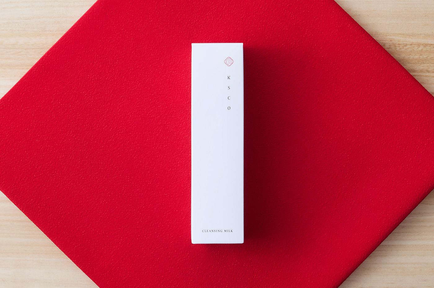
KSCOの大きな特長は、肌への刺激を抑えたミルククレンジングであること。
肌にやさしいスキンケアを日々使い続けることは、未来の自分への投資であるという考えのもと、「未来の肌を育てる」というコピーを掲げ、
肌にやさしいスキンケアを日々使い続けることは、未来の自分への投資であるという考えのもと、「未来の肌を育てる」というコピーを掲げ、
新たな視点からのスキンケアコンセプトを構築した。
One of KSCO’s defining features is its milk cleanser, formulated to be gentle on the skin.
Based on the idea that using skin-friendly skincare products every day is an investment in the future, we developed the concept around the message “Nurturing the skin of tomorrow,” presenting KSCO as a skincare brand with a fresh and forward-looking perspective.
Based on the idea that using skin-friendly skincare products every day is an investment in the future, we developed the concept around the message “Nurturing the skin of tomorrow,” presenting KSCO as a skincare brand with a fresh and forward-looking perspective.
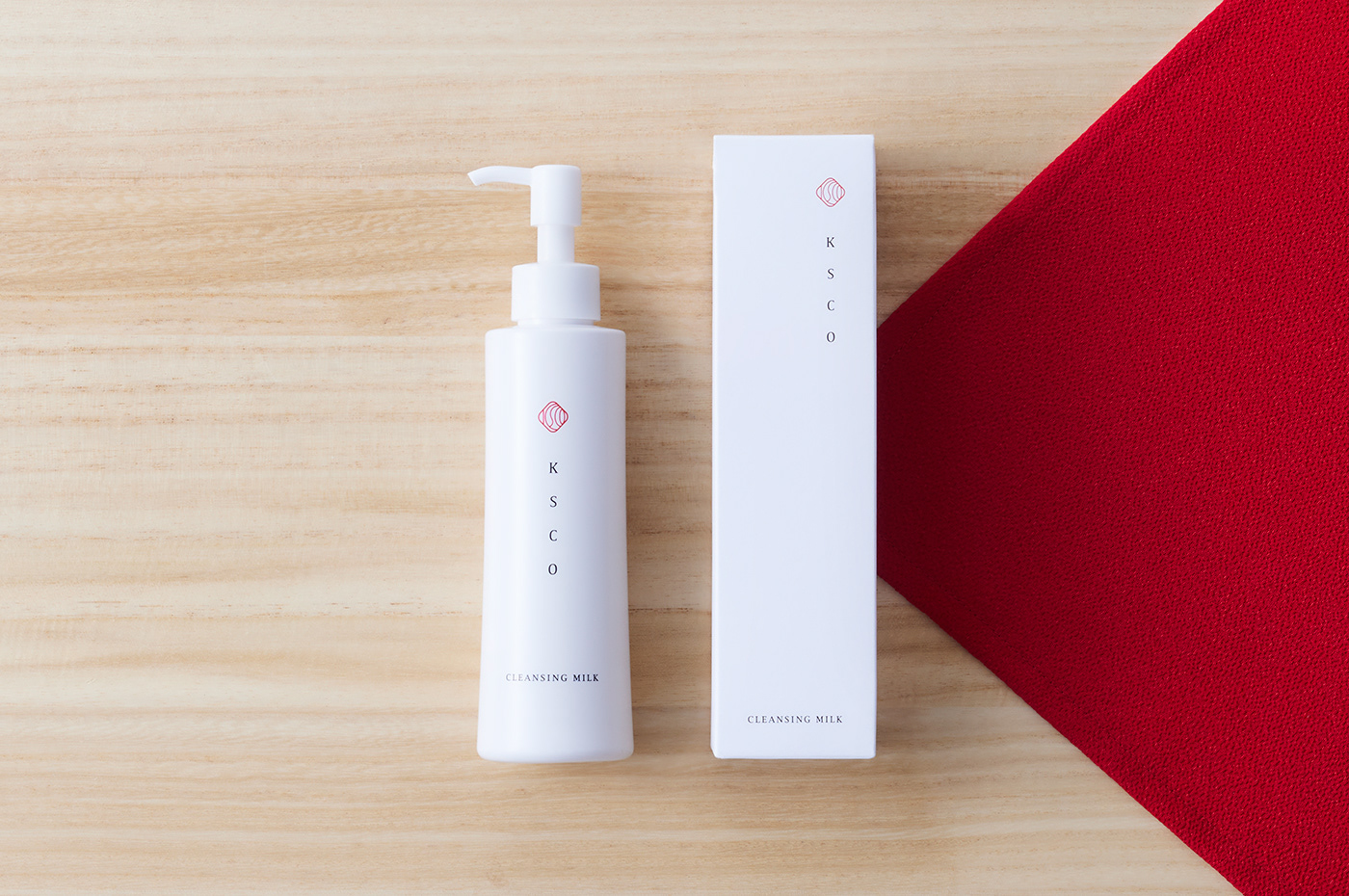
容器には、安定感のある佇まいを意識し、末広がりのフォルムを採用。
ボトルを包む紙箱には、触れたときの質感にこだわり、雪を思わせるきめ細やかな手触りの紙を使用した。
ボトルを包む紙箱には、触れたときの質感にこだわり、雪を思わせるきめ細やかな手触りの紙を使用した。
視覚や触覚といった感覚を通して、商品コンセプトである「日本の美」と、ミルククレンジングならではの特性を表現。
やわらかさや優しさ、そして繊細さが自然に伝わるデザインを目指した。
やわらかさや優しさ、そして繊細さが自然に伝わるデザインを目指した。
For the container, a gently widening form was adopted to convey a sense of stability.
The paper box surrounding the bottle was carefully selected for its tactile quality, using a finely textured paper reminiscent of snow.
The paper box surrounding the bottle was carefully selected for its tactile quality, using a finely textured paper reminiscent of snow.
Through visual and tactile sensations, the design aimed to express both the product concept of “Japanese beauty” and the inherent qualities
of a milk cleanser—communicating softness, gentleness, and delicacy in a natural and understated way.

CLIENT: BEAUTY VALLEY
ART DIRECTION, GRAPHIC DESIGN: JUNICHI HAKOYAMA (RHYTHM INC.)
ILLUSTRATION: KATSUYA YOSHIZAWA (RHYTHM INC.)