
"Because I am a Girl" Campaign, BRANDING
ART DIRECTION, DESIGN, WORK :
BRANDING, MARK, LOGOTYPE, ADVERTISING
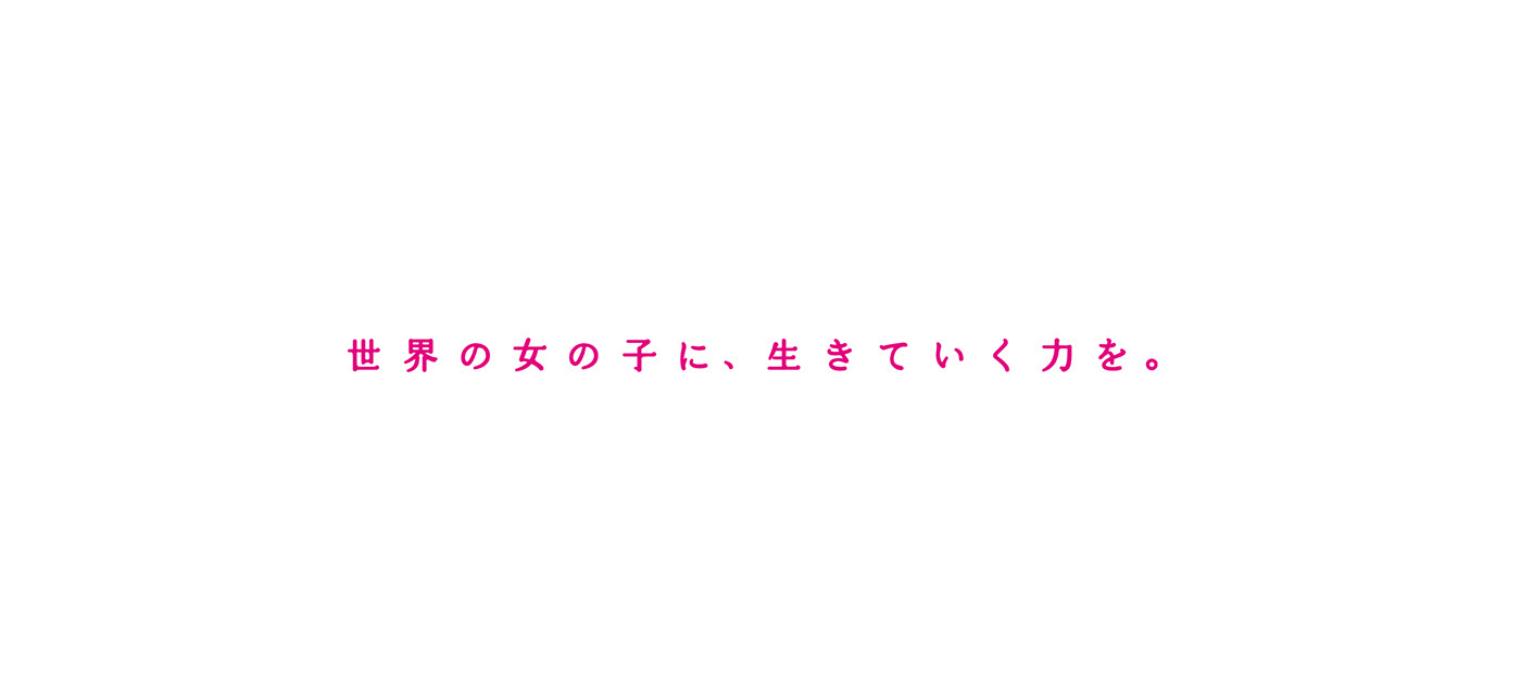


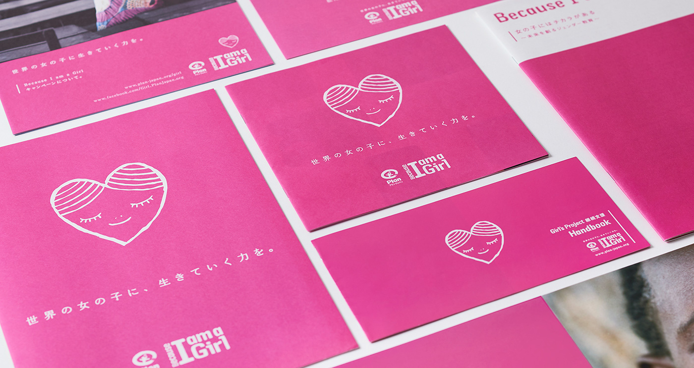
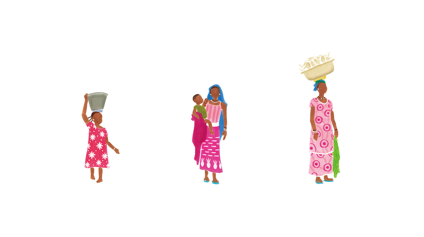
世界的なNGO団体であるPlanが行うインターナショナルキャンペーン「Because I am a Girl」のブランディングを、2012年から2018年まで担当しました。 Planが実施した「Because I am a Girl」キャンペーンとは、女性であること、そして子どもであることによって、様々な困難に直面する途上国の女の子たちの現状改善を訴え、彼女たちに「生きていく力」を身に付けてもらうことで、途上国の問題解決を目指すキャンペーンです。 デザイン制作で意識したのは、コンセプトとメッセージを届けるのはもちろんのこと、グローバルキャンペーンとして、他国との世界観の統一性を持たせることです。ブランディングに関わるビジュアルは、テーマカラーをピンク色に統一。色によってキャンペーンの統一性をはかると同時に、見た人の記憶に強く印象づけられるように意識しました。 キャンペーンスローガンの開発に加えて、日本でより親しみを感じていただくため、日本独自のキャンペーンマークも開発しました。マークには、支援する側と受ける側の気持ちを伝えるために、心地良い表情とハートのフォルムによって表現しました。
From 2012 to 2018, we were in charge of branding for the international campaign, "Because I am a Girl", run by Plan, a global non-governmental organization (NGO). The "Because I am a Girl" campaign conducted by Plan is a campaign that aims to solve problems in developing countries by appealing to people for the improvement of the girls’ serious situations in developing countries who face various difficulties because of being women and children, and by having them acquire “the power to live". In the design process, we have focused on not only delivering the concept and messages, but also unifying the view of the world with other countries as a global campaign. For the visual related to branding, the theme color was unified in pink. We tried to unify the campaign by color as well as make a strong impression on people who saw it. In addition to creating campaign slogans, we have also developed the campaign mark unique to Japan so that people in Japan could feel more familiar. In order to convey the feelings of those who support and those who receive support, the mark was expressed with a pleasant facial expression and heart form.


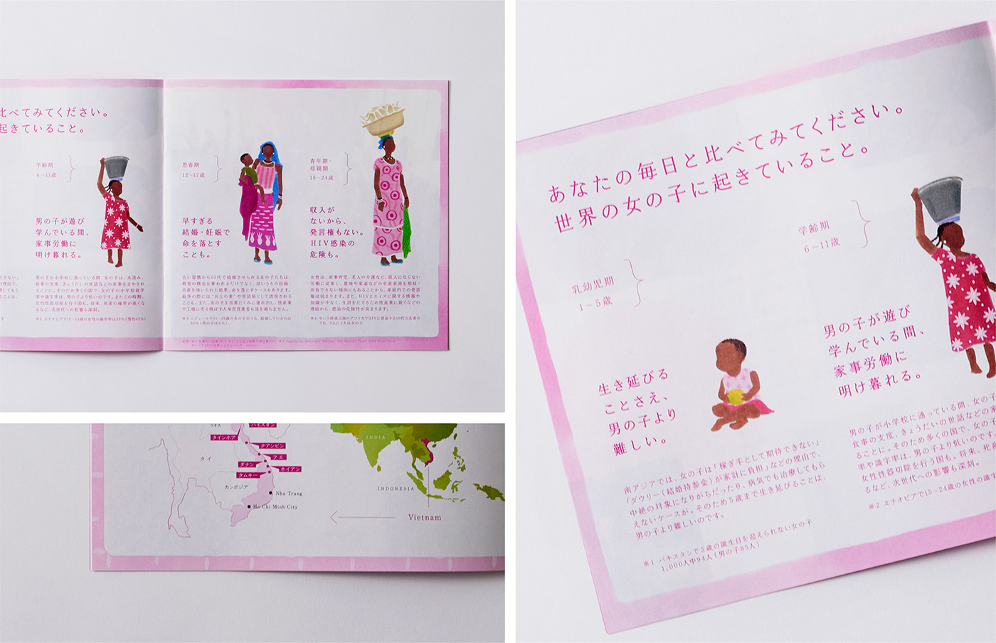
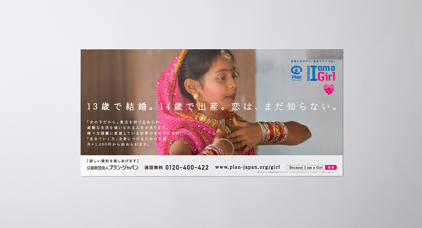
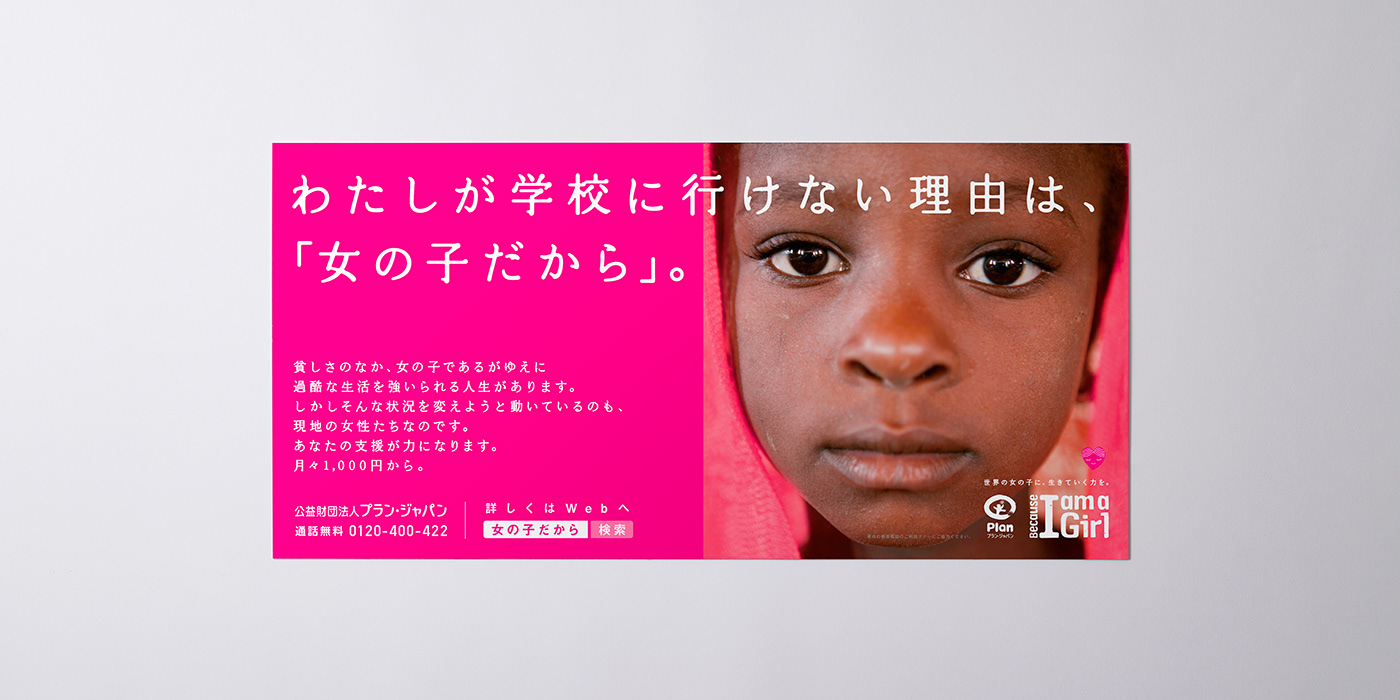
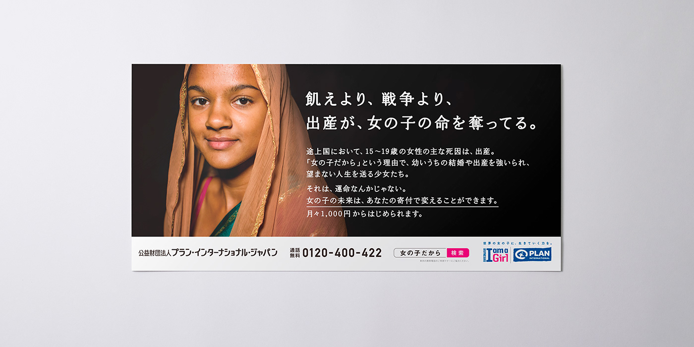
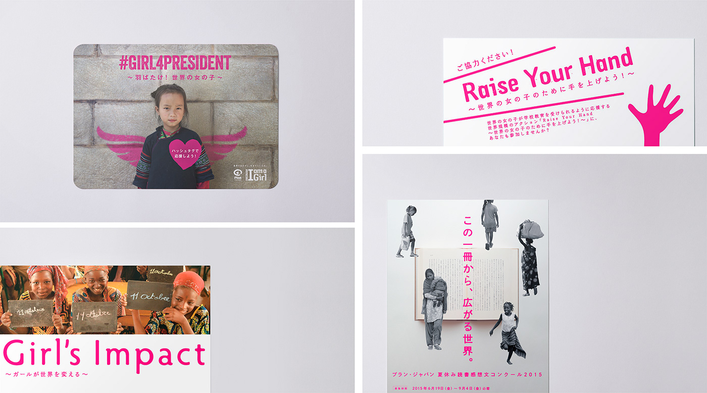
途上国の女の子たちの現状をいかに訴えかけても、日本で暮らす多くの人々とっては想像がつきづらいものです。日常生活からは大きくかけ離れた途上国の問題を、どうしたら身近に感じてもらえるのかを考えました。また、人々が寄付を通じて、その問題に主体的にかかわることで、どのような価値を得ることができるのかを、きちんと伝えることを意識しました。 コピーライターとのチームで生み出した様々な広告を通じて、多くの方々に途上国が現在抱える問題を知っていただく機会を提供できたと思います。
No matter how much you appeal to the current situation of girls in developing countries, it is hard to imagine for many people living in Japan. I thought about how to make people feel closer to the problems of developing countries, which are far from their daily lives. In addition, I was conscious of communicating properly what kind of value people can get by being actively involved in the problem through donations. Through the various advertisements created by the team with copywriters, I think we were able to provide many people with an opportunity to learn about the current problems facing developing countries.


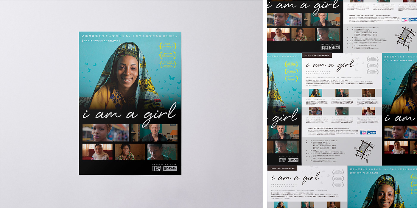
映画の上映会やSNS上の告知や、ハーフマラソン、様々な講演や大学での講義など、様々なイベントやコンクールなどがキャンペーンの一環として行われました。それぞれのイベントのテーマや趣旨に合わせて制作した告知ツールは反響も大きく、長期間にわたって、幅広い層の参加者を増やすツールとして活用されました。結果、多くの方にキャンペーンの存在を知っていただき、大きな成果を出すことができたと思います。
Various events and competitions such as movie screenings, SNS announcements, half marathons, various lectures and university lectures were held as part of the campaign. The announcement tools created according to the theme and purpose of each event have received a great deal of feedback, and have been used as a tool to increase the number of participants in a wide range of people over a long period of time. As a result, I think we were able to achieve great results by making many people aware of the existence of the campaign.


CLIENT:Plan Japan
ART DIRECTION,:JUNICHI HAKOYAMA (RHYTHM INC.)
GRAPHIC DESIGN : JUNICHI HAKOYAMA (RHYTHM INC.)
ILLUSTRATION:YOSUKE EDA (RHYTHM INC.), KATSUYA YOSHIZAWA (RHYTHM INC.)